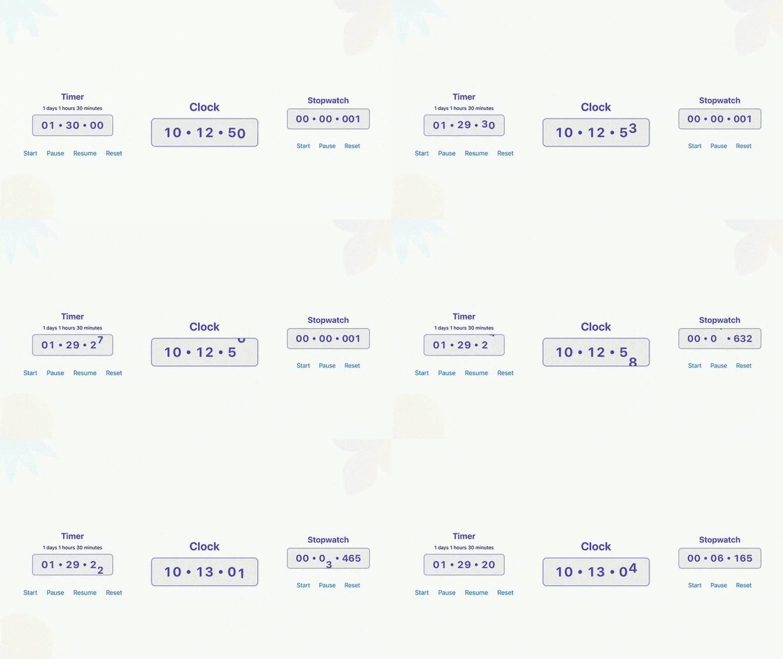
A Reanimated-powered library for creating smooth and customizable timers, stopwatches, and time displays in React Native. ⏳
- ⚡ High Performance – Achieves smooth 60FPS animations using Reanimated
- 🎨 Fully Customizable – Configure behavior, appearance, and animations via flexible props
- 🎞️ Built-in Entry & Exit Animations – Seamlessly integrate with Reanimated transitions
- 🧩 Powered by Reanimated v3 – Utilizes the latest version for optimal performance and capabilities
- 🚀 Expo-Compatible – Works out of the box with managed Expo projects
- ✨ TypeScript First– Fully typed for better DX and safer code
- Timer – Countdown timer with customizable duration, animations, and callbacks. Check it out
- Stopwatch – Accurate stopwatch with start, pause, and reset controls. Check it out
- Digital Clock – Live clock display showing current time, updated in real-time. Check it out
-
🙏 Component and Animation Inspiration
This library is heavily inspired byreact-native-animated-stopwatch-timerand the accompanying blog. It’s a great resource for understanding animation patterns with Reanimated—highly recommended! -
🧠 Custom Hook Design
The internal time management logic draws inspiration fromreact-timer-hook. Chose not to use it as a direct dependency to allow for more fine-grained control and customization.
If you're only looking for a headless timekeeping hook (without UI), definitely consider usingreact-timer-hookdirectly.
npm install react-native-reanimated-chronoNote: This package is built on top of react-native-reanimated, so make sure it’s properly installed and configured in your project. Refer to the Reanimated installation guide if you haven’t already set it up.
Timer component that counts down from a specified duration.
| Prop | Type | Default | Description |
|---|---|---|---|
| durationMs | number | - |
Required The duration in milliseconds for the timer. |
| intervalMs | number | 1000 | The interval in milliseconds to update the timer. |
| autoStart | boolean | true | Whether to start the timer automatically. |
| onExpire | () => void | undefined | Callback function to be called when the timer expires. |
For additional props, refer to the Common Props section.
Starts the timer if it is not already running or paused.
timerRef.current?.start();Pauses the timer if it is running.
timerRef.current?.pause();Resumes the timer if it is paused.
timerRef.current?.resume();Restarts the timer with a new duration and optional autoStart value.
- duration - The new duration in milliseconds.
- autoStart - Whether to start the timer automatically. Optional, Defaults to true
timerRef.current?.restart(1800000, false); // Timer for 30 mins, with autoStart set to falseResets the timer to the initial duration and intial autoStart value.
timerRef.current?.reset();| Prop | Type | Default | Description |
|---|---|---|---|
| autoStart | boolean | false | Whether to start the stopwatch automatically. |
| intervalMs | number | 1000 | The interval in milliseconds to update the stopwatch. |
| offsetTimestamp | Date | undefined | The offset timestamp to start the stopwatch from. |
For additional props, refer to the Common Props section.
Starts the stopwatch
timerRef.current?.start();Pauses the stopwatch
timerRef.current?.pause();Resets the stopwatch with a new offset and autoStart value.
- autoStart - Whether to start the timer automatically. Optional, Defaults to false
- offset - The offset date to set the stopwatch to. Optional, Defaults to undefined
timerRef.current?.restart();Clock component to display the current time.
- It can be configured to show hours, minutes, seconds, and milliseconds.
- The time format can be set to either 12-hour or 24-hour format.
| Prop | Type | Default | Description |
|---|---|---|---|
| format | '12' | '24' | '24' | The time format to be used. |
| intervalMs | number | 1000 | The interval in milliseconds to update the clock. |
For additional props, refer to the Common Props section.
All common props are optional
| Prop | Type | Default | Description |
|---|---|---|---|
| animationDelay | number | 0 | Delay before the animation starts (in milliseconds). |
| animationDuration | number | 80 | Duration of the animation (in milliseconds). |
| animationDistance | number | 1200 | Distance the animation moves. |
| animationDirection | 'up' | 'down' | 'down' | Direction of the animation ('up' or 'down'). |
| entering | EntryOrExitLayoutType | undefined | Custom entering animation from react-native-reanimated. |
| exiting | EntryOrExitLayoutType | undefined | Custom exiting animation from react-native-reanimated . |
| skipEntering | boolean | true | Useful for preventing initial animation on mount. |
| skipExiting | boolean | false | Useful for preventing exit animation on unmount. |
| separator | string | ":" | Separator between time units, can be a string, a function returning a JSX element, or null. |
| separatorStyle | TextStyle | undefined | Style for the separator, if a string separator is provided. Oterwise, this prop is ignored. |
| style | ViewStyle | undefined | Style for grouped digit's container. eg: [tens of seconds, units of seconds] |
| digitContainerStyle | ViewStyle | undefined | Style for grouped digit's container. eg: [tens of seconds, units of seconds] |
| digitStyle | TextStyle | undefined | Style for the individual digits, eg: Tens of seconds |
| millisecondsStyle | TextStyle | undefined | Style for the milliseconds digits. |
See the contributing guide to learn how to contribute to the repository and the development workflow.
This project is licensed under the MIT License.


