react-native-rating-simple

react-native-rating-simple is a versatile react native "star" review component with half star compatibility and custom component "star". You can slide/move or simply click on stars. It cna be used for view only
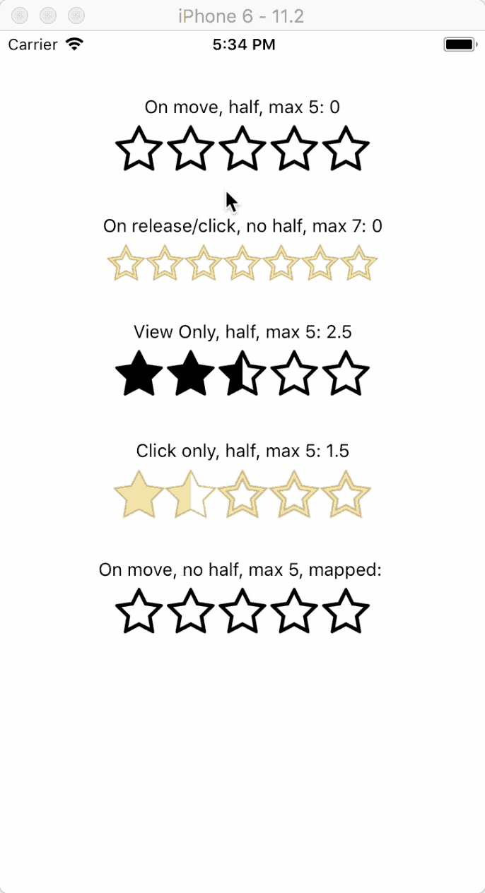
Table of Contents
Installation
npm install react-native-stars --saveUsage
For Selection with sliding and half star
<Rating halfStar= <Image source=halfStar style= width: 40 height: 40 /> fullStar= <Image source=fullStar style= width: 40 height: 40 /> emptyStar= <Image source=emptyStar style= width: 40 height: 40 /> starSize=40 onChange= { this; } />For view only and half star
<Rating rating=25 halfStar= <Image source=halfStar style= width: 40 height: 40 /> fullStar= <Image source=fullStar style= width: 40 height: 40 /> emptyStar= <Image source=emptyStar style= width: 40 height: 40 /> starSize=40 viewOnly=true />Props
| Property | Type | Required | Default value | Description |
|---|---|---|---|---|
| rating | number | no | 0 | The initial rating |
| maxRating | number | no | 5 | The maximum rating, increasing this number will increase the "stars" as well |
| emptyStar | element | yes | The component for the empty "star" | |
| fullStar | element | yes | The component for the full "star" | |
| halfStar | element | no | The component for the half "star". Passing this prop will make the rating selectable by 0.5 (half) | |
| onChange | func | no | A callback function that i called when you click or when you finish to move/slide. | |
| onChangeMove | func | no | A callback function that i called when you are moving/sliding on the stars | |
| starSize | number | yes | The size of the stars, this is needed to calculate the value. It must be accurate | |
| viewOnly | bool | no | false | Set to true if you want to be view only (no interaction/change) |
| clickOnly | bool | no | false | Set to true if you want to disable the sliding/moving |
Demo
I have added an example on the example folder and also published it on Expo.

Contributing
Pull Requests for new features and bugfixes are welcome! :)