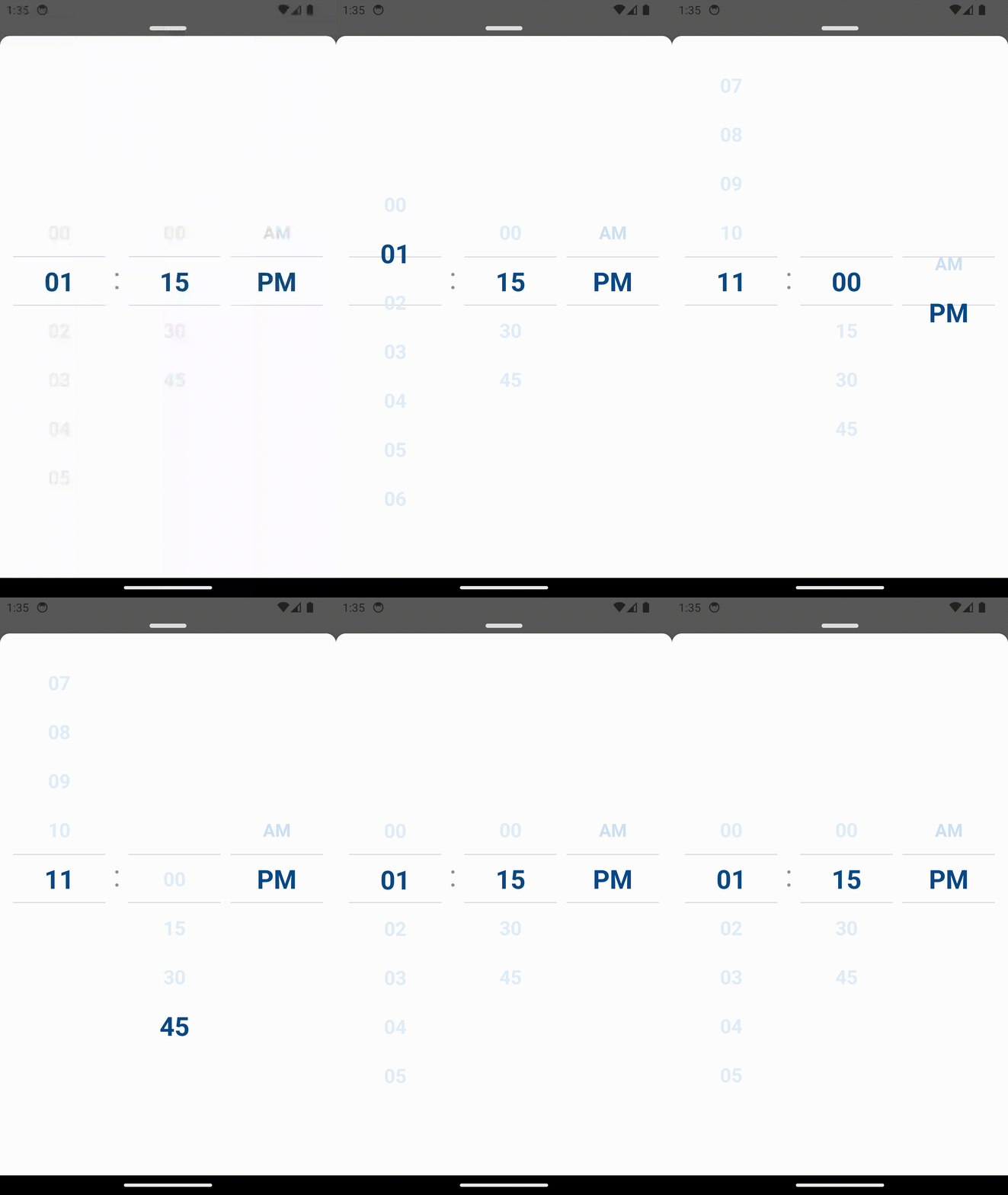
react-native-limit-timepicker
React Native Limit Timepicker is a library that provides a LIMITABLE and CUSTOMIZABLE timepicker component for React Native applications.
Features
- Smooth Animated Timepicker
- Can limit the minimum time and maximum time in scroll picker
- Easy to use
- Consistent look and feel on iOS and Android
- Customizable font size, colors and animation duration
- Implemented with typescript
If you love this library, and want to support it, let's give us a star, you will be a ray of sunshine in our lives 🥰Getting started
npm install react-native-limit-timepicker --saveor
yarn add react-native-limit-timepickerTimepicker Props
| Props | Params | isRequire | Description |
|---|---|---|---|
| disabled | boolean | No | Disable the scrollable of Timepicker |
| customHourData | Array<ItemT = string | number> | No | String or number array of the hour (Ex: [0, 1, 2, 3, 4, 5, 6, 7, 8, 9, 10, 11]) |
| customMinutesData | Array | No | String or number array of the minute (Ex: [0, 30]) |
| customPeriodData | Array | No | String or number array of the minute (Ex: ['am, 'pm']) |
| renderTextHour | (data: ItemT) => string | No | Customize the text of the hour item |
| renderTextMinute | (data: ItemT) => string | No | Customize the text of the minute item |
| renderTextPeriod | (data: ItemT) => string | No | Customize the text of the period item |
| onChangeHour | (value: ItemT | undefined, index: number) => void | No |
| onChangeMinute | (value: ItemT | undefined, index: number) => void | No |
| onChangePeriod | (value: ItemT | undefined, index: number) => void | No |
| time | Date | No | Set default time |
| minDate | Date | No | the minimum date can selected |
| maxDate | Date | No | the maximum date can selected |
| containerStyle | ViewStyle | No | Styling for view container |
| scrollHourStyle | ViewStyle | No | Styling for hour scroll View |
| scrollMinuteStyle | ViewStyle | No | Styling for minute scroll View |
| scrollPeriodStyle | ViewStyle | No | Styling for period scroll View |
| highlightColor | String | No | Border color for top and bottom centered item in scroll timepicker container |
| highlightBorderWidth | Number | No | Border width for top and bottom line selected in scroll timepicker container |
| hourTextStyle | TextStyle | No | Styling for hour text |
| minuteTextStyle | TextStyle | No | Styling for minute text |
| periodTextStyle | TextStyle | No | Styling for period text |
| activeItemTextStyle | TextStyle | No | Styling for selected text |
| itemHeight | Number | No | Customize item height in each scroll container |
| wrapperHeight | Number | No | Customize wrapper height of scroll container |
| wrapperBackground | String | No | Customize background color of scroll container |
Timepicker example
  import React, { useState } from 'react';
  import { View } from 'react-native';
  import TimePicker from 'react-native-limit-timepicker';

  const TimePickerComponent = () => {
    return (
      <View style={styles.container}>
        <TimePicker
          customMinutesData={[0, 15, 30, 45]}
          onChangeHour={value => console.log('hour: ', value)}
          onChangeMinute={value => console.log('minute: ', value)}
          onChangePeriod={value => console.log('period: ', value)}
          minDate={new Date()}
          time={new Date()}
        />
      </View>
    );
  };

  export default TimePickerComponent;

  const styles = StyleSheet.create({
    container: {
      backgroundColor: 'white',
      padding: 16,
    },
  });


