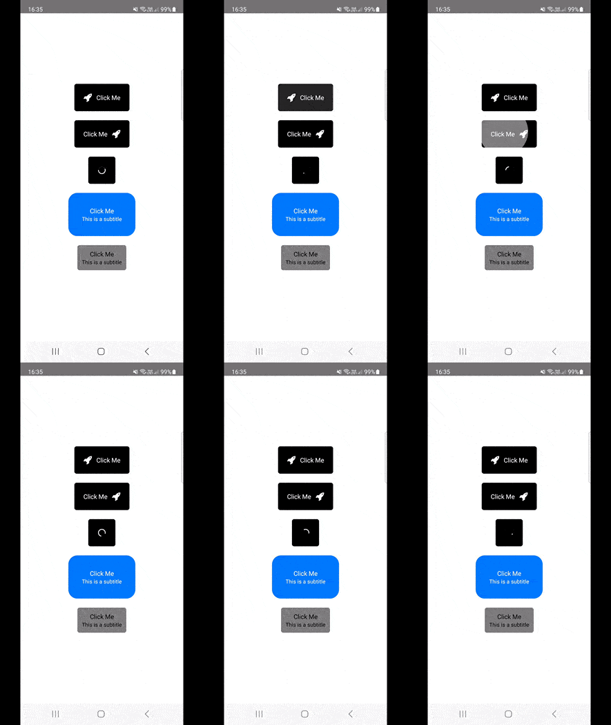
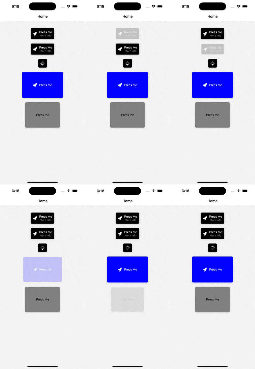
A flexible and feature-rich button component for React Native applications, offering a variety of customization options including icons, subtitles, loading state, and more.
Android
iOS
- Customizable Styles: Modify colors, sizes, padding, border radius, and more.
- Loading State: Show a loading spinner when the button is in a loading state.
- Animation on Press: Scale down animation on button press, enhancing user interaction.
- Icon Support: Include icons within your button, with options for left or right positioning.
- Customizable Icon Color: Change the color of icons as per your design needs.
- Subtitle Option: Add a subtitle for additional context or information.
- Customizable Title and Subtitle Colors: Set specific colors for title and subtitle text.
- Shadow Effect: Optional shadow for a more distinguished look.
- Ripple Effect: On Android, a ripple effect is provided for touch feedback.
- Accessibility Features: Improve accessibility with labels and hints.
To add the Customizable Button to your React Native project, run:
npm install react-native-interactive-button
# or
yarn add react-native-interactive-buttonImport the Button component and use it in your project:
import React from 'react';
import Button from 'react-native-interactive-button';
import Icon from 'react-native-vector-icons/FontAwesome'; // If using icons

const App = () => {
  return (
    <Button
        title="Press Me"
        subtitle="More Info"
        titleColor="white"
        subtitleColor="gray"
        onPress={() => console.log('Pressed')}
        style={{backgroundColor: 'black'}}
        loading={false}
        disabled={false}
        iconName="rocket"
        iconComponent={Icon}
        iconColor="white"
        iconRight={false}
        shadow={true}
    />
  );
};

export default App;- title (string): Main text displayed on the button.
- subtitle (string): Additional text displayed below the title.
- titleColor (string): Color of the title text.
- subtitleColor (string): Color of the subtitle text.
- onPress (function): Function to execute on button press.
- style (object): Custom styles to apply to the button.
-
loading (bool): If
true, shows a loading spinner. -
disabled (bool): If
true, disables button interactions. - iconName (string): Name of the icon (if using icons).
-
iconComponent (elementType): The icon component (e.g., from
react-native-vector-icons). - iconColor (string): Color of the icon.
- shadow (bool): Enables shadow effect.
- borderColor (string): Color of the button's border.
-
iconRight (bool): If
true, places the icon to the right side.
Licensed under the MIT License.


