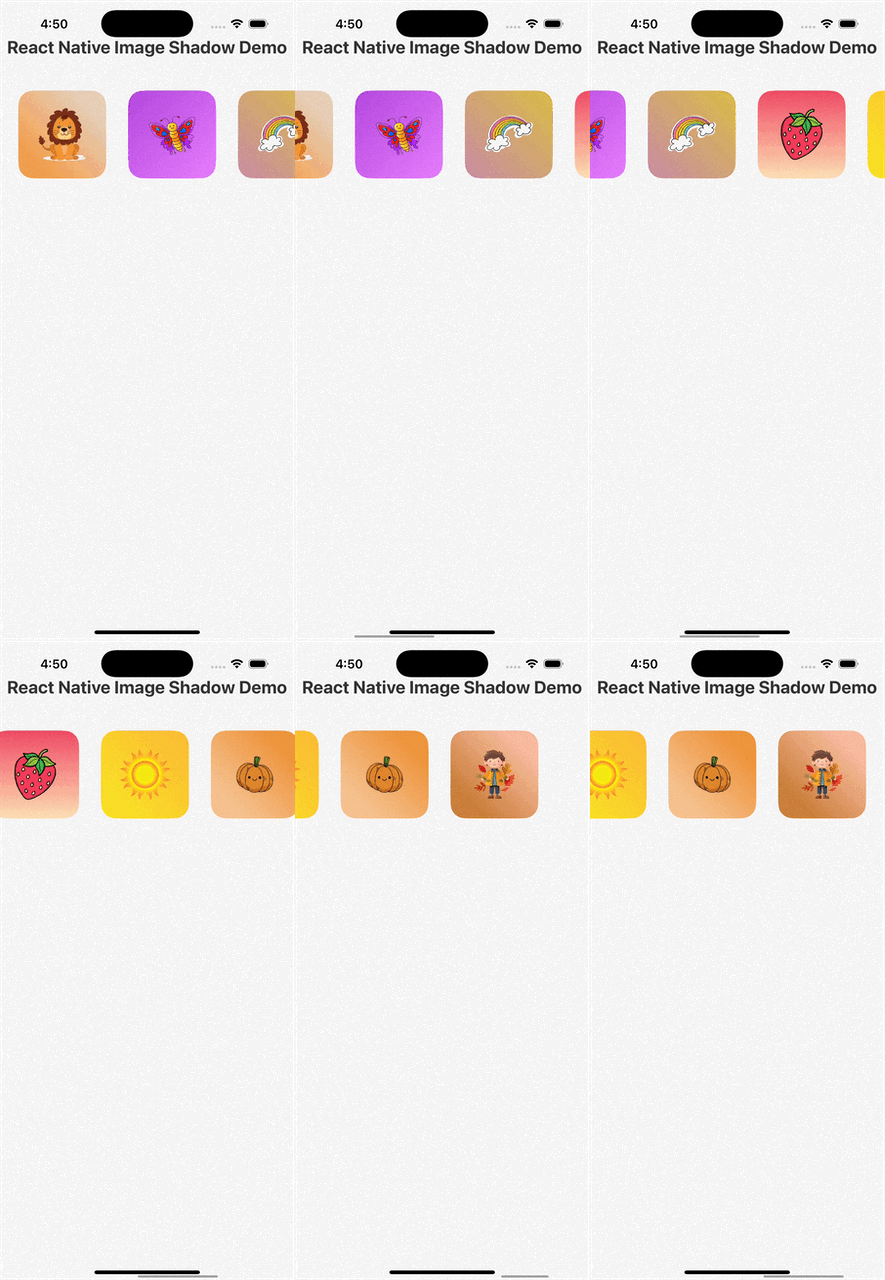
A React Native library that generates beautiful shadows from images using color analysis and gradient effects. Automatically extracts dominant colors from images and creates dynamic gradient backgrounds that complement the image content.
- 🎨 Automatic Color Extraction - Extracts dominant colors from images using advanced palette analysis
- 🌈 Dynamic Gradients - Creates beautiful gradient backgrounds based on image content
- 🌀 Multiple Gradient Angles - 6 different gradient directions for variety
- 🧩 Easy Integration - Simple API that works with existing React Native components
- ⚡ Performance Optimized - Lightweight and efficient with proper memoization
- 🛡️ Error Handling - Graceful fallbacks for failed image loads or color extraction
- 📱 Cross Platform - Works on both iOS and Android
Make sure you have the following dependencies installed in your React Native project:
npm install react-native-linear-gradient @somesoap/react-native-image-palette
# or
yarn add react-native-linear-gradient @somesoap/react-native-image-palettenpm install react-native-image-shadow
# or
yarn add react-native-image-shadowFor iOS, you'll need to install CocoaPods dependencies:
cd ios && pod install && cd ..import React from 'react';
import { SafeAreaView, StyleSheet } from 'react-native';
import ImageCard from 'react-native-image-shadow';
export default function App() {
return (
<SafeAreaView style={styles.container}>
<ImageCard
item={{
url: 'https://images.unsplash.com/photo-1506744038136-46273834b3fb',
}}
style={{ width: 200, height: 200 }}
gradientAngleIndex={1}
/>
</SafeAreaView>
);
}
const styles = StyleSheet.create({
container: {
flex: 1,
justifyContent: 'center',
alignItems: 'center',
backgroundColor: '#fff',
},
});| Prop | Type | Required | Default | Description |
|---|---|---|---|---|
item |
object | ✅ | - | Object containing the image URL |
item.url |
string | ✅ | - | URL or require() path to the image |
style |
object | ❌ | - | Custom styles for the container |
gradientAngleIndex |
number | ❌ | auto | Index to select gradient angle (0-5) |
The library provides 6 different gradient angles that you can select using gradientAngleIndex:
- 0: Diagonal from bottom-left to top-right
- 1: Diagonal from top-left to bottom-right
- 2: Diagonal from top-right to bottom-left
- 3: Vertical from top to bottom
- 4: Diagonal from bottom-right to top-left
- 5: Diagonal from top-right to bottom-left (alternative)
If no gradientAngleIndex is provided, the library automatically selects an angle based on the image URL hash.
import ImageCard from 'react-native-image-shadow';

<ImageCard
  item={{
    url: 'https://example.com/image.jpg',
  }}
/>;<ImageCard
item={{
url: 'https://example.com/image.jpg',
}}
style={{
width: 300,
height: 200,
borderRadius: 25,
margin: 20,
}}
/><ImageCard
item={{
url: 'https://example.com/image.jpg',
}}
gradientAngleIndex={2}
style={{ width: 150, height: 150 }}
/>import React from 'react';
import { FlatList, View } from 'react-native';
import ImageCard from 'react-native-image-shadow';
const images = [
{ id: '1', url: 'https://example.com/image1.jpg' },
{ id: '2', url: 'https://example.com/image2.jpg' },
{ id: '3', url: 'https://example.com/image3.jpg' },
];
export default function ImageGallery() {
const renderImageCard = ({ item, index }) => (
<ImageCard
item={item}
gradientAngleIndex={index % 6}
style={{ width: 120, height: 120, margin: 10 }}
/>
);
return (
<FlatList
data={images}
renderItem={renderImageCard}
keyExtractor={item => item.id}
horizontal
/>
);
}<ImageCard
item={{
url: require('./assets/local-image.png'),
}}
style={{ width: 200, height: 200 }}
/>-
Image Analysis: The library uses
@somesoap/react-native-image-paletteto extract dominant colors from the image - Color Selection: It intelligently selects primary and background colors from the palette
- Gradient Creation: Creates a beautiful gradient using the extracted colors
- Fallback Handling: If color extraction fails, it uses default colors and fallback images
The library uses a modern teal blue (#36D1C4) as the default color when color extraction fails.
You can access the available gradient angles programmatically:
import ImageCard from 'react-native-image-shadow';

console.log(ImageCard.GRADIENT_ANGLES);
// Returns array of gradient angle configurationsCheck out the example app in the example/LatestApp directory to see the library in action:
cd example/LatestApp
npm install
# or
yarn install

# For iOS
npx react-native run-ios

# For Android
npx react-native run-androidContributions are welcome! Please feel free to submit a Pull Request.
This project is licensed under the MIT License - see the LICENSE file for details.
- react-native-linear-gradient for gradient support
- @somesoap/react-native-image-palette for color extraction
- react-native-fast-image for optimized image loading
Made with ❤️ by Ashraz Rashid


