


react-native-form4u
A React Native form builder, simple, light and fast !
- Define fields using a simple json file. Any kind of react-native field or valid component is accepted;
- Define field validation with the flexibility of using a JavaScript function to return the erros;
- Define your own callback function to handle form submission;
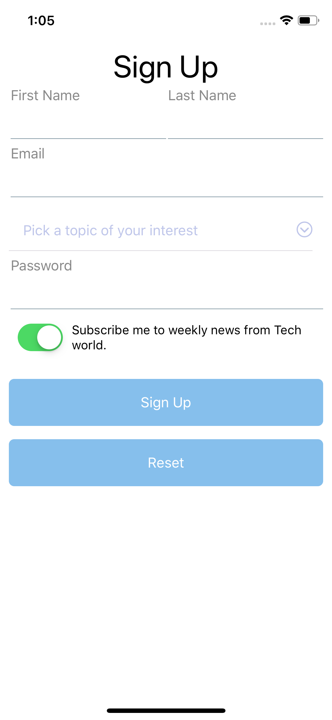
- Package comes with a full Sign Up login screen example.


Features
- Prevents submit dirty forms
- Initialize fields with default values
- Default mask types for most common field types, like datetime, only number, zip code, currency, Brazilian CPF/CNPJ
- Use custom masks with help of react-native-masked-text
- Supports custom validations
- Implements default validations for common field types (email)
- Define your own Form style
- Define your own Field style
- Uses Nativebase components
Getting Started
Installation
Install Peer Dependencies
The peer dependencies included from any npm packages does not automatically get installed. Your application will not depend on it explicitly.
react-native-form4u requires a peer of native-base
Install NativeBase
npm install native-base --saveLink the library
react-native link native-baseIcons
If you have icons problems, please try to install and link react-native-vector-icons
npm install --save react-native-vector-iconreact-native link react-native-vector-iconsInstall Form4u
$ npm i react-native-form4u --saveBasic Usage
- Make sure you have react-native installed
npm i -g react-nativeFields
Field structure
Fields are array items. You can easily define more than one field per row. See example for more details.
| Prop | Description | Default |
|---|---|---|
name |
Field name | None |
label |
Field label | None |
required |
Required field | false |
type |
Field type | Field Types |
fieldProps |
Default react props for each field type | None |
defaultValue |
Default value for the field | None |
fieldStyle |
Style object for the field | None |
mask |
Custom mask for the field | None |
formFields = name: "field1" label: "Field 1" required: false type: "text" fieldProps: {} defaultValue: null fieldStyle: {} mask: {} ;Example:
const fields = name: "firstName" label: "First Name" type: "input" inputProps: autoCorrect: false name: "lastName" label: "Last Name" type: "input" inputProps: autoCorrect: false name: "email" label: "Email" type: "input" inputProps: autoCorrect: false autoCapitalize: "none" keyboardType: "email-address" name: "subject" placeholder: "Pick a topic of your interest" pickerItems: label: "React Native" value: 0 label: "React Hooks" value: 1 label: "React Navigation" value: 2 label: "React News" value: 3 type: "picker" name: "password" label: "Password" type: "input" inputProps: secureTextEntry: true name: "subscribe" label: "Subscribe me to weekly news from Tech world." type: "boolean" defaultValue: true name: "signUpButton" label: "Sign Up" type: "button" name: "resetButton" label: "Reset" type: "button" ;Validation
const validate = { const errors = {}; if !firstNamevalue errorsfirstName = "First name is required"; if !lastNamevalue errorslastName = "Last name is required"; if !emailvalue errorsemail = "Email address is required"; else if !/\S+@\S+\.\S+/ errorsemail = "Email address is invalid"; if !subjectvalue errorssubject = "A subject of interest is required."; if !passwordvalue errorspassword = "Password is required"; return errors;}; ;Submit
- this callback is executed after form submission/validation
const handleSubmit = { const firstName lastName email subject password = fields; Alert;};Field Types
boolean
button
reset
customComponent
text
credit-card
Field will be automatically formated according to card provider:
- visa or master:
9999 9999 9999 9999or9999 **** **** 9999(obfuscated) - amex:
9999 999999 99999or9999 ****** 99999(obfuscated) - diners:
9999 999999 9999or9999 ****** 9999(obfuscated)
cpf
Field will be automatically formated for 999.999.999-99
cnpj
Field will be automatically formated for 99.999.999/9999-99
zip-code
Field will be automatically formated for 99999-999
only-numbers
accept only numbers
money
cel-phone
datetime
picker
Properties
Form properties
Any View property and the following:
| Prop | Description | Default |
|---|---|---|
formFields |
Object with field definitions. | None |
handleSubmit |
Callback function to handle form submission | Inherited |
validation |
Function to return errors object | {fieldName: error message} |
submitOnDirty |
Disable form buttons in case form is dirty (empty or with errors) | false |
formStyle |
Style object with custom styles. Overrides default style of the Form | {flex:1 , padding: 10} |
Field properties
Most style properties will work as expected.
| Prop | Description | Default |
|---|---|---|
size |
Size of the icon, can also be passed as fontSize in the style object. |
12 |
name |
What icon to show, see Icon Explorer app or one of the links above. | None |
color |
Color of the icon. | Inherited |
Custom masks
If you want, we use the MaskService from react-native-masked-text
Form example
import Form4u from "react-native-form4u";import fields from "./formFields.js";import validationRules from "./formValidationRules.js"; const App = return <Form4u = = = /> ;; ;BACKLOG
- Implement other field types
- Tests
- Documentation!!!
Version History
0.0.1
- remove styled-component from Input from native-base, onChange and onChangeText were not been called see more
- fix errors view which was shrinking in few cases
- implement form validation with error messages
- Implement custom form picker
- Allows form to render any kind of React component
- Added react-native-maked-text to allows masked input texts
Contributing
Pull requests are welcome. For major changes, please open an issue first to discuss what you would like to change.
Please make sure to update tests as appropriate.