react-native-flat-header


A simple and fully customizable React Native component that implements a Flat-Header UI.
Install This library :
npm i react-native-flat-header
Install Icon component(Optional)
- For
iconComponent you can use https://github.com/oblador/react-native-vector-icons
icon use :
; <Icon name="rocket" size=30 color="#FFF" />Usage :
List of available props for customization FlatHeader component.
| Props | Value Type | Description |
|---|---|---|
leftIcon |
Icon Component | set icon Component |
leftText |
String | left text string |
leftTextStyle |
Style object | set style for left text |
leftIconHandler |
handler callback function | handle for click on left icon, if not set icon does not touchable |
leftTextHandler |
handler callback function | handle for click on left text, if not set leftText does not touchable |
leftContentHandler |
handler callback function | handle for click on both leftIcon and leftText together; if set does not need handler icon and text separately |
rightIcon |
Icon Component | set icon component |
rightIconHandler |
handler callback function | handle for click on right icon, if not set rightIcon does not touchable |
rightText |
String | right text string |
rightTextStyle |
Style Object | set style for right text |
rightTextHandler |
handler callback function | handle for click on right text, if not set rightText does not touchable |
rightContentHandler |
handler callback function | handle for click on both rightIcon and rightText together; if set does not need handler icon and text separately |
centerContent |
Group Component | set Group component that can contain Text and icon component |
centerContentHandler |
handler callback function | handle for click on centerContent, if not set centerContent does not touchable |
large |
attribute | if set this attribute, left and right text appear in bold style |
style |
style object | set style for main header container, such as background color |
Examples:
First of all add below codes to your code (Import Components) :
; //-------For use Icon (must be installed first);Simple 1: left icon and text with handlers
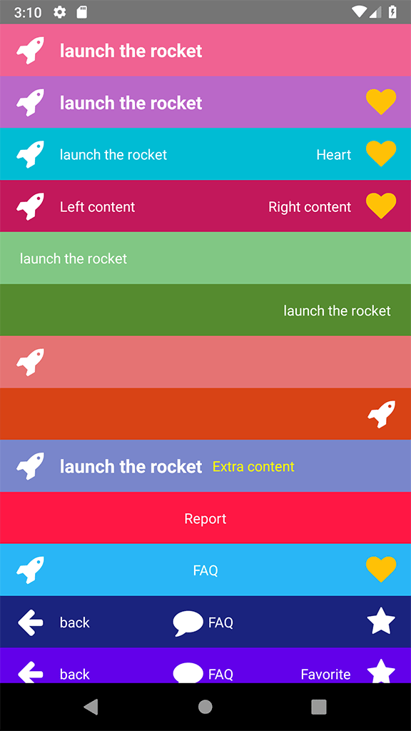
<FlatHeader leftIcon=<Icon name="rocket" size=30 color="#FFF" /> leftIconHandler= { console; } leftText="launch the rocket" leftTextHandler= { console; } large/>Simple 2: left icon and text with handlers + right icon and right handler
<FlatHeader leftIcon=<Icon name="rocket" size=30 color="#FFF" /> leftIconHandler= { console; } rightIcon=<Icon name="heart" size=30 color="#FFC107" /> rightIconHandler= { console; } leftText="launch the rocket" leftTextHandler= { console; } large style= backgroundColor: '#BA68C8' />Simple 3: left and right icon and text with handlers
<FlatHeader leftIcon=<Icon name="rocket" size=30 color="#FFF" /> leftIconHandler= { console; } leftText="launch the rocket" leftTextHandler= { console; } rightIcon=<Icon name="heart" size=30 color="#FFC107" /> rightIconHandler= { console; } rightText="Heart" rightTextHandler= { console; } style= backgroundColor: '#00BCD4' />Simple 4: left and right icon and text + rightContentHandler
<FlatHeader leftIcon=<Icon name="rocket" size=30 color="#FFF" /> leftText="Left content" leftContentHandler= { console; } rightIcon=<Icon name="heart" size=30 color="#FFC107" /> rightText="Right content" rightContentHandler= { console; } style= backgroundColor: '#C2185B' />Simple 5: left text
<FlatHeader leftText="launch the rocket" leftTextHandler= { console; } style= backgroundColor: '#81C784' />Simple 6: right text
<FlatHeader rightText="launch the rocket" rightTextHandler= { console; } style= backgroundColor: '#558B2F' />Simple 7: left icon
<FlatHeader leftIcon=<Icon name="rocket" size=30 color="#FFF" /> leftIconHandler= { console; } style= backgroundColor: '#e57373' />Simple 8: right icon without handler
<FlatHeader rightIcon=<Icon name="rocket" size=30 color="#FFF" /> style= backgroundColor: '#D84315' />Simple 9: left icon and text + Extra content as children that added to left side
<FlatHeader leftIcon=<Icon name="rocket" size=30 color="#FFF" /> leftIconHandler= { console; } leftText="launch the rocket" leftTextHandler= { console; } large style= backgroundColor: '#7986CB' > <Text style= marginLeft: 10 color: 'yellow' > Extra content </Text></FlatHeader>Simple 10: center content
<FlatHeader centerContent=<Text style= color: '#FFF' >Report</Text> style= backgroundColor: '#ff1744' />Simple 11: left + center content (Just Text Component) + right
<FlatHeader leftIcon=<Icon name="rocket" size=30 color="#FFF" /> centerContent=<Text style= color: '#FFF' >FAQ</Text> rightIcon=<Icon name="heart" size=30 color="#FFC107" /> style= backgroundColor: '#29B6F6' />Simple 12: left + center content(Group Component) + right
<FlatHeader leftIcon=<Icon name="arrow-left" size=30 color="#FFF" /> leftText="back" leftContentHandler= { console; } centerContent= <Group> <Icon name="comment" size=30 color="#FFF" /> <Text style= color: '#FFF' paddingHorizontal: 5 >FAQ</Text> </Group> rightIcon=<Icon name="star" size=30 color="#FFF" /> style= backgroundColor: '#1A237E' />Simple 13: Full Example (Advance mode) :
<FlatHeader leftIcon=<Icon name="arrow-left" size=30 color="#FFF" /> leftText="back" leftTextStyle= color: 'yellow' leftContentHandler= { console; } centerContent= <Group> <Icon name="comment" size=30 color="#FFF" /> <Text style= color: '#FFF' paddingHorizontal: 5 >FAQ</Text> </Group> centerContentHandler= console rightIcon=<Icon name="star" size=30 color="#FFF" /> rightText="Favorite" rightTextStyle= color: 'yellow' rightContentHandler= { console; } large=false style= backgroundColor: '#6200EA' />Full Screen Example :
;; ;; { return <View style=stylescontainer> <FlatHeader leftIcon=<Icon name="arrow-left" size=30 color="#FFF" /> leftText="back" leftTextStyle= color: 'yellow' leftContentHandler= { console; } centerContent= <Group> <Icon name="comment" size=30 color="#FFF" /> <Text style= color: '#FFF' paddingHorizontal: 5 ></Text>FAQ</Text> </Group> centerContentHandler= console rightIcon=<Icon name="star" size=30 color="#FFF" /> rightText="Favorite" rightTextStyle= color: 'yellow' rightContentHandler= { console; } style= backgroundColor: '#6200EA' /> </View> ; } const styles = StyleSheet;