

Un componente de React Native que refleja la funcionalidad de UIStepper de iOS.
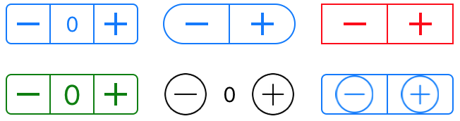
Un control de stepper proporciona una interfaz de usuario para incrementar o decrementar un valor. Un stepper muestra dos botones: uno con un símbolo de menos (“–”) y otro con un símbolo de más (“+”).
Ahora puedes configurar tu react-native-custom-ui-stepper para que sea vertical
npm i react-native-custom-ui-stepper
import UIStepper from 'react-native-custom-ui-stepper';
...
setValue = (value) => {
  // do something with value
}
render() {
  return (
      <UIStepper
        onValueChange={(value) => { this.setValue(value) }}
      />
  )
}
Ahora puedes usar imágenes personalizadas, ya sea desde tu sistema de archivos local o desde Internet. Consulta Props para más detalles.

| Nombre | Tipo | Descripción | Valor por defecto |
|---|---|---|---|
initialValue |
Number | Valor inicial | 0 |
value |
Number | Sobrescribir forzosamente el valor | 0 |
minimumValue |
Number | Valor mínimo | 0 |
maximumValue |
Number | Valor máximo | 100 |
steps |
Number | Valor de incremento | 1 |
displayValue |
Boolean | Muestra el valor del stepper entre el botón de incremento y el de decremento | false |
incrementImage |
String or Number | Sobrescribir la imagen de incremento predeterminada | require('./assets/increment.png') |
decrementImage |
String or Number | Sobrescribir la imagen de decremento predeterminada | require('./assets/decrement.png') |
wraps |
Boolean | Cuando se establece en verdadero, incrementar más allá del maximumValue establecerá el valor en minimumValue y viceversa |
false |
tintColor |
String | Cambia el color de todos los píxeles no transparentes al tintColor | #0076FF |
overrideTintColor |
Boolean | Al usar una imagen externa, establece si deseas que el tintColor se aplique a los píxeles no transparentes. | false |
backgroundColor |
String | Color de fondo | transparent |
vertical |
Boolean | Muestra un UI Stepper vertical. Debes especificar una altura y un ancho. | false |
displayDecrementFirst |
Boolean | Muestra el botón de decremento encima del botón de incremento, solo funciona cuando vertical es true
|
false |
width |
Number | Ancho | 94 |
height |
Number | Alto | 29 |
textColor |
String | El color de texto deseado que se usará cuando displayValue esté configurado como true
|
#0076FF |
fontFamily |
String | La familia de fuente utilizada en el valor mostrado cuando displayValue esté configurado como true
|
System |
fontSize |
Number | El tamaño de fuente utilizado en el valor mostrado cuando displayValue esté configurado como true
|
15 |
borderColor |
String | Color utilizado para el borde | #0076FF |
borderWidth |
Number | Ancho del borde | 1 |
borderRadius |
Number | Radio del borde | 4 |
onValueChange |
Function | Ejecutada cuando el valor cambia. El valor se pasa como parámetro | null |
onIncrement |
Function | Ejecutada cuando el usuario hace clic en el botón de incremento (+). El valor se pasa como parámetro | null |
onDecrement |
Function | Ejecutada cuando el usuario hace clic en el botón de decremento (–). El valor se pasa como parámetro | null |
onMinimumReached |
Function | Ejecutada cuando se alcanza el minimumValue. El valor se pasa como parámetro |
null |
onMaximumReached |
Function | Ejecutada cuando se alcanza el maximumValue. El valor se pasa como parámetro |
null |
innerRef |
Function | Una referencia al UIStepper renderizado. Puedes usar esto para acceder a métodos basados en clases. increment(), decrement(), resetValue() y setValue() son los más comunes |
null |
No hay requisitos para contribuir al paquete react-native-custom-ui-stepper. Puedes Navegar a o plantear problemas en los que te gustaría contribuir.
Haz un fork del repositorio en Github Clona el proyecto Realiza cambios y súbelos a tu rama forkeada Envía tus cambios a tu rama Envía un Pull Request para que se pueda fusionar en react-native-custom-ui-stepper
$ git clone https://github.com/tahelromero/react-native-custom-ui-stepper.git
$ cd example
$ yarn # or npm install
$ react-native run-ios
A react-native component which mirrors the functionality of UIStepper from iOS.
A stepper control provides a user interface for incrementing or decrementing a value. A stepper displays two buttons, one with a minus (“–”) symbol and one with a plus (“+”) symbol.
You can now configure your react-native-custom-ui-stepper to be vertical
npm i react-native-custom-ui-stepper
import UIStepper from 'react-native-custom-ui-stepper';
...
setValue = (value) => {
  // do something with value
}
render() {
  return (
      <UIStepper
        onValueChange={(value) => { this.setValue(value) }}
      />
  )
}
You can now use custom images, from your local file system or from the Internet. See Props for more details.
| Name | Type | Description | Default |
|---|---|---|---|
initialValue |
Number | Start value | 0 |
value |
Number | Forcibly override the value | 0 |
minimumValue |
Number | Minimum value | 0 |
maximumValue |
Number | Maximum value | 100 |
steps |
Number | Increment value | 1 |
displayValue |
Boolean | Displays the stepper value between the increment and decrement button | false |
incrementImage |
String or Number | Override the default increment image | require('./assets/increment.png') |
decrementImage |
String or Number | Override the default decrement image | require('./assets/decrement.png') |
wraps |
Boolean | When set to true, incrementing beyond the maximumValue will set the value to minimumValue and vice versa |
false |
tintColor |
String | Changes the color of all the non-transparent pixels to the tintColor. | #0076FF |
overrideTintColor |
Boolean | When using an external image, set whether you want the tintColor to be applied to non-transparent pixels. | false |
backgroundColor |
String | Background color | transparent |
vertical |
Boolean | Display a vertical UI Stepper. You must specify a height and a width. | false |
displayDecrementFirst |
Boolean | Display the decrement button above the increment button, only works when vertical is true
|
false |
width |
Number | Width | 94 |
height |
Number | Height | 29 |
textColor |
String | The desired text colour which will be used when displayValue is set to true
|
#0076FF |
fontFamily |
String | The font family used on the value displayed when displayValue is set to true
|
System |
fontSize |
Number | The font size used on the value displayed when displayValue is set to true
|
15 |
borderColor |
String | Color used for the border | #0076FF |
borderWidth |
Number | Width of the border | 1 |
borderRadius |
Number | Radius of the border | 4 |
onValueChange |
Function | Executed when the value changes. The value is passed as a parameter | null |
onIncrement |
Function | Executed when the User clicks the increment (+) button. The value is passed as a parameter | null |
onDecrement |
Function | Executed when the User clicks the decrement (+) button. The value is passed as a parameter | null |
onMinimumReached |
Function | Executed when the minimumValue is reached. The value is passed as a parameter |
null |
onMaximumReached |
Function | Executed when the maximumValue is reached. The value is passed as a parameter |
null |
innerRef |
Function | A reference to the rendered UIStepper. You can use this to gain access to class-based methods. increment(), decrement(), resetValue() and setValue() are most commonly used |
null |
There are no requirements for contributing to the react-native-custom-ui-stepper package. You can browse or raise issues that you are would like to contribute to.
- Fork the repository on Github
- Clone the project
- Commit changes to your forked branch
- Push your changes to your branch
- Submit a Pull Request so that it can be merged into react-native-custom-ui-stepper
$ git clone https://github.com/tahelromero/react-native-custom-ui-stepper.git
$ cd example
$ yarn # or npm install
$ react-native run-ios