react-line-width-picker
A line width picker React component

Basically the same as [react-line-width-chooser], but as an importable React component created with [create-react-library].
Install
npm install --save react-line-width-pickerIntro
Usage
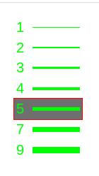
import React Component from 'react' import LineWidthPicker from 'react-line-width-picker'import 'react-line-width-picker/dist/index.css' { return <LineWidthPicker /> }LineWidthPicker accepts these props:
- lineWidths: array of widths to display (default: [1, 2, 3, 4, 5, 7, 9])
- lineWidth: the default selected element from lineWidths
- width: component width (default: 100)
- background: component's background colour (default: "#000000");
- colour: the texts' and lines' colour (default: "#00ff00")
- hoverBorder: an element's border when hovering over it (default: no border)
- hoverBackground: an element's background when hovering over it (default: undefined)
- font: the text's font-family (default: "sans-serif")
- fontSize: the text's font size (CSS value; default: initial)
- opacity: the component's opacity (not the hovering opacity; CSS value, default: 1)
- onClick: a function that is called with a single argument, the line width value from lineWidths, when user clicks a hovered line
- onChange: a function that is called with the hovered over lineWidth when user hovers over a line (enters it)
Develop
Watch and build bundle:
yarn start
In separate terminal run dev server:
cd example
yarn start
Run storybook:
yarn storybook
or
npm run storybook
License
MIT © okloecker