
react-library-paginator
A React bootstrap-oriented customizable paginator component written in typescript.

Features included:
- Paging functionality - tested and proven to work, will make those pages appear on the screen,
- Includes built-in styles - default styling, for the lazy ones,
- Boostrap-friendly - compatible with Boostrap 4, for the conservative ones,
- Customizable styles - allows to customize styles via css classes or inline styles, for the love-to-customize-things ones,
- Customizable navigation - allows to customize paginator navigation elements.
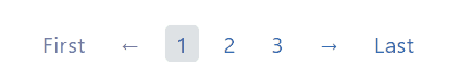
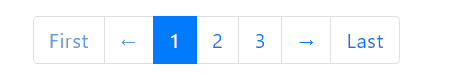
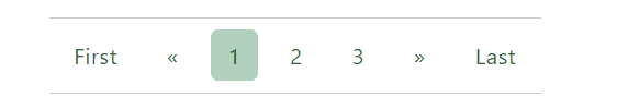
Demo
Check out demo showing a few common use-cases.
Install
npm install --save react-library-paginatorUsage
; ; state = page: 1 totalItems: 120 ; { this; }; { const page totalItems = thisstate; return <Paginator totalItems=totalItems currentPage=page onPageChange=thishandlePageChange classes= container: 'paginator-container' list: 'paginator-list' pageItem: 'paginator-item' pageLink: 'paginator-link' pageLinkActive: 'paginator-link--active' pageLinkDisabled: 'paginator-link--disabled' /> ; }API
| Name | Type | Default | Description |
|---|---|---|---|
| totalItems | number |
Required | Total number of items that will be paginated. |
| onPageChange | function |
Required | Event that is triggered when the page changes. The new page number is passed into the event handler function. |
| currentPage | number |
1 |
Number of the current page. |
| itemsPerPage | number |
10 |
How many items are displayed per one page. |
| maxPagesToShow | number |
3 |
How many page numbers should be visible in the paginator between previous and next navigation symbols. |
| useBootstrapClasses | bool |
false |
Indicates whether to apply bootstrap 4 pagination classes (e.g. pagination, page-item etc) to the paging elements. |
| styles | object |
{} |
Object defining class names for the paging elements (see below). |
| classes | object |
{} |
Object defining inline styles for the paging elements (see below). |
| navigation | object |
{} |
Object customizing visibility and texts for paginator navigation elements (see below). |
Classes and styles
| Object key | Type (classes/styles) | Description |
|---|---|---|
| container | string/object |
Class name/style object for the outer container (nav). |
| list | string/object |
Class name/style object for the paginator list (ul). |
| pageItem | string/object |
Class name/style object for the paginator list item (li). |
| pageLink | string/object |
Class name/style object for the link inside the list item (a). |
| pageLinkActive | string/object |
Class name/style object for the link of currently selected page. |
| pageLinkDisabled | string/object |
Class name/style object for the link of non-selectable pages/navigation symbols. |
Navigation
| Object key | Type | Description |
|---|---|---|
| firstPageText | string |
Text displayed inside navigation element for the first page . |
| prevPageText | string |
Text displayed inside navigation element for the previous page. |
| nextPageText | string |
Text displayed inside navigation element for the next page . |
| lastPageText | string |
Text displayed inside navigation element for the last page . |
| hideFirstPageNav | boolean |
Indicates whether to hide navigation element for the first page. |
| hidePrevPageNav | boolean |
Indicates whether to hide navigation element for the previous page. |
| hideNextPageNav | boolean |
Indicates whether to hide navigation element for the next page . |
| hideLastPageNav | boolean |
Indicates whether to hide navigation element for the last page . |
Contributing
Contributions are welcome, bug reports, pull requests, feature requests are highly appreciated and rewarded with lightning fast responses and developing!
License
MIT © MargaretKrutikova