

A React component for Instagram like stories

npm install --save react-insta-storiesThe component responds to actions like tap on right side for next story, on left for previous and tap and hold for pause. Custom time duration for each story can be provided. See it in action here: https://mohitk05.github.io/react-insta-stories/
import React, { Component } from 'react';

import Stories from 'react-insta-stories';

const App = () => {
	return (
		<Stories
			stories={stories}
			defaultInterval={1500}
			width={432}
			height={768}
		/>
	);
};
Here stories is an array of story objects, which can be of various types as described below.
| Property | Type | Default | Description |
|---|---|---|---|
stories |
[String/Object] | required |
An array of image urls or array of story objects (options described below) |
renderers ⚡️ |
[Object] | [] |
An array of renderer objects (options described below) |
defaultInterval |
Number | 1200 | Milliseconds duration for which a story persists |
loader |
Component | Ripple loader | A loader component as a fallback until image loads from url |
header |
Component | Default header as in demo | A header component which sits at the top of each story. It receives the header object from the story object. Data for header to be sent with each story object. |
storyContainerStyles |
Object | {} |
Styles object for the outer container |
width |
Number/String | 360 | Width of the component, e.g. 600 or '100vw' or 'inherit' |
height |
Number/String | 640 | Height of the component, e.g. 1000 or '100%' or 'inherit' |
storyStyles |
Object | none | Override the default story styles mentioned below. |
progressContainerStyles |
Object | {} |
Styles object for the container wrapping the progress bars |
progressWrapperStyles |
Object | {} |
Styles object for the container wrapping each progress bar bars |
progressStyles |
Object | {} |
Styles object for the progress bars |
loop |
Boolean | false | The last story loop to the first one and restart the stories. |
| New props | ⭐️ | ⭐️ | ⭐️ |
isPaused |
Boolean | false | Toggle story playing state |
currentIndex |
Number | undefined | Set the current story index |
onStoryStart |
Function | - | Callback when a story starts |
onStoryEnd |
Function | - | Callback when a story ends |
onAllStoriesEnd |
Function | - | Callback when all stories in the array have ended |
onNext |
Function | - | Callback when the user taps/press to proceed to the next story |
onPrevious |
Function | - | Callback when the user taps/press to go back to the previous story |
keyboardNavigation |
Boolean | false | Attaches arrow key listeners to navigate between stories if true. Also adds up arrow key listener for opening See More and Escape/down arrow for closing it |
preventDefault |
Boolean | false | Disable the default behavior when user click the component |
preloadCount |
number | 1 | Determines how many stories should be preloaded ahead of the current story index. |
Instead of simple string url, a comprehensive 'story object' can also be passed in the stories array.
| Property | Description |
|---|---|
url |
The url of the resource, be it image or video. |
type |
Optional. Type of the story. `type: 'video' |
duration |
Optional. Duration for which a story should persist. |
header |
Optional. Adds a header on the top. Object with heading, subheading and profileImage properties. |
seeMore |
Optional. Adds a see more icon at the bottom of the story. On clicking, opens up this component. (v2: updated to Function instead of element) |
seeMoreCollapsed |
Optional. Send custom component to be rendered instead of the default 'See More' text. |
styles |
Optional. Override the default story styles mentioned below. |
preloadResource |
Optional. Whether to preload the resource or not, defaults to true for images and false for videos (video preloading is experimental) |
Following are the default story content styles. Override them by providing your own style object with each story or a global override by using the storyStyles prop.
storyContent: {
    width: 'auto',
    maxWidth: '100%',
    maxHeight: '100%',
    margin: 'auto'
}To allow reusable components to display story UI, you can pass in pre-built or custom-built components in a special manner to leverage this behavior. Each renderer object has two properties:
-
renderer- This is the UI component that will be rendered whenever the object matches certain conditions. -
tester- This is a function that tests whether the renderer is suitable for the current story. It receives the current story object to render and returns an object with two properties:-
condition- This states if the renderer matches the current story's criteria (a boolean). -
priority- A number denoting the priority of the current renderer. E.g. priority of 2 is less than a 5, and if two renderers have condition =true, their priorities will be compared and the one with higher priority will be selected.
-
So essentially a simple renderer would look like this: (you may also refer the inbuilt Image renderer)
// Renderer.js

export const renderer = ({ story, action, isPaused, config }) => {
	return <div>Hello!</div>;
};

export const tester = (story) => {
	return {
		// Use this renderer only when the story type is video
		condition: story.type === 'video',
		priority: 3,
	};
};
Every renderer component gets 4 props as shown above. Out of these the story, action and isPaused are as their names suggest. The config object contains certain global properties which were passed while initialising the component. It looks like this:
const { width, height, loader, storyStyles } = config;These props can be used to customize the entire UI as required, and then can be packaged as a Node module and shared. If someone else wishes to use your package as a renderer, they can simply pass it inside an array as the
renderersprop to the main component. If you publish any such renderer, please raise a PR to add it to this list. A few suggestions would be a Markdown renderer, highlighted code renderer, etc.
List of public renderers:
- Add one here
This is a wrapper component which includes the UI and logic for displaying a 'See More' link at the bottom of the story. This is available as a named export from the package and can be used to easily add the functionality to a custom content story.
It takes in two props - story and action.
const { WithSeeMore } from 'react-insta-stories';

const CustomStoryContent = ({ story, action }) => {
	return <WithSeeMore story={story} action={action}>
		<div>
			<h1>Hello!</h1>
			<p>This story would have a 'See More' link at the bottom ✨</p>
		</div>
	</WithSeeMore>
}
You can also send custom 'See More' component for the collapsed state. While using WithSeeMore, pass in a customCollapsed prop with a value of your custom component. It will receive a toggleMore and action prop to handle clicks on the See More link.
const { WithSeeMore } from 'react-insta-stories';

const customCollapsedComponent = ({ toggleMore, action }) =>
	<h2 onClick={() => {
		action('pause');
		window.open('https://mywebsite.url', '_blank');
	}}>
		Go to Website
	</h2>

const CustomStoryContent = ({ story, action }) => {
	return <WithSeeMore
		story={story}
		action={action}
		customCollapsed={customCollapsedComponent}
	>
		<div>
			<h1>Hello!</h1>
			<p>This story would have a 'See More' link at the bottom and will open a URL in a new tab.</p>
		</div>
	</WithSeeMore>
}
If not implementing a custom UI, you can send the customCollapsedComponent component inside the story object as seeMoreCollapsed.
const stories = [
	{
		url: 'some.url',
		seeMore: SeeMoreComponent, // when expanded
		seeMoreCollapsed: customCollapsedComponent, // when collapsed
	},
];This named export can be used to include the header UI on any custom story. Simply wrap the component with this HOC and pass in some props.
const { WithHeader } from 'react-insta-stories';

const CustomStoryContent = ({ story, config }) => {
	return <WithHeader story={story} globalHeader={config.header}>
		<div>
			<h1>Hello!</h1>
			<p>This story would have the configured header!</p>
		</div>
	</WithHeader>
}
You may also use both these HOCs together, as in the Image renderer.
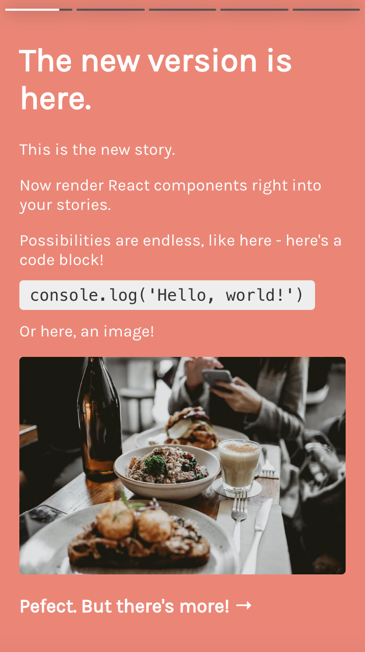
If you wish to have a bare minimum setup and only need to show image stories, you can simply pass the image urls inside the stories array.
This will show all your images as stories.
import Stories from 'react-insta-stories';

const stories = [
	'https://example.com/pic.jpg',
	'data:image/jpg;base64,R0lGODl....',
	'https://mohitkarekar.com/icon.png',
];

return () => <Stories stories={stories} />;If plain images does not suffice your usecase, you can pass an object instead of a string. This object supports all the properties mentioned above in the section story object. While using the object type, use url to denote the source url in case of media.
These properties can be mixed in different ways to obtain desired output.
Each story can be set to have a different duration.
const stories = [
	'https://example.com/pic.jpg',
	{
		url: 'https://example.com/pic2.jpg',
		duration: 5000,
	},
];Adds a header to the story.
const stories = [
	'https://example.com/pic.jpg',
	{
		url: 'https://example.com/pic2.jpg',
		duration: 5000,
		header: {
			heading: 'Mohit Karekar',
			subheading: 'Posted 30m ago',
			profileImage: 'https://picsum.photos/100/100',
		},
	},
];Adds a click to see more option at the bottom of the story. When present, shows the arrow at the bottom and when clicked, shows the provided component.
const stories = [
	'https://example.com/pic.jpg',
	{
		url: 'https://example.com/pic2.jpg',
		duration: 5000,
		seeMore: SeeMore, // some component
	},
	{
		url: 'https://example.com/pic3.jpg',
		duration: 2000,
		seeMore: ({ close }) => {
			return <div onClick={close}>Hello, click to close this.</div>;
		},
	},
];If provided type: video, then the component loads a video player. All expected features come in automatically. Duration is ignored, if provided and actual video duration is considered.
const stories = [
	'https://example.com/pic.jpg',
	{
		url: 'https://example.com/vid.mp4',
		duration: 5000, // ignored
		type: 'video',
	},
];Override default story element styles. Regular style object can be provided.
You can render custom JSX inside a story by sending a content property inside the story object. If a content property is present, all other media related properties are ignored. duration holds true here.
const stories = [
	'https://example.com/pic.jpg',
	{
		content: (props) => (
			<div style={{ background: 'pink', padding: 20 }}>
				<h1 style={{ marginTop: '100%', marginBottom: 0 }}>🌝</h1>
				<h1 style={{ marginTop: 5 }}>A custom title can go here.</h1>
			</div>
		),
	},
];
The content property can hold any React component. For further control, it receives two important props:
-
actionIt allows you to fire play/pause actions. -
isPausedHolds true is the story is currently paused, false otherwise.
const stories = [
	'https://example.com/pic.jpg',
	{
		content: ({ action, isPaused }) => {
			useEffect(() => {
				setTimeout(() => {
					action('pause');
					setTimeout(() => {
						action('play');
					}, 2000);
				}, 2000);
			}, []);
			return (
				<div style={{ background: 'pink', padding: 20 }}>
					<h1 style={{ marginTop: '100%', marginBottom: 0 }}>🌝</h1>
					<h1>{isPaused ? 'Paused' : 'Playing'}</h1>
				</div>
			);
		},
	},
];
In the code above, on render a timeout will be set which would fire a 'pause' action after 2 seconds. Again after 2 seconds, a 'play' action would be fired.
In the JSX, isPaused is used to display the current play state.
To develop this package locally, you can follo these steps:
- Clone the repo to your local.
- Run
npm install. - Then
cd example && npm install - Come back to the root directory
cd .. - Run
npm start - In a new command window/tab, run
npm run example.
This will start a hot-reloading setup with a live example.
- @SamHambert for the default spinner SVG
Do you use react-insta-stories too? Raise a PR to include your site in this list!
This project exists thanks to all the people who contribute.


MIT © mohitk05