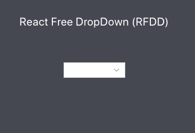
react-free-dropdown (RFDD)
Easy custom dropdown list with React


Get Started 📦
react-free-dropdown install the package.
npm install react-free-dropdownUsage 📃
;; const App = { const value setValue = React; return <> <Rfdd onChange= > <RfddOption value="Apple">Apple</RfddOption> <RfddOption value="Grape">Grape</RfddOption> </Rfdd> <p>value</p> </>;} ;Rfdd Property ⛷
| Property | Type | Descriptions | Example |
|---|---|---|---|
| selectClassName | string |
select className | selectClassName="select-classname" |
| selectStyle | React.CSSProperties |
select component style | selectStyle={{border: '1px solid red'}} |
| optionClassName | string |
option className | optionClassName="option-classname" |
| optionStyle | string |
all option custom style | optionStyle='border: 1px solid red;' |
| style | React.CSSProperties |
dropdown wrapper style | style={{border: '1px solid red'}} |
| className | string |
dropdown wrapper className | className="wrapper-classname" |
| focusStyle | React.CSSProperties |
if focus use style | focusStyle={{border: '1px solid red'}} |
| value | string |
selected value | value={value} |
| children | React.ReactElement<RfddOptionType, 'RfddOption'>[] |
only use RfddOption component | <RfddOption>option</RfddOption> |
| onChange | (value: string) => void |
change value function | onChange={(optionValue) => setValue(optionValue)} |
| mode | light or dark |
light or dark mode | mode='dark' |
| hoverStyle | string |
custom hover style | hoverStyle='border: 1px solid red;' |
| icon | any |
usage import image import image from './example.png' |
icon={image} |
| hiddenIcon | boolean |
hidden icon | hiddenIcon={true} |
| placeholder | string |
setting placeholder | placeholder='area' |
| listStyle | string |
ul list style | listStyle='max-height:200px' |
| optionOnClick | () => void |
all option onClick | optionOnClick={() => console.log('onClick')} |
RfddOption Property 🏂
| Property | Type | Descriptions | Example |
|---|---|---|---|
| value | string |
option value | value='option-value' |
| style | React.CSSProperties |
must be entered as camelcase | style={{ border: '1px solid red' }} |
| className | string |
must be entered as camelcase | className="class-name" |
| children | React.ReactNode |
option children | option text or <div>option Element</div> |
| hoverStyle | string |
each option custom hover style | hoverStyle='border: 1px solid red;' |
| onClick | () => void |
onChange before active function | onClick={() => console.log('onClick')} |
Preview 🎆