
react-formalized
Collection of pre-styled JSX elements based on the HTML Form Elements. Offers an easy way to collect form data and/or input values.

Introduction
This library is a collection of pre-styled JSX elements based on the common HTML Form Elements. It offers an easy way to collect form data and/or input values, while letting certain HOCs do the heavy work on the background. It is also possible to change CSS themes on the fly by using React Context objects and Providers, for example changing between light and dark CSS themes globally. The style and animations were inspired by different <input> elements from popular websites such as Reddit and Netflix.
Install
npm install --save react-formalizedShowcase

Input Elements

Checkbox Elements

Select Element
Range Element

Numeric Element

Instructions
This package contains multiple exports, each used differently but similarly. Below you will find instructions for each element and their respective props. Here's a list of all the possible elements you may import:
Note:
Remember there are examples displayed on the showcase with their respective code snippters. The following type declarations are referenced in some of the previously listed elements' sections, here are their type definitions:
Input value attribute type
;Input component validation object structure
Custom rule object structure:
Input component elementConfig prop
Input onChange callback prop, fired after the input change events
;Input
Based on the HTML <input> element, this component accepts data from the user. It can be of type text (by default), email, password, and textarea. The Input component is already programmed to handle many things such as validation and CSS styling with support of CSS variables.
- The
emailtype component will always check validity for email and let the user know if the value is valid or not. - The
passwordcan switch between typetextandpasswordto display the password if the programmer allows for it. - The
textareawill auto expand depending on how many characters are typed, it can also be manually expanded, spellcheck is enabled by default.
This component accepts the following props:
| Props | Type | Default | Definition |
|---|---|---|---|
| type | string |
'text' |
The input will be rendered based on the respective types previously mentioned. If the type does not match any of the available inputs, a console.warn will trigger. |
| identifier | string |
Generated string based on props. | The identifier is used to let the Form component assign a namespace for the input values, essentially to identify the form data. More info on the Form section. |
| required | boolean |
false |
HTML input required attribute. |
| disabled | boolean |
false |
HTML input disabled attribute. Also provides additional styling for the component, to better indicate it's disabled. |
| validation | *validation object |
Depends on type and if required. | Validation rules, there are some pre-set rules such as minimum and maximum amount of values, required, email, number, and custom rules. More detailed information above. Will displayed validation messages. |
| valueType | string |
Placeholder to lower case, or undefined if placeholder is undefined. | Value type to indicate what is being handled in the validation messages. Typically used when the placeholder is not appropriate for the validation messages. |
| elementConfig | *elementConfig object |
Depends on type. | HTML input common attributes. More information available in the MDN official documentation about inputs. |
| value | *value | Empty string (''). |
Input value. |
| placeholder | string |
Undefined. | Placeholder displayed on the label element tag. |
| className | string |
Default aesthetic class (margin, and padding). | CSS class name string. |
| onChange | *onChange function |
Undefined. | Callback that executes after the input change event is fired. |
| valid | boolean |
false |
Boolean value used by the Form to calculate validity of all inputs. It depends on the validation rules and if the input is required. |
| touched | boolean |
false |
Determines if the label should be active initially or not. Rarely used. |
| minRows | number |
3 |
Minimum rows for the textarea input. |
| passwordHandler | string |
Undefined. | Renders a button that displays the password, basically switches the input from type text to type password, note that it must be of type password initially for it to work. Note that it won't display on mobile. |
| passwordHandlerClassName | string |
Bold font-weight, margin. | CSS class name for the passwordHandler button. |
Range
Heavily based on the HTML <input> element of type range. To quote the MDN, this component lets the user specify a numeric value which must be no less than a given value, and no more than another given value. It supports the step, minimum and maximum values, and of course initial value.
This component accepts the following props. Note that the Range component onChange prop is a function defined as:
;| Props | Type | Default | Definition |
|---|---|---|---|
| indicator | boolean |
false |
A small indicator component will be rendered next to the range slider that indicates the current value if true. |
| indicatorClassName | string |
Default CSS (dark background, white color, arrow pointing to the range input). | The indicator component className. |
| step | string |
'1' |
The stepping interval, used both for user interface and validation purposes. |
| value | string or number |
Average of minValue and maxValue. | The HTML input value attribute. |
| minValue | string or number |
0 |
The minimum permitted value. |
| maxValue | string or number |
100 |
The maximum permitted value. |
| onChange | *onChange function |
Undefined. | Callback that executes after the input change event is fired. |
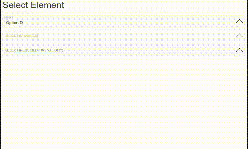
Select
Based on the HTML <select> element with some differences. The main difference is that in actuality it's a common input of type 'text', and the list is rendered through a React state. It's easy to set-up since the options are passed as an array, and you may also set up values with different display names. It can also validate.
Closing the list is user friendly. An user may click on the background, on the arrow button, or press the ESC key if not on a mobile device to close it.
The <Select /> datalist prop type is defined as:
// props.datalistIt is based on the HTML <datalist> element that contains a set of <option> elements which represent the values available for other controls. Except, instead of a set of <option> elements, the datalist is an array of options.
What this means is that the datalist is an array that accepts a value for each array item (options), or an object structured like the ISelectValue interface shown above. The displayValue will be the value displayed on the input, but the value will be the value returned from the onChange callbacks. If displayValue is null it will simply fallback to value.
<Select /> accepts the following props:
| Props | Type | Default | Definition |
|---|---|---|---|
| identifier | string |
Generated string based on props. | The identifier is used to let the Form component assign a namespace for the input values, essentially to identify the form data. More info on the Form section. |
| value | *value | Empty string (''). |
Input value. |
| datalist | (*value or *datalist object)[] |
[] | Based on the HTML <datalist> element that contains a set of <option> elements which represent the values available for other controls. Each array item will be an available option, for more information about the value type options, see the paragraphs above for an explanation. |
| onChange | *onChange function |
Undefined. | Callback that executes after the input change event is fired. |
| elementConfig | *elementConfig object |
Undefined. | HTML input common attributes. More information available in the MDN official documentation about inputs . |
| disabled | boolean |
Undefined. | HTML input disabled attribute. Also provides additional styling for the component, to better indicate it's disabled. |
| placeholder | string |
Undefined. | Placeholder displayed on the label element tag. |
| required | boolean |
Undefined. | HTML input required attribute. |
| shouldValidate | boolean |
If required is true then shouldValidate is true, otherwise false. |
Determines if the component validates the value or not. |
| shouldCloseListOnChange | boolean |
true |
Determines if the list should close after an option is selected, defaults to true. |
Numeric
A simple component intended to handle small natural numbers or integers while also managing to look elegant.
This component accepts the following props. Note that the Numeric component onChange prop is a function defined as:
;| Props | Type | Default | Definition |
|---|---|---|---|
| value | number |
0 |
Input value. |
| minValue | number |
0 |
The minimum permitted value. |
| maxValue | number |
true |
The maximum permitted value. |
| style | CSSProperties |
Undefined. | CSS properties for the wrapper fieldset element. |
| shouldNotType | boolean |
true |
Disables typing on the input field. The only way to modify the input value would be by using the buttons. |
| onChange | *onChange function |
Undefined. | Callback that executes after the input change event is fired. Only receives the value as an argument unlike the other onChange callbacks. The type definition is above. |
Checkbox
Based on the <input> elements of type checkbox and radio. The main difference is that the type will primarily will be styling, looks, and pre-set configurations, but bear in mind that a a <Checkbox /> component of type radio can function as an input type checkbox and vice versa. There is also an input of type bubble which functions as an input of type checkbox by default, but can function as an input type radio as well.
The guideline is the following:
<Checkbox />component of type checkbox will function as a normal<input>element of type checkbox, but can be configured otherwise through props.<Checkbox />component of type radio will function as a normal<input>element of type radio, but can too be configured otherwise through props.<Checkbox />component of type checkbox follows the same principles, but by default it's configured as an<input>element of type checkbox.
To configure a <Checkbox /> component of type radio as a checkbox input element you need to pass a prop defined as multiple of type boolean, as true. Otherwise if you want to configure <Checkbox /> component of type checkbox or bubble to work as a checkbox input element you need to pass a prop defined as single of type boolean, as true.
If you pass the single prop as true and are using more than one set of checkboxes, I recommend also passing the same name of type string prop to all of the components.
Handling all of these props for multiple <Checkbox /> components is way easier by using the <CheckboxGroup /> component, more information about this in its respective section directly below this one.
Note that the Checkbox component onChange prop is a function defined as:
The difference is that the second value is the checked status instead of the value as of the other onChange callbacks. The value, if it exists, will be the third argument. The reason for this change is because <input> elements of type checkbox or radio don't always require values.
The <Checkbox /> component accepts the following props:
| Props | Type | Default | Definition |
|---|---|---|---|
| label | string |
Undefined. | Similar to a placeholder, it's displayed on the label element tag. |
| identifier | string |
Generated string based on props. | The identifier is used to let the Form component assign a namespace for the input values, essentially to identify the form data. More info on the Form section. |
| checked | boolean |
false |
The HTML defaultChecked attribute of the input, basically, the initially status. |
| type | CSSProperties |
Undefined. | CSS properties for the wrapper fieldset element. |
| name | string |
Undefined. | The input's name, to identify the input in the data submitted with the form's data. It's even more important on input elements of type 'radio' and 'checkbox' to set up their behavior. |
| disabled | boolean |
Undefined. | HTML input disabled attribute. Also provides additional styling for the component, to better indicate it's disabled. |
| multiple | boolean |
Depends on type. | Configures the checkbox to behave as an <input> of type checkbox. Only necessary if the component's type is 'radio'. |
| single | boolean |
Depends on type. | Configures the checkbox to behave as an <input> of type radio. Only necessary if the component's type is 'checkbox' or 'bubble'. |
| inline | boolean |
Undefined. | The <Checkbox /> rendered element is a block element by default, if you pass this prop they'll be rendered as inline elements. |
| value | *value | Undefined. | Input value. |
| required | boolean |
Undefined. | HTML input required attribute. |
| style | CSSProperties |
Undefined. | CSS properties for the wrapper fieldset element. |
| className | string |
Undefined. | CSS class name string. |
| onChange | *onChange function |
Undefined. | Callback that executes after the input change event is fired. Only receives the value as an argument unlike the other onChange callbacks. The type definition is above. |
CheckboxGroup
<CheckboxGroup /> copies the same props passed to it to all of its children, it can only be used only for the Checkbox functional components, everything else will be rendered as null. This means that every prop (that <CheckboxGroup /> supports) passed to <CheckboxGroup /> will be copied and passed down to the Checkbox components. Keep in mind that any Checkbox existing prop will be overwritten. We can copy and pass the following props:
name,type,style,className,single,required.
Their type and definitions are obviously the same as the Checkbox props, respectively.
Copying props is not the only benefit that <CheckboxGroup /> offers though, by passing the required property as true, the <CheckboxGroup /> will monitor if any of its children are checked. If true, then the require attribute of all of its children <input> elements will be removed, to allow the form to be submitted without trouble.
Finally, the onChange callback prop is defined as:
;It executes after any of the Checkbox children change, the value argument will be the data of every of its Checkbox children, identified by their respective name attribute props, or a generated fallback.
An example of what the value argument may look like is as follows:
"favorite-ice-creams": shouldValidate: true value: chocolate: checked: true value: "FLAV_01" vanilla: checked: true value: "FLAV_02" strawberry: checked: false value: "FLAV_03" bIsInputValid: true isValid:true}For more information, you may look at the example displayed on the showcase, along with its code snippet.
Form
The <Form /> component works similarly to how <CheckboxGroup /> works, by keeping track of its direct children components' onChange events from the react-formalized library components (e.g. <Input />, <CheckboxGroup/ >), and data values. It's really simple to use, almost all of the logic is handled without the need of prior setup. Also, components that are not part of the react-formalized library will still be rendered, but they won't receive any of the functionality that <Form /> offers.
I will refer to the form data as the formState. There are three ways to access the formState and it's simple, either you add an onChange callback, an onSubmit callback, or both. I think it's safe to say their names are self explanatory when it comes to explaining when do they execute.
Here are the types of onChange, onSubmit, and the object structure of formState:
; ;It's worth noting that the onSubmit event argument is exactly the same as the event argument you would get after submitting a form, for example you are able to prevent its default behavior by running
event.preventDefault().
Here's an example of what printing formState would look on the console:
"form-state": isValid: true email: bIsInputValid: true shouldValidate: true value: "rmolinamir@gmail.com" password: bIsInputValid: true shouldValidate: true value: "123123" // ...That being said, the <Form /> component accepts the following props:
| Props | Type | Default | Definition |
|---|---|---|---|
| onChange | *onChange function |
Undefined. | Callback that executes after any of the input children change events are fired. |
| onSubmit | *onSubmit function |
Generated string based on props. | Callback that executes after the form is submitted. |
| style | string |
Undefined. | CSS properties for the <form> element. |
| className | string |
Undefined. | CSS class name string for the <form> element. |
As a final note, the <Form /> component currently only keeps track of the following components:
<Input /><Select /><CheckboxGroup/ >
Context
The Context and Provider exports are used to set up the CSS color themes by using CSS variables behind the scene. As you may have realized, Context is the React Context object generated by React.createContext(initialContext).
The initial context is defined as:
Provider and CSS Themes
As you may know, every Context object comes with a Provider React component that allows consuming components to subscribe to context changes. The Provider from the react-formalized library may also receive an initial theme passed to it as four different props each targetting a respecive element from the library. Here's the object structure and definition for the props that contain the CSS variables:
declare declare /** * Input components, including the Select and Numeric components. */ /** * Range component. */ /** * Checkbox component. */ The names are self explanatory as to which CSS properties they affect and how/when they trigger, although it is worth mentioning that --my-highlight-color is the color an input changes to when focused, and --my-icon-color is the color of certain icons such as the arrow of the <Select /> component and the checkmarks of the <Checkbox /> component.
Next is a collection of the currently two available CSS themes.
Themes
Currently there are only two available themes, although you are welcomed to come up with your own and even share them, I'll gladly post them here and give due credit. These themes are showcased in the showcase, excuse the redundancy.
Default theme
Dark theme
License
MIT © rmolinamir