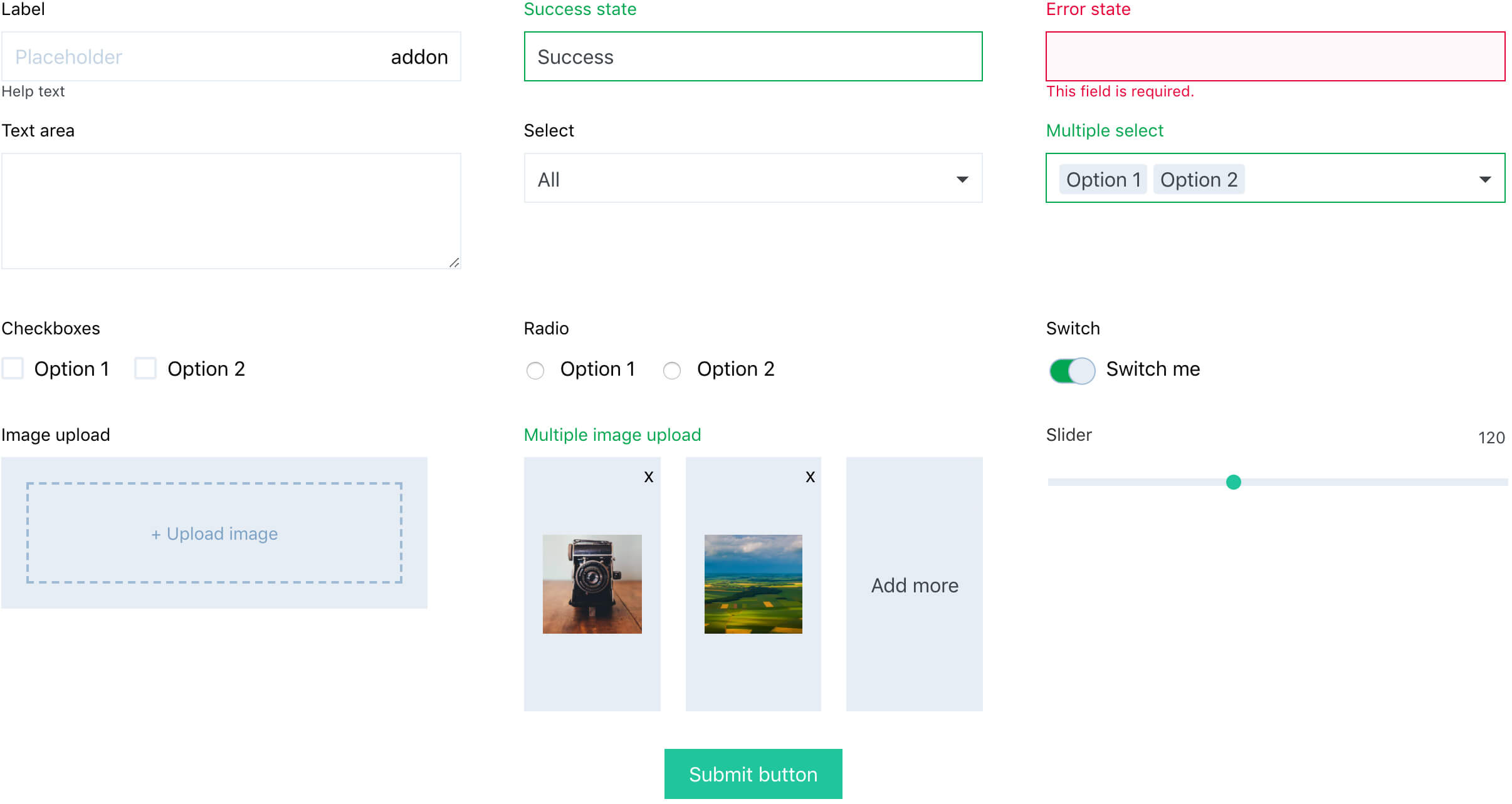
Create React forms just with a pure JSX code and let the react-form-component manage its state for you. A themeable form library based on Context API, with a selection of user friendly inputs and wide customization abilities to match your design and functionality.
yarn add react-form-component
- Wrap entitre app into
<FormThemeProvider>. Optionally define a custom theme in theme prop. - Use
<Form>component anywhere in the app, declare all field names in afieldsprop. - Use any from built-in input widgets or build custom inputs to compose a form. Give each input a
nameprop that corresponds with one defined in afieldsprop of the ancestor<Form>component. - Use
<FormButton>to trigger a submit function that returns all values formatted in a form of a simple javascript object.
// App.js
// Wrap entitre app into a FormThemeProvider.
import React from 'react'
import ReactDOM from 'react-dom'
import { FormThemeProvider } from 'react-form-component'
import BasicExampleForm from './BasicExampleForm'

const App = () =>
  <FormThemeProvider>
    <BasicExampleForm />
  </FormThemeProvider>

ReactDOM.render(<App />, document.querySelector('#app'))


// BasicExampleForm.js
// Create a fully operational form.
import React from 'react'
import ReactDOM from 'react-dom'
import Form, {
  Input,
  Select,
  FormButton,
} from 'react-form-component'

const BasicExampleForm = () =>
  <Form fields={['name', 'email', 'type']}>
    <Input
      name='name'
      label='User name'
    />
    <Input
      name='email'
      type='email'
      label='E-mail'
    />
    <Select
      name='type'
      label='Type of a user'
      options={['Viewer', 'Moderator', 'Admin']}
    />
    <FormButton
      onClick={fields => console.log(fields)}
    >Save</FormButton>
  </Form>

export default BasicExampleForm- Built in form state management
- Wide range of UI form components
- Handles validation, success states, error state and error messages
- Customizable theme and notification labels
- Marking mandatory fields
- Loading state support for asynchronous operations
- Various ways for triggering submit action.
- Optional reseting of all fields after a successful submit (show docs)
- Values from all fields formatted as one object, well formatted for API calls
- Suppports nested structure of a form (Field groups)
- Built in, repleacable react-toastify notification plugin
- Cross-browser tested
- SSR support
- Easy way of custom inputs creation

