react-floating-buttons
A lightweight, customizable and animated ⚛️ react floating buttons

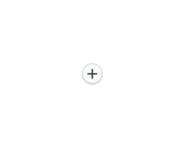
Install
npm install --save react-floating-buttonsUsage
import React Component from 'react' import FloatingButtons from 'react-floating-buttons' import icon1 from './assets/icon1.svg'import icon2 from './assets/icon2.svg' thisbuttonsList = src: icon1 src: icon2 { return <FloatingButtons ='plus' = = = = ="right" /> }Props
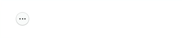
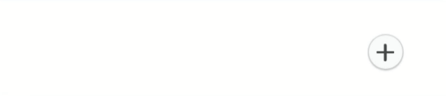
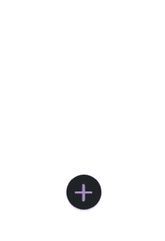
buttonType
type: string, isRequired: false, default: 'hamburger'
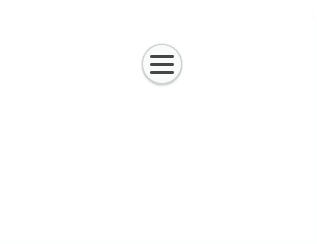
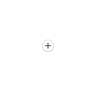
The toggler button type, accepts: hamburger, plus, vert-dots or hori-dots
dimension
type: number, isRequired: false, default: 40
The buttons dimensions { width, height }
top
type: number | string, isRequired: false, default: 0
The offsetTop position of the toggler button
left
type: number | string, isRequired: false, default: 0
The offsetLeft position of the toggler button
backgroundColor
type: string, isRequired: false, default: '#f8f9fa'
The toggler button background color
buttonColor
type: string, isRequired: false, default: '#313131'
The toggler button color ( the dots color, the plus color ... )
itemBackgroundColor
type: string, isRequired: false, default: '#f8f9fa'
The toggler button color ( the dots color, the plus color ... )
direction
type: string, isRequired: false, default: 'circular'
The direction of the nav when opened, accepts: left, right, top, bottom or circular
distance
type: number, isRequired: false, default: 100
The distance between the toggler button and the buttons, used only with direction='circular'
degree
type: number, isRequired: false, default: 180
The angle of the circle, used only with direction='circular'
buttonsList
type: [{ onClick: () => {}, src: '' }], isRequired: true
The buttons item, a list of object where each object must have: onClick function to handle on click button and src the source of the icon of that button.
Examples
To run the exemple you need to:
- clone this repo:
git clone https://github.com/AM-77/react-floating-buttons.git - inside the react-floating-buttons folder run:
yarnornpm i - inside the example folder run:
yarnornpm ithen run:yarn startornpm start
Screenshots
circular 360 degree
circular down 180 degree
circular customizable degree
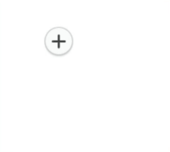
direction right
direction left
customized background & direction up
Contribution
Feel free to raise an Issue or submit a PR.
Copyright and license
Code copyright 2019 AM-77. Code released under MIT license.