

React Circular Carousel Component
Features
Try the demo here.
- Circular image carousel
- Everything you see is customisable
- Get focus element to add in your own components
- Smooth, easy to implement, fantastic UI
Installation
$ npm install react-fancy-circular-carousel
Include the styles by importing FancyCarousel.css
import 'react-fancy-circular-carousel/FancyCarousel.css';Quickstart
Parameters
| Parameter | Type | Description |
|---|---|---|
| images | String[] |
mandatory List of image sources |
| setFocusElement | Function |
optional SetState method to get focus element in parent component |
| offsetAngle | Number |
optional Angle in degrees to offset the carousel elements |
| carouselRadius | Number |
optional Carousel radius in px |
| centralImageRadius | Number |
optional Central image radius in px |
| centralImageBoxShadow | String |
optional Central image box shadow property |
| peripheralImageRadius | Number |
optional Peripheral Image radius in px |
| peripheralImageBoxShadow | String |
optional Peripheral image box shadow property |
| focusElementStyling | React.CSSProperties |
optional Custom styling for the element in focus |
| border | Boolean |
optional Enable/disable bordering |
| borderWidth | Number |
optional Border stroke width property in px |
| borderHexColor | String |
optional Border hex color as a string excluding the '#' |
| autoRotateTime | Number |
optional Time in seconds for an auto rotating carousel |
| transitionTime | Number |
optional Time in seconds for the rotating transition |
| navigationTextSize | Number |
optional ↓ Arrow font size in rem |
| navigationButtonRadius | Number |
optional Navigation button radius in px |
| navigationButtonColor | String |
optional ↓ Arrow hex color as a string excluding the '#' |
| navigationButtonBgColor | String |
optional Navigation button hex color as a string excluding the '#' |
| navigationButtonStyling | React.CSSProperties |
optional Custom styling for navigation buttons |
Usage
import React from "react";

import FancyCarousel from "react-fancy-circular-carousel";
import 'react-fancy-circular-carousel/FancyCarousel.css';

import image1 from './assets/image1.png';
import image2 from './assets/image2.png';
import image3 from './assets/image3.png';
import image4 from './assets/image4.png';

const YourComponent = () => (

  const images = [image1, image2, image3, image4];

  return <div className="carousel">
    <FancyCarousel images={images} />
  </div>
);

export default YourComponent;
Retrieve focus element
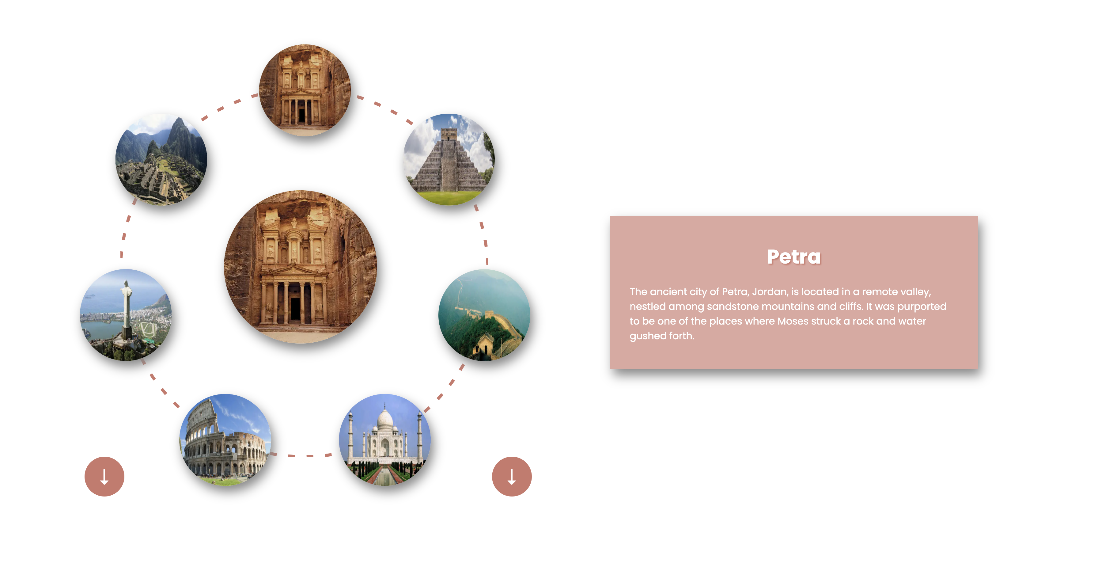
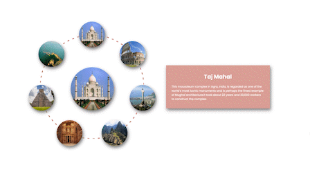
Utility using which one can know which element is currently at focus and may add relevant components around it.
For eg. if the carousel portrays images of cities, this feature may help you update the description in the information box along side the carousel.
import React, { useState } from "react";

import FancyCarousel from "react-fancy-circular-carousel";
import 'react-fancy-circular-carousel/FancyCarousel.css';

import image1 from './assets/image1.png';
import image2 from './assets/image2.png';
import image3 from './assets/image3.png';
import image4 from './assets/image4.png';

const YourComponent = () => (

  // the focus element would be the array index of the image currently at focus
  const [focusElement, setFocusElement] = useState(0);

  const images = [image1, image2, image3, image4];
  const info = ['Delhi', 'Mumbai', 'Bengaluru', 'Kolkata'];

  return <div className="carousel">
      <FancyCarousel images={images} setFocusElement={setFocusElement}/>
      <div className="info-box-wrapper">
        <p> {info[focusElement]} </p>
      </div>
    <div>
);

export default YourComponent;
Customisations
Customise the carousel to your needs such as modifying the carousel size, image size, adding styling such as drop shadow, adding auto rotate, etc
The focusElementStyling and navigationButtonStyling props are of type React.CSSProperties, which is essentially a JavaScript object containing camelcased CSS properties and their corresponding values.
To know more check the official documentation here.
import React from "react";

import FancyCarousel from "react-fancy-circular-carousel";
import 'react-fancy-circular-carousel/FancyCarousel.css';

import image1 from './assets/image1.png';
import image2 from './assets/image2.png';
import image3 from './assets/image3.png';
import image4 from './assets/image4.png';

const YourComponent = () => (

  const images = [image1, image2, image3, image4];

  return <div className="carousel">
    <FancyCarousel
      images={images}
      carouselRadius={400}
      peripheralImageRadius={100}
      centralImageRadius={200}
      focusElementStyling={{border: '2px solid #ba4949'}}
      autoRotateTime={3}
      borderWidth={4}
      borderHexColor={'1c364f'}
    />
  </div>
);

export default YourComponent;
Preview
With navigators
With auto rotation
Github Repo
Github Repo
Try it out for yourselves and
License
MIT © Ninad Sutrave