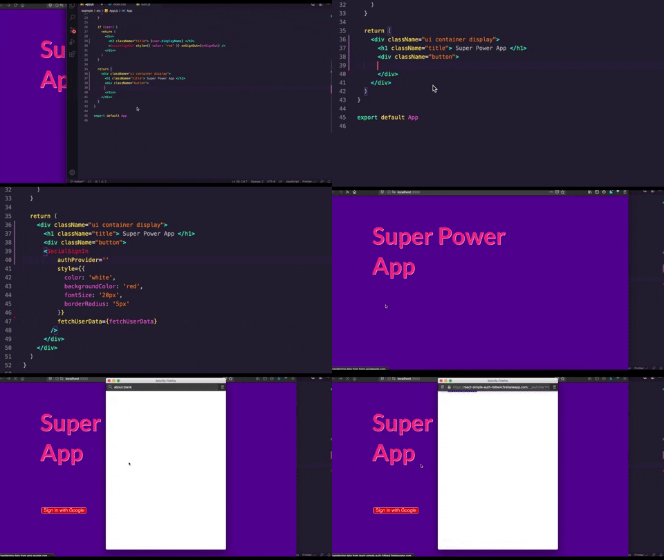
react-easy-auth
A React component that easily adds social authentication with firebase to your projects.

Install
npm install --save react-easy-authConfiguration
- Use an existing firebase project or create a new one. Then enable your preferred sign-in method from the firebase console.
For help visit: https://firebase.google.com/docs/web/setup - Paste your firebase configuration in a
.envfile inside your React project:
REACT_APP_APIKEY="api-key"REACT_APP_AUTHDOMAIN="project-id.firebaseapp.com"REACT_APP_DATABASEURL="https://project-id.firebaseio.com"REACT_APP_PROJECTID="project-id"REACT_APP_STORAGEBUCKET="project-id.appspot.com"REACT_APP_MESSAGINGSENDERID="sender-id"REACT_APP_APPID="app-id"Usage
import React useState from 'react' import SocialSignIn SocialSignOut from 'react-easy-auth' const App = const user setUser = //a method to fetch user data from the SocialSignIn component const fetchUserData = userData userCredentials error if !error // a method to handle sign-out const onSignOut = error if !error console // if the user data is present we show the SocialSignOut Compononent if user return <div> <h1> Welcome userdisplayName </h1> <SocialSignOut = = /> </div> // if there is no user data we show the SocialSignIn Component return <SocialSignIn ='Google' = = /> API
SocialSignIn
authProvider
| Type | Required |
|---|---|
| string | Yes |
This prop is used to describe what authentication provider needs to be activated.
Make sure to also enable the same from firebase console.
The available providers are:
- Github
- Microsoft
fetchUserData()
| Type | Parameters | Required |
|---|---|---|
| function | userData, userCredentials, error |
Yes |
This function is used as a prop to fetch the data from the SignIn Component whenever
a user signs in.
userData(Object): The user related data.userCredentials(Object): The user credentials like access tokenserror(Object): Error generated during the authentication flow
style
| Type | Required |
|---|---|
| object | Optional |
This prop is used to add styling to the SocialSignIn button using inline CSS. You can add your preffered
styling to the button to give it a custom appeal.
scopes
| Type | Required |
|---|---|
| array | Optional |
This prop is used to specify additional OAuth 2.0 scopes that you want to request from the.
authentication provider.
SocialSignOut
onSignOut()
| Type | Parameters | Required |
|---|---|---|
| function | error |
Yes |
This function is used as a prop to activate the sign out method. If any error
occurs during the process it is returned through the error object.
error(Object): Error generated during the sign out flow
style
| Type | Required |
|---|---|
| object | Optional |
This prop is used to add styling to the SocialSignOut button using inline CSS. You can add your preffered
styling to the button to give it a custom appeal.
Contributing
See contributing guidlines here
License
MIT © chiragsrvstv

