react-dynamic-checkbox-tree


Demo: https://modest-varahamihira-1caac8.netlify.com/
Features
- No dependencies
- Size only 2.8 kb (gzipped)
- For React 15.x and 16.x.
- Styles customizable
Usage
Installation
Install the library using your favorite dependency manager:
Using yarn:
yarn add react-dynamic-checkbox-tree
Using npm:
npm install react-dynamic-checkbox-tree --save
Render Component
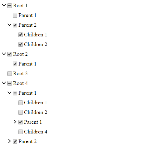
import React from 'react'import CheckboxTree from 'react-dynamic-checkbox-tree' const exampleData = id: 1000 label: 'Root 1' children: id: 1100 label: 'Children 1' id: 1200 label: 'Parent 1' children: id: 1210 label: 'Children 1' id: 1220 label: 'Children 2' id: 2000 label: 'Root 2' children: id: 2100 label: 'Children 1' id: 3000 label: 'Root 3' id: 4000 label: 'Root 4' children: id: 4100 label: 'Parent 1' children: id: 4110 label: 'Children 1' id: 4120 label: 'Children 2' id: 4130 label: 'Parent 1' children: id: 4131 label: 'Children 1' id: 4132 label: 'Children 2' id: 4133 label: 'Children 3' id: 4140 label: 'Children 3' id: 4200 label: 'Parent 2' children: id: 4210 label: 'Children 1' id: 4220 label: 'Children 2' id: 4230 label: 'Children 3' id: 4240 label: 'Children 4' id: 4250 label: 'Children 5' Component state = checked: // This stores the checked ID's { return <CheckboxTree = = = /> }API
| Prop | Type | Description |
|---|---|---|
nodes |
array |
Required. Array of objects. Objects must have id (number) and label (string), optionally children. Children has the same format, array of objects: (id, label and optionally more children) |
checked |
array |
Required. Array of numbers (id). Should derive from state (this.state.checked). If empty, no checkboxes are checked by default |
onCheck |
function |
Required. Function to update the state when nodes are checked. Should not be modified. See the example |
| Customize: classes | ||
classNameNodeContainer |
String |
Optional. class for the container. |
classNameLabel |
String |
Optional. class for a label. |
classNameParentLabel |
String |
Optional. class a parent label. |
classNameCheckbox |
String |
Optional. class for a checkbox. |
classNameCheckboxIcon |
String |
Optional. class for a checkbox icon. |
| Customize: inline-style | ||
styleNodeContainer |
object |
Optional. style for the container. |
styleLabel |
object |
Optional. style for a label. |
styleParentLabel |
object |
Optional. style for a parent label. |
styleCheckbox |
object |
Optional. style for a checkbox. |
styleCheckboxIcon |
object |
Optional. style for a checkbox icon. |