react-do-tree-select
A tree select React component.


Features
- Support a large amount of data (1000,000 pieces of data were tested for stability)
- Support half-selection (even if the child nodes are all selected, the check of parent level will not be affected)
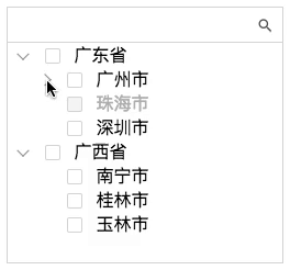
Demo
Install
npm install react-do-tree-react-do-tree-select depends on React
Examples
Here's simple example to get you started.
;;; Component { superprops; thisstate = treeData: selectVal: '' showlevel: 0 thisonSelect = thisonSelect; thisonExpand = thisonExpand; thisonChecked = thisonChecked; thiscustomTitleRender = thiscustomTitleRender; } { const treeData = Data; this; } { return itemtitle } { console; } { console; } { console; } { return const treeData showlevel = thisstate; const checkbox = enable: true parentChain: true // child Affects parent nodes; childrenChain: true // parent Affects child nodes; halfChain: true // The selection of child nodes affects the semi-selection of parent nodes. initCheckedList: // Initialize check multiple lists return <div className="App"> <TreeSelect treeData = treeData style = width: 320height: 600 selectVal = thisstateselectVal onSelect = thisonSelect onExpand = thisonExpand onChecked = thisonChecked checkbox = checkbox showlevel = showlevel customTitleRender = thiscustomTitleRender/> </div> ; ; }./Data.js
title: '广东省' value: '1' children: title: '广州市' value: '1-1' children: title: '越秀区' value: '1-1-1' title: '白云区' value: '1-1-2' title: '珠海市' value: '1-2' disabled: true title: '深圳市' value: '1-3' title: '广西省' value: '2' children: title: '南宁市' value: '2-1' title: '桂林市' value: '2-2' title: '玉林市' value: '2-3' API
| property | description | type | default | required |
|---|---|---|---|---|
| treeData | source data config | array | - | true |
| showlevel | Hierarchy of expansion | number | 0 | |
| checkbox | Check box config config | object | - | |
| wrapperClassName | Extended class name | string | - | |
| selectVal | Selected items | string | - | |
| style | Custom style | object | {width: 320, height: 800} | |
| onSelect | Click the event callback function | function( item, event ) | - | |
| onExpand | Icon Click the event callback function | function( item, event ) | - | |
| onChecked | Check the callback function for the event | function( items, event ) | - | |
| customIconRender | The custom icon is extended after the entry | function(item) : DOM | - | |
| customTitleRender | Displays the title of the entry | function(item) : DOM | - |
treeData
| property | description | type | default | required |
|---|---|---|---|---|
| title | Item title | string | - | |
| value | The unique identity of the item | string | - | |
| disabled | Whether the item is disabled | bool | false | |
| children | Item children | array | - |
checkbox
| property | description | type | default | required |
|---|---|---|---|---|
| enable | Switch the check box | bool | false | |
| parentChain | child Affects parent nodes | bool | true | |
| childrenChain | parent Affects child nodes | bool | true | |
| halfChain | The selection of child nodes affects the semi-selection of parent nodes | bool | true | |
| initCheckedList | Initialize check multiple lists | array | - |
License
react-do-tree-select is available under the MIT License.