MUI json endpoint form builder. Check this storybook and the docs folder for more samples...
A React view builder which interacts with a JSON endpoint to generate nested 12-column grids with input fields and automatic state management in a declarative style. Endpoint is typed by TypeScript guards (IntelliSense available). This tool is based on MUI components, so your application will look normal on any device...
[!TIP] A few adjectives which can be applied to
react-declarative
- Accesible
Every callback you need: field or group of fields focus/blur event, form invalidity state, data-testid and more
- Configurable
Each field can be statically hidden by settings dictionary and dynamically by form state condition. Same if you want to disable or make field readonly
- Extendable
It allow you to override any field type by slot context or inject custom JSX directly into form without additional boilerplate. Also that lib can be used with all React ecosystem, for example, try with million@3.0.3, It makes react-declarative extreamly performant even on 2016 devices
- Maintainable
Write code without going into technical debt. The big diffrence with jsonforms is you actually write less code cause you don't need data schema. In react-declarative all validations are build into ui schema, so backend endpoint can be changed partially if some properties are unused (see PATCH method)
- Reflectable
Each form schema can be reflected by using getAvailableFields for additional inline validations, data cleanup if some fields are not required anymore, data export (generate excel export from current form). That extreamly hard to implement with jsonforms
- Reliable
React 18 Concurrent render used under the hood (state updates in async useEffect) so the jsonforms will slow down on 200+ fields form, react-declarative will not. Also RPS optimised by debounce of form state change event. That means you will need less hardware measures on a server side to implement autosubmit
- Code-Splittable
JSON templates can be downloaded statically, builded dynamically, lazy-loaded dynamically
- Scalable
Easy internationalization with translation dictionaries for Combobox field. JSX Factory for labels translation. An organisation for tutoring newbies with 25 projects with AI, reactive programming and more
[!IMPORTANT] There is a
create-react-apptemplate available in this repository
yarn create react-app --template cra-template-react-declarative .or
npx create-react-app . --template=react-declarative[!NOTE] There is a sample app avalible in the demo folder...
npm install --save react-declarative tss-react @mui/material @emotion/react @emotion/styled[!NOTE] The
react-declarativeis not just a form builder. This one is the huge framework with dashboard adaptive cards builder, crud-based Grid component and more.
Check the docs folder
This tool also provide it's own way of rapid application development by simplifying app state managament. New features appear frequently, so you should be able to read the project's storybook, browse an organization with sample projects, and read the source code
Several starter kits available
1. Pure React Starter
[!NOTE] GitHub repo: https://github.com/react-declarative/cra-template-react-declarative
yarn create react-app --template cra-template-react-declarative .2. Ethers.js/React Starter
[!NOTE] GitHub repo: https://github.com/react-declarative/cra-template-solidity
yarn create react-app --template cra-template-solidity .3. AppWrite/React Starter
[!NOTE] GitHub repo: https://github.com/react-declarative/cra-template-appwrite
yarn create react-app --template cra-template-appwrite .and few more quite interesting demo projects
1. ERC-20 Payment gateway
[!NOTE] GitHub repo: https://github.com/react-declarative/erc20-payment-gateway
git clone https://github.com/react-declarative/erc20-payment-gateway.git2. React Face KYC
[!NOTE] GitHub repo: https://github.com/react-declarative/react-face-kyc
git clone https://github.com/react-declarative/react-face-kyc.git3. BrainJS Cryptocurrency Trend
[!NOTE] GitHub repo: https://github.com/react-declarative/brainjs-cryptocurrency-trend
git clone https://github.com/react-declarative/brainjs-cryptocurrency-trend.git4. NFT Mint Tool
[!NOTE] GitHub repo: https://github.com/react-declarative/nft-mint-tool
git clone https://github.com/react-declarative/nft-mint-tool.git5. React PocketBase CRM
[!NOTE] GitHub repo: https://github.com/react-declarative/react-pocketbase-crm
git clone https://github.com/react-declarative/react-pocketbase-crm.git6. ChatGPT Ecommerce Grid
[!NOTE] GitHub repo: https://github.com/react-declarative/chatgpt-ecommerce-prompt
git clone https://github.com/react-declarative/chatgpt-ecommerce-prompt.git[!NOTE] Link to the source code
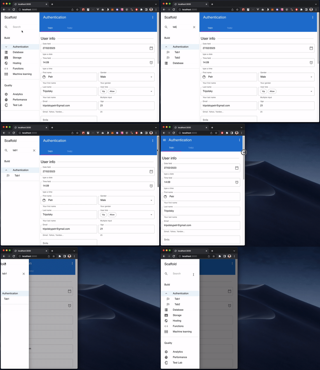
The <Scaffold2 /> implements the basic Material Design visual layout structure by using config instead of manual ui elements composition.
const options: IScaffold2Group[] = [
  {
    id: 'build',
    label: 'Build',
    children: [
      {
        id: 'authentication',
        label: 'Authentication',
        isVisible: async () => await ioc.authService.hasRole('unauthorized'),
        icon: PeopleIcon,
        tabs: [
          { id: 'tab1', label: 'Tab1 in header', },
          { id: 'tab2', label: 'Tab2 in header', },
        ],
        options: [
          { id: 'tab1', label: 'Tab1 in side menu' },
          { id: 'tab2', label: 'Tab2 in side menu' },
        ],
      },
      { id: 'Database', label: 'Label is optional (can be generated automatically from ID in snake case)', icon: DnsRoundedIcon, },
      { id: 'Storage', isDisabled: async () => await myAmazingGuard(), icon: PermMediaOutlinedIcon, },
      { id: 'Hosting', icon: PublicIcon, },

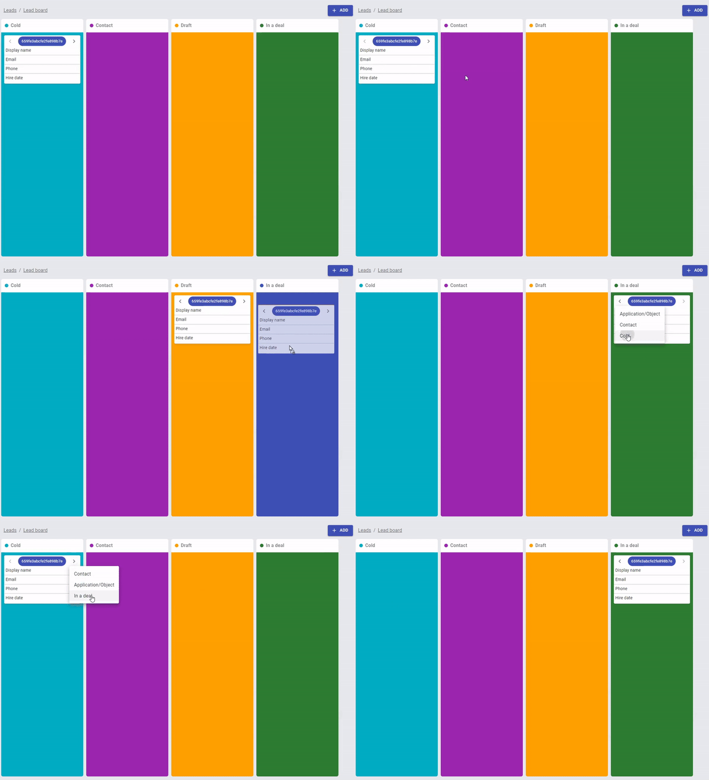
...The <KanbanView /> allow you to build kanban boards with realtime support
const rows: IBoardRow<ILeadRow>[] = [
  {
    label: "Display name",
    value: (id, employee) =>
      [employee.first_name, employee.last_name].join(" "),
  },
  {
    label: "Email",
    value: (id, employee) => employee.email,
    click: (id, data, payload) => payload.pickEmployeePreviewModal(id),
  },
  {
    label: "Phone",
    value: (id, employee) => employee.phone,
  },
  {
    label: "Hire date",
    value: (id, employee) => employee.hire_date,
  },
];

const columns: IBoardColumn<ILeadRow>[] = [
  {
    color: "#00ACC1",
    column: "cold",
    label: "Cold",
    rows,
  },
  {
    color: "#9C27B0",
    column: "contact",
    label: "Contact",
    rows,
  },
  {
    color: "#FFA000",
    column: "draft",
    label: "Draft",
    rows,
  },
  {
    color: "#2E7D32",
    column: "deal",
    label: "In a deal",
    rows,
  },
];

...

<KanbanView<ILeadRow>
  sx={{
    height: "calc(100vh - 145px)",
  }}
  onChangeColumn={handleChangeColumn}
  columns={columns}
  items={data}
/>The <WizardView /> component allows you to build action wizard with stepper and nested routing
const steps: IWizardStep[] = [
  {
    id: "select",
    label: "Choose file",
  },
  {
    id: "validate",
    label: "Validation",
  },
  {
    id: "import",
    label: "Import",
  },
];

const routes: IWizardOutlet[] = [
  {
    id: "select",
    element: SelectFileView,
    isActive: (pathname) => !!parseRouteUrl("/select-file", pathname),
  },
  {
    id: "validate",
    element: ValidateFileView,
    isActive: (pathname) => !!parseRouteUrl("/validate-file", pathname),
  },
  {
    id: "import",
    element: ImportFileView,
    isActive: (pathname) => !!parseRouteUrl("/import-file", pathname),
  },
];

...

<WizardView pathname="/select-file" steps={steps} routes={routes} />

...

const SelectFileView = ({
    history
}: IWizardOutletProps) => {
  return (
    <WizardContainer
      Navigation={
        <WizardNavigation
          hasNext
          onNext={() => history.replace("/validate-file")}
        />
      }
    >
        <p>123</p>
    </WizardContainer>
  );
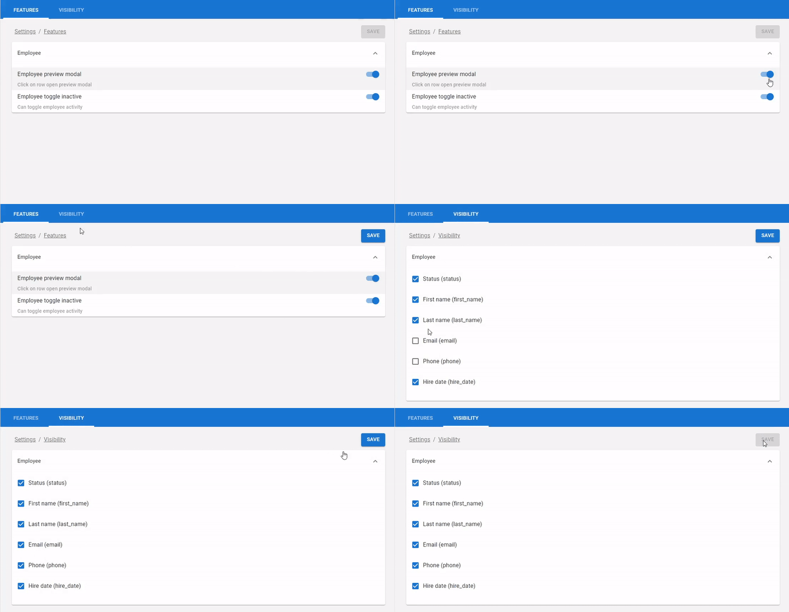
};The <VisibilityView /> and <FeatureView /> components allows you to build configurable UI by using reflection
const groups: IVisibilityGroup[] = [
  {
    name: "employee_visibility",
    /**
     * @type {IField[] | TypedField[]}
     * @description Same field type from `<One />` template engine
     */
    fields: employee_fields,
  },
];

...

<VisibilityView
  expandAll
  data={{ employee_visibility: data }}
  groups={groups}
  onChange={({ employee_visibility }) => onChange(employee_visibility)}
/>
By using feature-oriented programming you can adjust view to different roles of users by partially hiding text, images and buttons
const features: IFeatureGroup[] = [
  {
    title: "Employee",
    expanded: true,
    children: [
      {
        name: "employee_preview_modal",
        label: "Employee preview modal",
        description: "Click on row open preview modal",
      },
      {
        name: "employee_toggle_inactive",
        label: "Employee toggle inactive",
        description: "Can toggle employee activity",
      },
    ],
  },
];

...

<FeatureView
  expandAll
  data={data}
  features={features}
  onChange={onChange}
/>

...

<If
  payload={userId}
  condition={async (userId) => {
    return await ioc.permissionRequestService.getOwnerContactVisibilityByUserId(userId)
  }}
  Loading="Loading"
  Else="Hidden"
>
  {owner_contact}
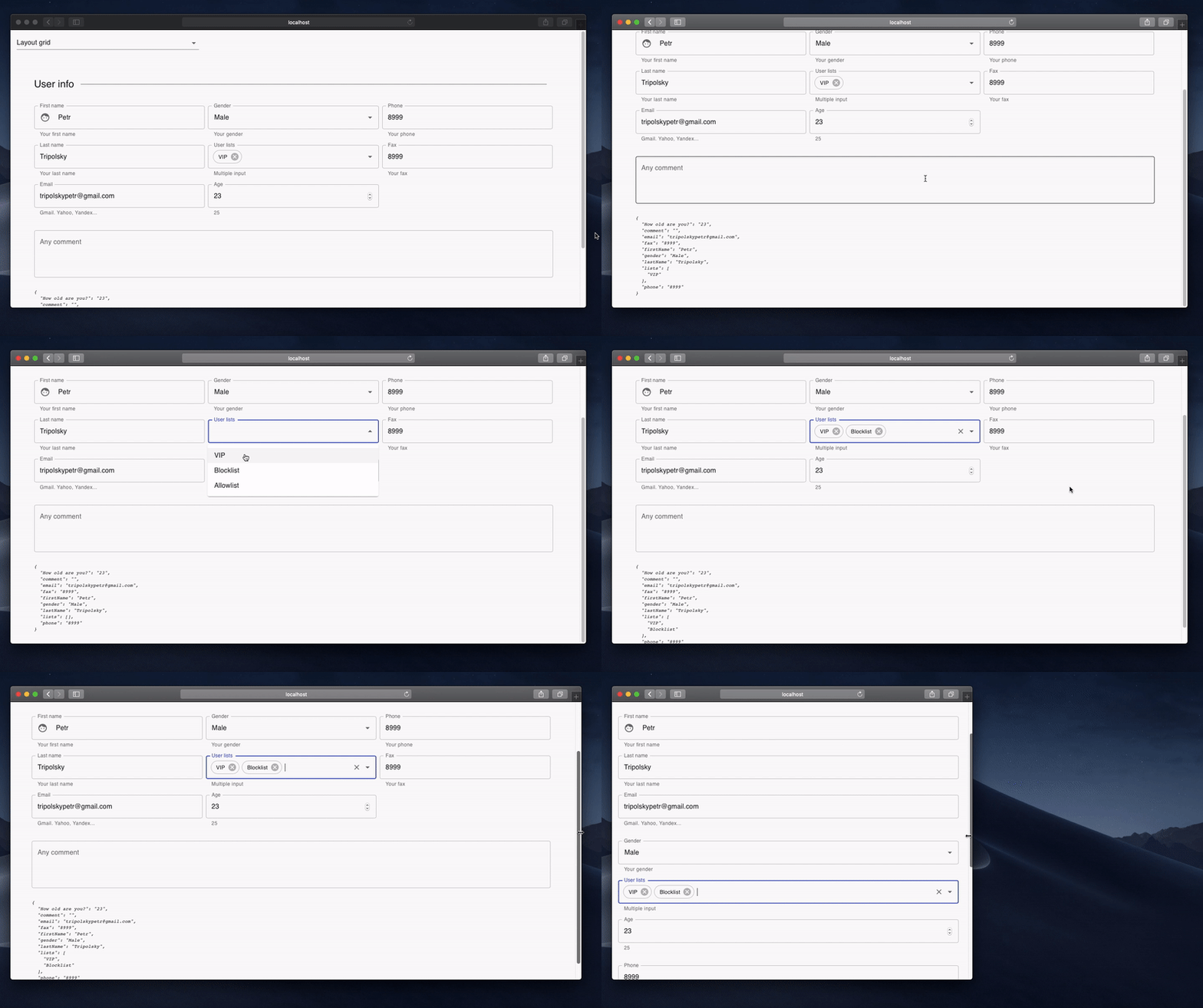
</If>1. Layout grid
[!NOTE] Link to the source code
const fields: TypedField[] = [
  {
    type: FieldType.Line,
    title: 'User info',
  },
  {
    type: FieldType.Group,
    phoneColumns: '12',
    tabletColumns: '6',
    desktopColumns: '4',
    fields: [
      {
        type: FieldType.Text,
        title: 'First name',
        defaultValue: 'Petr',
        description: 'Your first name',
        leadingIcon: Face,
        focus() { console.log("focus :-)"); },
        blur() { console.log("blur :-("); },
        name: 'firstName',
      },
      {
        type: FieldType.Text,
        title: 'Last name',
        defaultValue: 'Tripolsky',
        description: 'Your last name',
        name: 'lastName',
      },

      ...

];
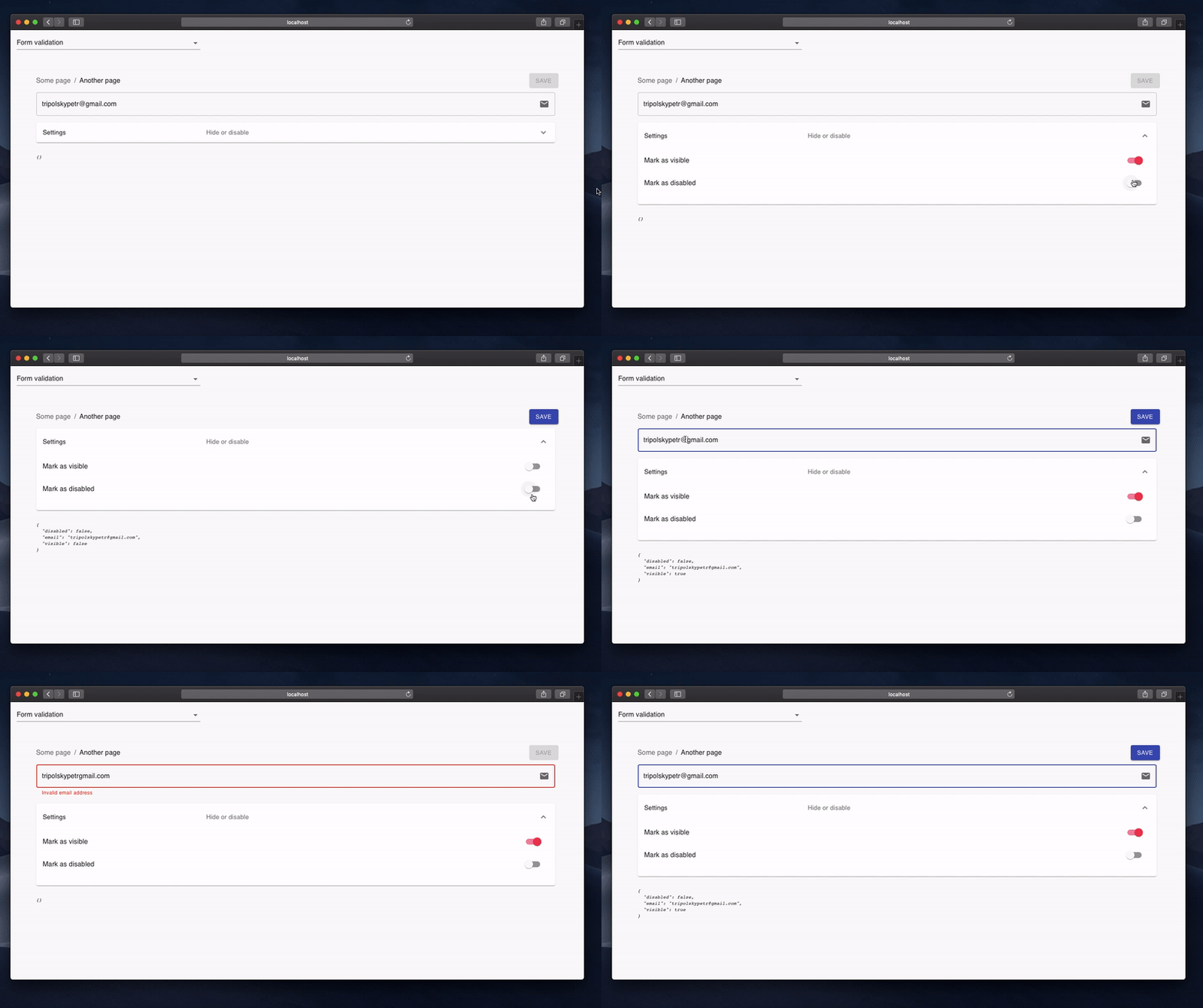
2. Form validation
[!NOTE] Link to the source code
const fields: TypedField[] = [
  {
    type: FieldType.Text,
    name: 'email',
    trailingIcon: Email,
    defaultValue: 'tripolskypetr@gmail.com',
    isInvalid({email}) {
      const expr = /^[\w-.]+@([\w-]+\.)+[\w-]{2,4}$/g;
      if (!expr.test(email)) {
        return 'Invalid email address';
      } else {
        return null;
      }
    },
    isDisabled({disabled}) {
      return disabled;
    },
    isVisible({visible}) {
      return visible;
    }
},
{
    type: FieldType.Expansion,
    title: 'Settings',
    description: 'Hide or disable',
    fields: [
      {
        type: FieldType.Switch,
        title: 'Mark as visible',
        name: 'visible',
        defaultValue: true,
      },

      ...
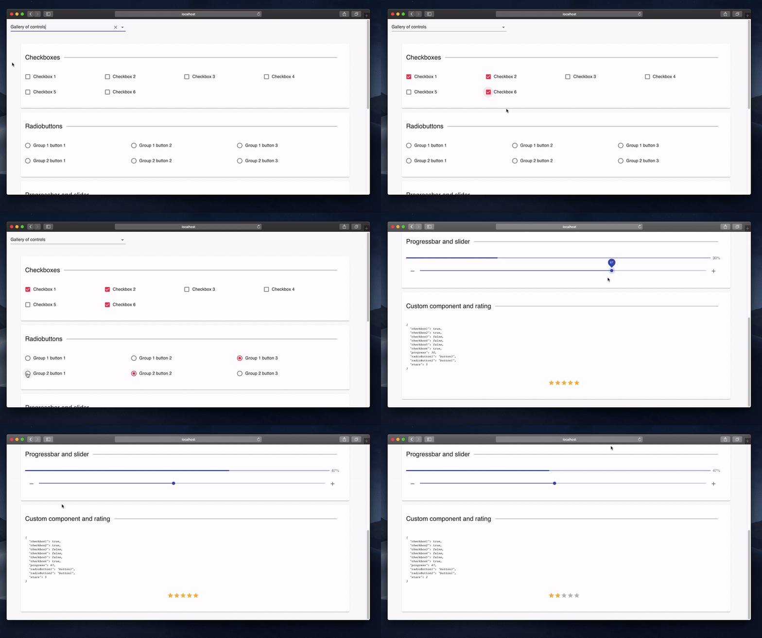
3. Gallery of controls
[!NOTE] Link to the source code
const fields: TypedField[] = [
  {
    type: FieldType.Paper,
    fields: [
      {
        type: FieldType.Line,
        title: 'Checkboxes',
      },
      {
        type: FieldType.Checkbox,
        name: 'checkbox1',
        columns: '3',
        title: 'Checkbox 1',
      },
      {
        type: FieldType.Checkbox,
        name: 'checkbox2',
        columns: '3',
        title: 'Checkbox 2',
      },

      ...
4. JSX Injection
[!NOTE] Link to the source code
const fields: TypedField[] = [
  {
    type: FieldType.Paper,
    fields: [
      {
        type: FieldType.Component,
        element: (props) => <Logger {...props}/>,
      },
    ],
  },

  ...

];
5. UI-Kit override
[!NOTE] Link to the source code
<OneSlotFactory
  CheckBox={MyCheckBox}
  Text={MyInput}
  ...
>
  <One
    ...
  />
  ...
</OneSlotFactory>
6. Hiding fields by business functions
[!NOTE] See RBAC
const fields: TypedField[] = [
  {
    type: FieldType.Text,
    name: 'phone',
    hidden: ({ payload }) => {
      return !payload.features.has('show-phone-number');
    },
  },

  ...

];[!NOTE] Link to the source code
Adaptive json-configurable data grid with build-in mobile device support
const filters: TypedField[] = [
  {
    type: FieldType.Text,
    name: 'firstName',
    title: 'First name',
  },
  {
    type: FieldType.Text,
    name: 'lastName',
    title: 'Last name',
  }
];

const columns: IColumn[] = [
  {
    type: ColumnType.Text,
    field: 'id',
    headerName: 'ID',
    width: (fullWidth) => Math.max(fullWidth - 650, 200),
    columnMenu: [
      {
        action: 'test-action',
        label: 'Column action',
      },
    ],
  },
  ...
];

const actions: IListAction[] = [
  {
    type: ActionType.Add,
    label: 'Create item'
  },
  ...
];

const operations: IListOperation[] = [
  {
    action: 'operation-one',
    label: 'Operation one',
  },
];

const chips: IListChip[] = [
  {
    label: 'The chip1_enabled is true',
    name: 'chip1_enabled',
    color: '#4caf50',
  },
  ...
];

const rowActions: IListRowAction[] = [
  {
    label: 'chip1',
    action: 'chip1-action',
    isVisible: ({ chip1_enabled }) => chip1_enabled,
  },
  ...
];

...

return (
  <ListTyped
    withMobile
    withSearch
    withArrowPagination
    rowActions={rowActions}
    actions={actions}
    filters={filters}
    columns={columns}
    operations={operations}
    chips={chips}
  />
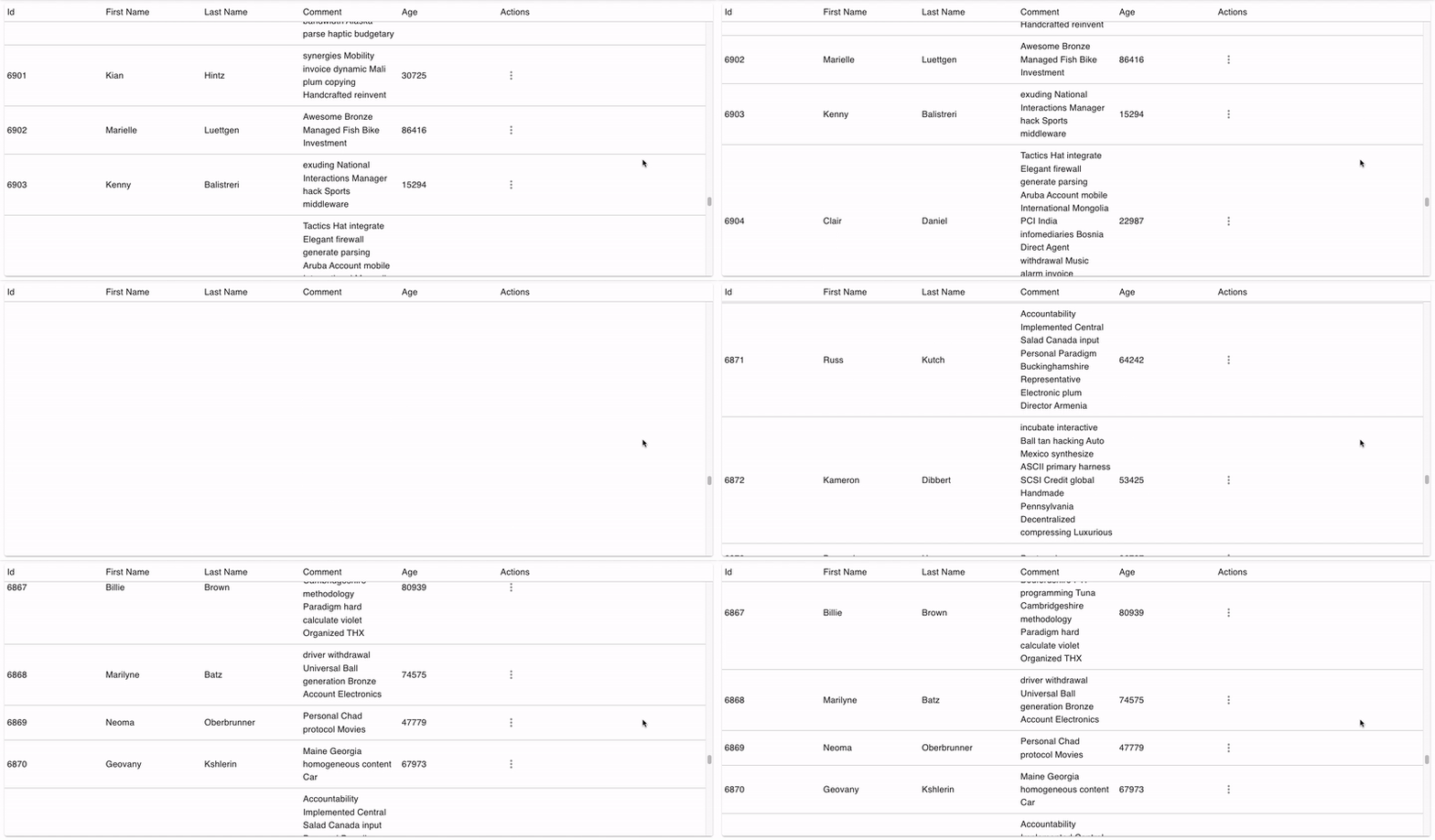
)[!NOTE] You can use InfiniteView for always-mounted or VirtualView for virtualized infinite lists
<VirtualView
  component={Paper}
  sx={{
    width: "100%",
    height: 250,
    mb: 1,
  }}
  onDataRequest={() => {
    console.log('data-request');
    setItems((items) => [
      ...items,
      ...[uuid(), uuid(), uuid(), uuid(), uuid()],
    ]);
  }}
>
  {items.map((item) => (
    <span key={item}>{item}</span>
  ))}
</VirtualView>[!NOTE] Hooks for fetching, caching and updating asynchronous data. Promise-based command pattern ui components. The hooks will help you to avoid multiple POST method execution when user missclick button. The components will show load indicator while
onClickpromise is pending
The useAsyncProgress will manage percent range of execution (0% - 100% for <LinearProgress /> value)
const { execute } = useAsyncProgress(
  async ({ data }) => {
    await createContact(data);
  },
  {
    onProgress: (percent) => {
      setProgress(percent);
    },
    onError: (errors) => {
      setErrors(errors);
    },
    onEnd: (isOk) => {
      history.replace("/report");
    },
  }
);

...

<ActionButton
  onClick={async () => {
    const file = await chooseFile(
      "application/vnd.openxmlformats-officedocument.spreadsheetml.sheet"
    );
    if (file) {
      const rows = await parseExcelContacts(file);
      execute(
        rows.map((row, idx) => ({
          data: row,
          label: `Row №${idx + 2}`,
        }))
      );
    }
  }}
>
  Choose XLSX
</ActionButton>
The useSinglerunAction will not execute any additional calls while original promise is pending
const { execute } = useSinglerunAction(
  async () => {
   const file = await chooseFile("image/jpeg, image/png");
    if (file) {
      const filePath = await ioc.appwriteService.uploadFile(file);
      onChange(filePath);
    }
  }
);

...

<ActionIcon onClick={execute}>
  <CloudUploadIcon />
</ActionIcon>
The useQueuedAction will queue all promise fulfillment in functions execution order. Quite useful while state reducer pattern when coding realtime.
const { execute } = useQueuedAction(
  async ({ type, payload }) => {
    if (type === "create-action") {
      ...
    }
    if (type === "update-action") {

    }
    if (type === "remove-action") {
      ...
    }
  },
  {
    onLoadStart: () => ioc.layoutService.setAppbarLoader(true),
    onLoadEnd: () => ioc.layoutService.setAppbarLoader(false),
  }
);

...

useEffect(() => ioc.kanbanService.createSubject.subscribe(execute), []);

useEffect(() => ioc.kanbanService.updateSubject.subscribe(execute), []);

useEffect(() => ioc.kanbanService.removeSubject.subscribe(execute), []);
The usePreventAction will prevent any other action execution while single one is pending
const {
  handleLoadStart,
  handleLoadEnd,
  loading,
} = usePreventAction();

...

<ActionButton
  disabled={loading}
  onLoadStart={handleLoadStart}
  onLoadEnd={handleLoadEnd}
>
  Action 1
</ActionButton>

...

<ActionButton
  disabled={loading}
  onLoadStart={handleLoadStart}
  onLoadEnd={handleLoadEnd}
>
  Action 2
</ActionButton>
The usePreventNavigate will prevent navigate while action is running
const { handleLoadStart, handleLoadEnd } = usePreventNavigate({
  history: ioc.routerService,
});

...

<ActionButton
  onLoadStart={handleLoadStart}
  onLoadEnd={handleLoadEnd}
>
  Action
</ActionButton>
The useAsyncValue will help you to manage react-hooks/rules-of-hooks while working with remote data
const [data, { loading, error }, setData] = useAsyncValue(async () => {
  return await getData();
});

if (loading || error) {
  return null;
}

return (
  <pre>
    {JSON.stringify(data, null, 2)}
  </pre>
)

...

const handleChangeData = async () => {
  const newData = await fetchApi('/api/v1/data', {
    method: "POST",
    ...
  })
  setData(newData)
}[!NOTE] See angular2 docs
import { Async } from 'react-declarative'

import { CircularProgress } from '@mui/material'

const PostItem = ({
  id,
}) => {

  const { getPostById } = useBlogApi();

  return (
    <Async payload={id} Loader={CircularProgress}>
      {async (id) => {
        const { title, body } = await getPostById(id);
        return (
          <div>
            <p>{title}</p>
            <p>{body}</p>
          </div>
        );
      }}
    </Async>
  );
};[!NOTE] See angular2 docs
import { If } from 'react-declarative'

const ProfilePage = () => {
  const { hasRole } = useRoleApi();
  return (
    <If condition={() => hasRole("admin")}>
      <button>The admin's button</button>
    </If>
  );
};[!NOTE] Link to the source code
import { FetchView } from 'react-declarative'

const PostList = () => {

  const { getPosts } = useBlogApi();

  const state = [
    getPosts,
  ];

  return (
    <FetchView state={state} animation="fadeIn">
      {(posts) => (
        <div>
          {posts.map((post, idx) => (
            <p key={idx}>
              <b>{post.title}</b>
              {post.body}
            </p>
          ))}
        </div>
      )}
    </FetchView>
  );
};[!NOTE] Link to the source code
import { Switch } from 'react-declarative';

...

const routes = [
  {
    path: '/mint-page',
    guard: async () => await ioc.roleService.has('whitelist'),
    prefetch: async () => await ioc.ethersService.init(),
    unload: async () => await ioc.ethersService.dispose(),
    redirect: () => {
      let isOk = true;
      isOk = isOk && ioc.ethersService.isMetamaskAvailable;
      isOk = isOk && ioc.ethersService.isProviderConnected;
      isOk = isOk && ioc.ethersService.isAccountEnabled;
      if (isOk) {
        return "/connect-page";
      }
      return null;
    },
  },
];

...

const App = () => (
  <Switch history={history} items={routes} />
);[!NOTE] Link to the source code
import { Source } from 'react-declarative';

...

const verifyCompleteEmitter = Source.multicast(() =>
  Source
    .join([
      captureStateEmitter,
      Source.fromInterval(1_000),
    ])
    .reduce((acm, [{ state: isValid }]) => {
      if (isValid) {
        return acm + 1;
      }
      return 0;
    }, 0)
    .tap((ticker) => {
      if (ticker === 1) {
        mediaRecorderInstance.beginCapture();
      }
    })
    .filter((ticker) => ticker === CC_SECONDS_TO_VERIFY)
    .tap(() => {
      mediaRecorderInstance.endCapture();
    })
);Link to the source code
import { useCollection } from "react-declarative";

...

const collection = useCollection({
  onChange: (collection, target) => console.log({
    collection,
    target,
  }),
  initialValue: [],
});

const handleAdd = async () => {
  const { id, ...data } = await fetchApi("/api/v1/counters/create", {
    method: "POST",
  });
  collection.push({
    id,
    ...data,
  });
};

const handleUpsert = async () => {
  const updatedItems = await fetchApi("/api/v1/counters/list");
  collection.upsert(updatedItems);
};

return (
  <>
    <button onClick={handleAdd}>Add item</button>
    <button onClick={handleUpsert}>Upsert items</button>
    <ul>
      {collection.map((entity) => (
        <ListItem key={entity.id} entity={entity} />
      ))}
    </ul>
  </>
);import { ConstraintView } from 'react-declarative';
import { DragDropView } from 'react-declarative';
import { ScrollView } from 'react-declarative';
import { ScaleView } from 'react-declarative';
import { FadeView } from 'react-declarative';
import { TabsView } from 'react-declarative';
import { WaitView } from 'react-declarative';
import { PingView } from 'react-declarative';
import { OfflineView } from 'react-declarative';
import { RevealView } from 'react-declarative';
import { SecretView } from 'react-declarative';
import { PortalView } from 'react-declarative';
import { RecordView } from 'react-declarative';
import { CardView } from 'react-declarative';
import { ErrorView } from 'react-declarative';
import { AuthView } from 'react-declarative';
import { InfiniteView } from 'react-declarative';
import { VirtualView } from 'react-declarative';-
MVVM -
useCollection,useModel -
DI -
provide,inject,createServiceManager -
Builder -
useListEditor,useMediaStreamBuilder -
Adapter -
normalizeText -
Observer -
useChangeSubject,useSubject,useRenderWaiter,Subject,BehaviorSubject,EventEmitter,fromPromise -
Command -
ActionTrigger,ActionFilter,ActionButton,ActionToggle,ActionMenu,ActionIcon,ActionModal,InfiniteView,VirtualView,useActionModal -
Coroutine -
FetchView,WaitView,PingView,Async,If,useAsyncAction -
Routing -
Switch,OutletView,getRouteParams,getRouteItem,useRouteParams,useRouteItem,createRouteItemManager,createRouteParamsManager -
Monad -
singleshot,cancelable,queued,cached,debounce,compose,trycatch,memoize,ttl,lock -
Composition -
VirtualView,InfiniteView,PortalView,RevealView,PingView,WaitView,FadeView,ScaleView,ScrollView,ModalManager -
HoC -
ConstraintView,AutoSizer,FetchView,Async,If -
Facade -
Subject,Observer -
Scheduled-task -
Task,singlerun -
RAD -
RecordView,CardView -
Functional -
useActualValue,useActualCallback,useActualState,useSearchParams,useSearchState,useChange -
Declarative -
One,List,Scaffold,Scaffold2,RecordView,CardView -
Reactive -
EventEmitter,Subject,BehaviorSubject,Observer -
Lambda Architecture -
Source,Operator,useSource,useSubscription -
Aspect Oriented -
serviceManager,Source -
Reflection -
getAvailableFields,VisibilityView -
Pagination -
useOffsetPaginator,useCursorPaginator -
Feature model -
useFeatureView,useVisibilityView,FeatureView,VisibilityView -
Software Fault Prevention -
ErrorBoundary,ErrorView
-
React: declarative vs imperative
Declarative programming is when a more qualified specialist writing code in a way when its behavior can be changed by using external config which represent oriented graph of objects
-
Fractal pattern conveys that similar patterns recur progressively and the same thought process is applied to the structuring of codebase i.e All units repeat themselves.
-
SOLID principles described by simple words with examples in a source code
-
These principles will help you to keep the code as clean as possible when you need to make a MVP immediately
-
Oriented graphs: reduce algoritm difficulty
The real useful note for working with oriented graphs
-
Using underected data flow for building software product line
Useful snippets to split procedure code with the inversion of control pattern
P.S. Got a question? Feel free to write It in issues, I need traffic
LGPL 2.1 @tripolskypetr
Dude, you reached that point, omg. Could you Star it on GitHub plz)


