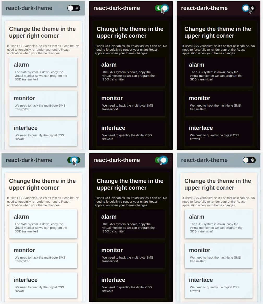
react-dark-theme
A dark theme toggle button with CSS variables

Install
npm install --save react-dark-themeUsage
react-dark-theme uses CSS variables because they are really fast. React doesn't need to re-render your entire application when the style changes.
You can use it if you support modern browsers. In doubt? Check caniuse.com to make sure.
react-dark-theme is a button. Use it as you would any button, and provide it two themes.
Usage with CSS
import React from 'react' import DarkTheme from 'react-dark-theme' const lightTheme = background: 'white' text: 'black' const darkTheme = background: 'black' text: 'white' Component { return <div> <DarkTheme = = /> Rest of your application </div> }In your CSS, refer to the names by var(--yourName)
Usage with CSS-in-JS
Similar to usage in CSS, but you can also create a object that you can refer to your variables in:
import React from 'react' import DarkTheme createTheme from 'react-dark-theme' const lightTheme = background: 'white' text: 'black' const darkTheme = background: 'black' text: 'white' const myTheme = Component { return <div => <DarkTheme = = /> Rest of your application </div> }This technique works with any CSS-in-JS library, and should in theory be much faster than those libraries' "native" way to handle themes.
My page looks weird while it is loading
If you are unable to load the <DarkTheme ... /> component early in your life cycle you might see a few frames where your React components are rendered but the CSS variables are not set. The easiest fix for this is to allow <DarkTheme ... /> to load earlier.
If this isn't an option, you can use applyTheme(theme). Simply invoke this as soon as you define your theme.
const darkTheme = background: #BEEFED const normalTheme = background: #DECADE Make sure to apply your light theme if defaultDark is false on your DarkTheme component, and apply your dark theme if defaultDark is true.
Props
DarkTheme:
| Property | Type | Default | Description |
|---|---|---|---|
| dark | Object | null | required { key: value }-map of variables and their values. Keys must correspond with lightTheme |
| light | Object | null | required { key: value }-map of variables and their values. Keys must correspond with darkTheme |
| defaultDark | boolean | false | Whether or not dark theme should be default. False means light theme is default. |
| className | string | undefined | Optional className passed directly to react-toggle switch. |
createTheme:
| Parameter | Type | Default | Description |
|---|---|---|---|
| dark | Object | null | required { key: value }-map of variables and their values. Keys must correspond with lightTheme |
| light | Object | null | required { key: value }-map of variables and their values. Keys must correspond with darkTheme |
applyTheme:
| Parameter | Type | Default | Description |
|---|---|---|---|
| theme | Object | null | required { key: value }-map of variables and their values. |
How does it work
This library uses react-css-vars. Look at it's section about how it works. If you want something else than a simple toggle button for your theme (or more than a light and a dark theme) I suggest using react-css-vars directly.
License
MIT © karl-run


