
react-css-vars 


A simple way to theme your React application using pure CSS variables.
Why
Because CSS variables are fast. React doesn't have to lift a finger when the style changes globally.
Can I use it
If you support modern browsers, you can use it!
Have a look at caniuse.com to make sure.
Does it work with styled-components/emotion/glamor/glamorous?
Yes. As long as the browser supports CSS variables, then you should be able to use var(--yourVariable) in any CSS-in-JS library.
Install
npm install react-css-varsor
yarn add react-css-varsBasic usage
Simply import ThemeSwitcher and use it anywhere in your application, providing it a theme map.
import React from 'react' import ThemeSwitcher from 'react-css-vars' const myTheme = myColor: 'red' Component { return <ThemeSwitcher = /> }In your CSS you can use these variables.
Props
ThemeSwitcher:
| Property | Type | Default | Description |
|---|---|---|---|
| theme | Object | null | required { key: value }-map of variables and their values |
| elementId | string | null | used to apply the variables to a different element that html. The element is only referenced on component mount, so it needs to be a static DOM-node that doesn't change (i.e. probably not a React-element). Common use-case is the #root node that most React-apps renders into. |
Careful with multiple instances
This project writes the CSS variables directly to the html element (see the "How does it work" section for more details). So if you have two or more ThemeSwitcher in your application they might work against eachother.
However, you may have it anywhere in your application, it does not need to wrap your application like typical Provider-pattern type solutions do. You can use ThemeSwitcher without providing any children as well.
Switching theme
To dynamically switch themes, simply provide a different theme as the theme-prop.
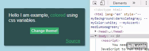
import React from 'react' import ThemeSwitcher from 'react-css-vars' const myFirstTheme = myColor: 'darkslategray' const coolTheme = myColor: 'yellow' state = basicTheme: true { this } { const basicTheme = thisstate return <ThemeSwitcher => <div> <div>Example</div> <button =>Change theme!</button> </div> </ThemeSwitcher> }This is just a basic example on how to switch themes. As long as the theme prop changes, the theme is going to be applied.
Overwriting CSS variables
If you would like to have your base theme in your CSS file, and only overwrite when the theme changes this is very simple.
In your CSS, provide your variables on the :root-pseudo-class
Then your switcher passes in null to the ThemeSwitcher when no theme is selected.
import React from 'react' import ThemeSwitcher from 'react-css-vars' // Only one theme here, the base theme is declared in the CSS-file.const coolTheme = myColor: 'yellow' state = basicTheme: true { this } { const basicTheme = thisstate return <ThemeSwitcher => <div> <div>Example</div> <button =>Change theme!</button> </div> </ThemeSwitcher> }For a full working example look at the example project.
How does it work
It's very simple! CSS variables are simply CSS properties that are assigned to a specific element. You can assign them to a psuedo-element known as :root like this:
This library simply takes a map of values that look like this:
const theme = myVariable: 'red'And simply sets them as CSS properties on the html element. Since this has higher precedence than the :root psuedo-element the browser will always select the programatically set values over the ones set on :root.
When the theme-prop changes, this library unsets the theme values that were previously set. If the theme-prop is set to null it will unset the previous values and not set any new ones. Any values on :root will then have the highest precedence again.
License
MIT © karl-run