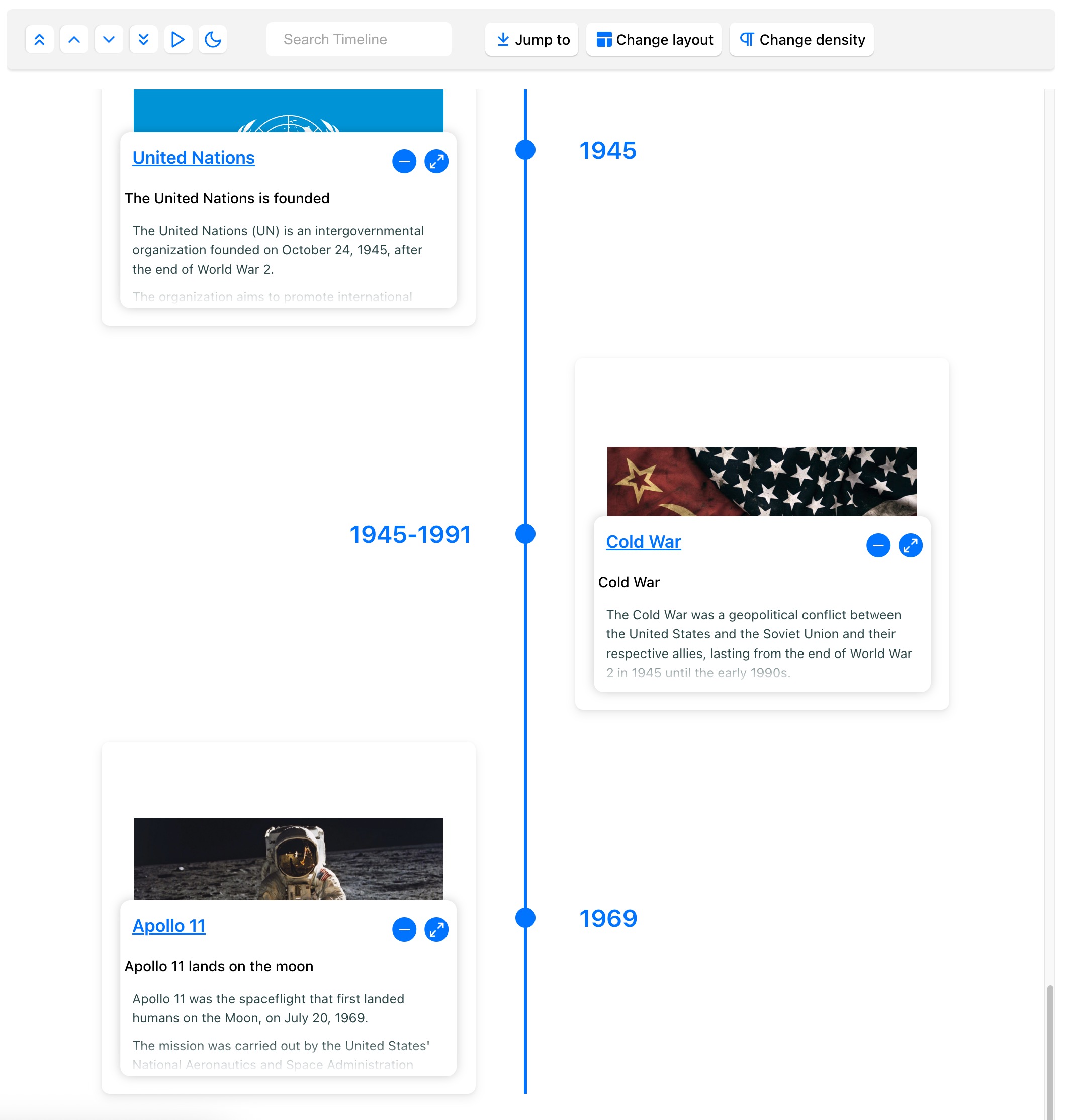
React Chrono is a modern timeline component for React that offers a variety of features and customization options. It allows you to render timelines in horizontal, vertical, and vertical-alternating modes, display images and videos, and much more.
- ✨ Features
- 💾 Installation
- 🚀 Getting Started
- ⚙️ Props
- 🎨 Customization
- 📦 Examples & Demos
- 🛠️ Build Setup
- 🧪 Tests
- 🤝 Contributing
- 🧱 Built With
- 💖 Support & Meta
- ✨ Contributors
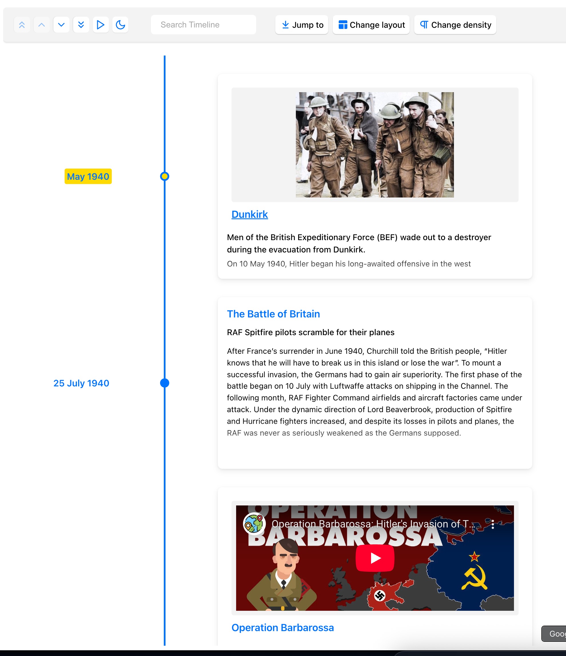
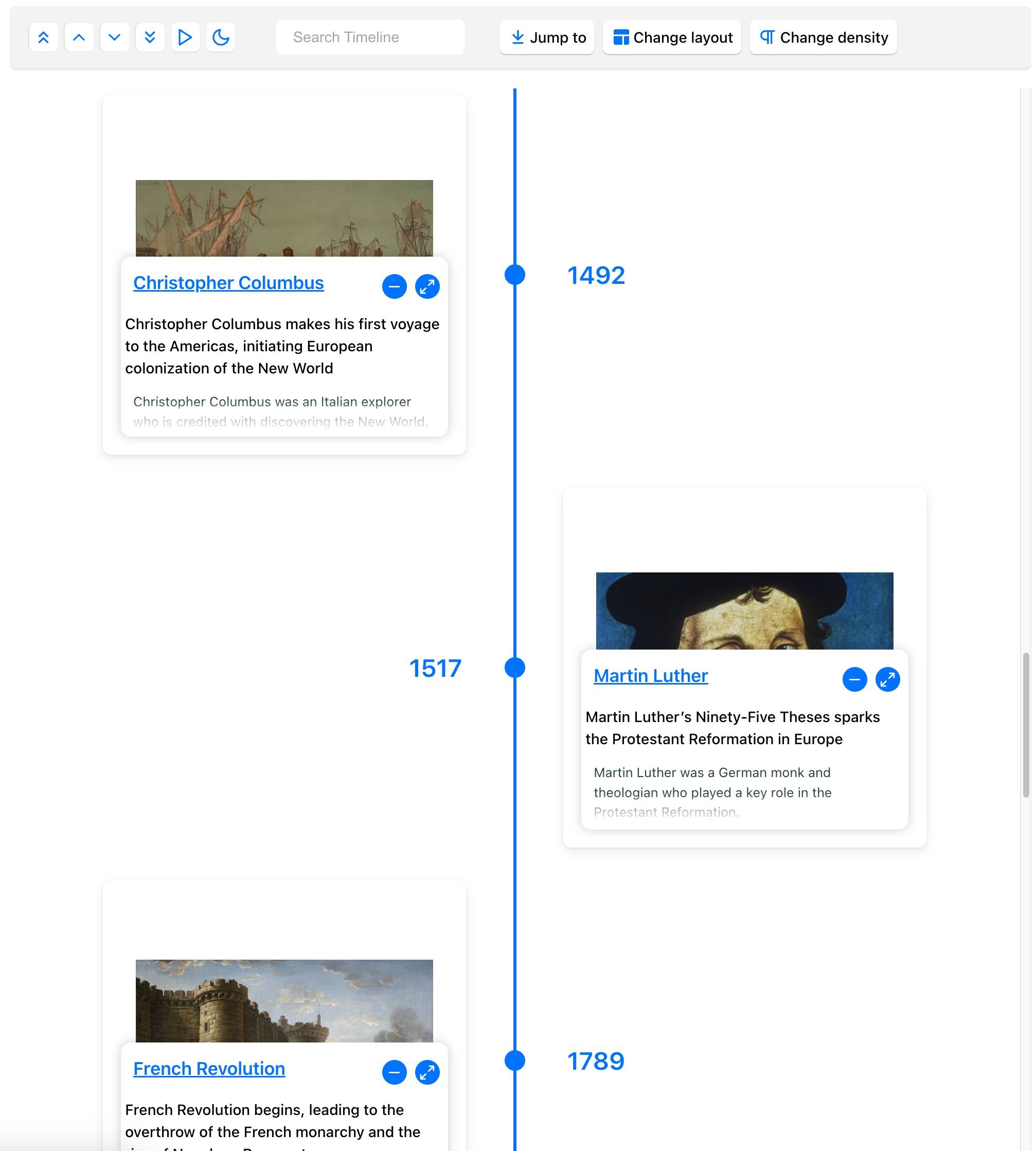
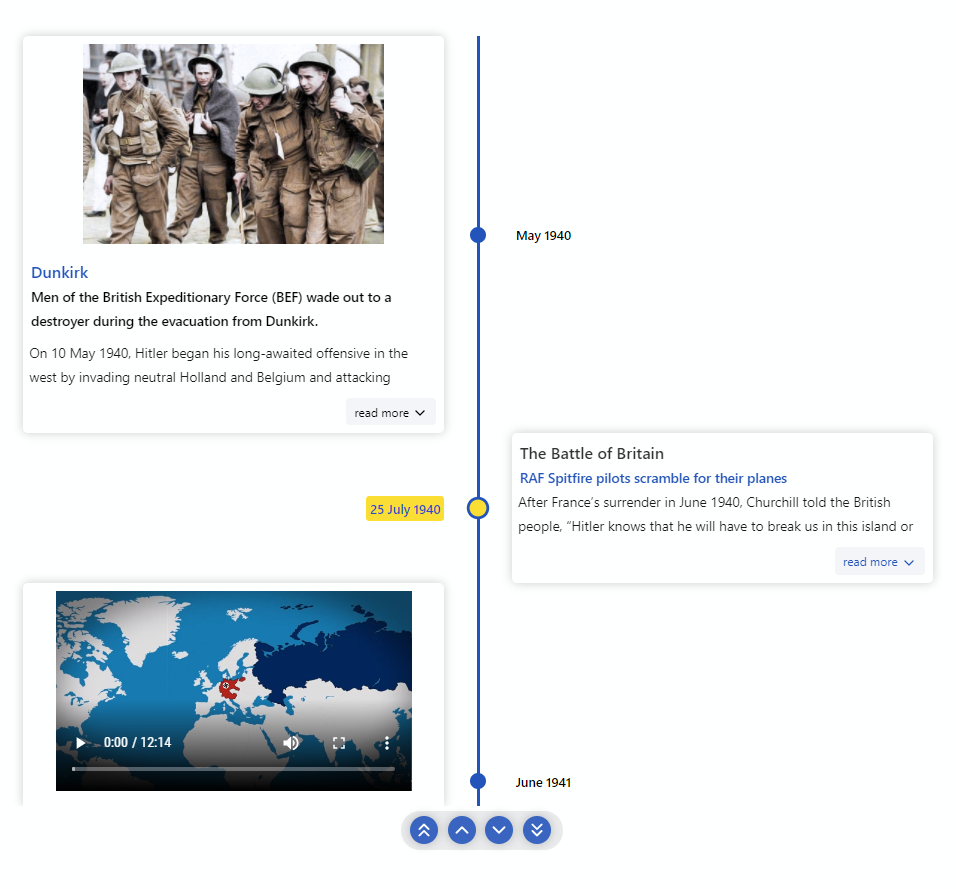
- 🚥 Multiple Modes: Render timelines in Horizontal, Vertical, or Vertical-Alternating layouts.
- 📺 Slideshow: Auto-play the timeline with slideshow functionality.
- 🖼️ Media Support: Easily display images and videos within timeline cards.
- ⌨️ Keyboard Accessible: Navigate the timeline using keyboard controls.
- 🔧 Custom Content: Render custom React components within timeline cards.
- 🌿 Nested Timelines: Display timelines within timeline cards for complex narratives.
- ⚡ Data-Driven API: Configure the timeline dynamically using a simple data structure.
- 🎨 Enhanced Theming: Comprehensive theme customization with 15+ new dark mode properties for complete visual control.
- 🌙 Advanced Dark Mode: Fully configurable dark mode with brand color integration and accessibility compliance.
- 🎭 Custom Icons: Use your own icons for timeline points.
- 💪 TypeScript: Built with TypeScript for robust development.
- 💅 Styled with Styled Component: Leverages Styled Component for flexible styling.
# Using yarn
yarn add react-chrono

# Using npm
npm install react-chronoEnsure you wrap the Chrono component in a container with a specified width and height.
By default, if no mode is specified, the component renders in HORIZONTAL mode.
import React from 'react';
import { Chrono } from 'react-chrono';

const App = () => {
  const items = [
    {
      title: 'May 1940',
      cardTitle: 'Dunkirk',
      url: 'http://www.history.com',
      cardSubtitle:
        'Men of the British Expeditionary Force (BEF) wade out to a destroyer...',
      cardDetailedText:
        'Men of the British Expeditionary Force (BEF) wade out to a destroyer during the evacuation from Dunkirk.',
      media: {
        type: 'IMAGE',
        source: {
          url: 'http://someurl/image.jpg',
        },
      },
    },
    // ... more items
  ];

  return (
    <div style={{ width: '800px', height: '400px' }}>
      <Chrono items={items} />
    </div>
  );
};

export default App;To render the timeline vertically, set the mode prop to VERTICAL.
<div style={{ width: '300px', height: '950px' }}>
  <Chrono items={items} mode="VERTICAL" />
</div>For a layout where cards alternate sides, use VERTICAL_ALTERNATING.
<div style={{ width: '500px', height: '950px' }}>
  <Chrono items={items} mode="VERTICAL_ALTERNATING" />
</div>React Chrono offers a wide range of props for customization.
| Name | Type | Default | Description |
|---|---|---|---|
items |
TimelineItemModel[] |
[] |
An array of Timeline Item objects to display. |
mode |
'HORIZONTAL', 'VERTICAL', 'VERTICAL_ALTERNATING'
|
'HORIZONTAL' |
Sets the layout mode of the timeline. Changed to HORIZONTAL from VERTICAL_ALTERNATING for new projects. |
theme |
Theme |
{...} |
Enhanced theming with 15+ new dark mode properties for complete visual customization. See Theming & Styling for details. |
Each object in the items array can have the following properties:
| Property | Type | Description |
|---|---|---|
title |
string |
Title of the timeline item (often a date or short label). |
cardTitle |
string |
Title displayed on the timeline card. |
cardSubtitle |
string |
Subtitle text displayed on the timeline card. |
cardDetailedText |
string or string[]
|
Detailed text for the card. An array of strings will render each string as a separate paragraph. |
media |
TimelineMediaModel |
Object to configure image or video display. See Media Handling. |
url |
string |
URL associated with the timeline item's title. Clicking the title will navigate to this URL. |
date |
Date or string
|
Date to be used in the title. If provided, this will override the title property for display purposes. |
timelineContent |
ReactNode |
Custom React content to render inside the card. Overrides cardDetailedText. See Rendering Custom Content. |
items |
TimelineItemModel[] |
Array of timeline items for creating Nested Timelines. |
hasNestedItems |
boolean |
New: Automatically set to indicate if this item contains nested sub-items. Used internally for optimized rendering. |
active |
boolean |
If true, this item will be initially active (only for the first matching item). |
id |
string |
A unique identifier for the timeline item. |
visible |
boolean |
Controls the visibility of the timeline item. |
Example TimelineItemModel:
{
  title: "May 1940",
  cardTitle: "Dunkirk",
  cardSubtitle: "Evacuation of Allied soldiers from the beaches and harbour of Dunkirk, France.",
  cardDetailedText: ["Paragraph one about Dunkirk.", "Paragraph two providing more details."],
  media: {
    type: "IMAGE", // "VIDEO"
    source: {
      url: "http://someurl/dunkirk.jpg"
    },
    name: "Dunkirk Evacuation"
  },
  url: "https://en.wikipedia.org/wiki/Dunkirk_evacuation",
  // For nested timeline:
  // items: [{ cardTitle: 'Sub-event 1' }, { cardTitle: 'Sub-event 2' }]
}| Name | Type | Default | Description |
|---|---|---|---|
activeItemIndex |
number |
0 |
Index of the timeline item to be active on load. |
disableNavOnKey |
boolean |
false |
Disables keyboard navigation (LEFT/RIGHT for Horizontal, UP/DOWN for Vertical). |
disableClickOnCircle |
boolean |
false |
Disables click action on timeline points/circles. |
disableAutoScrollOnClick |
boolean |
false |
Prevents auto-scrolling to the active card when a timeline card or point is clicked. |
onItemSelected |
function |
Callback function invoked when a timeline item is selected. Passes item data and index. | |
onScrollEnd |
function |
Callback function invoked when the end of the timeline is reached during scrolling. | |
focusActiveItemOnLoad |
boolean |
false |
Automatically scrolls to and focuses on the activeItemIndex when the timeline loads. |
disableInteraction |
boolean |
false |
Disables all user interactions with the timeline (clicks, keyboard navigation). |
enableQuickJump |
boolean |
true |
Allows quick jumping to a timeline item via controls (if toolbar is enabled). |
useReadMore |
boolean |
true |
Enables a "read more" button if card content exceeds available space. Set to false to always show all text. |
Semantic Tags Configuration:
| Name | Type | Default | Description |
|---|---|---|---|
semanticTags |
SemanticTagsConfig |
Configure semantic HTML tags for card elements to improve accessibility and SEO. |
The semanticTags object allows you to specify HTML tags for card elements:
interface SemanticTagsConfig {
  cardTitle?: 'h1' | 'h2' | 'h3' | 'h4' | 'h5' | 'h6' | 'span' | 'div';
  cardSubtitle?: 'h1' | 'h2' | 'h3' | 'h4' | 'h5' | 'h6' | 'span' | 'div';
}
Example:
<Chrono
  items={items}
  semanticTags={{
    cardTitle: 'h2',
    cardSubtitle: 'h3',
  }}
/>
Keyboard Navigation:
- Horizontal Mode: Use LEFT and RIGHT arrow keys.
- Vertical/Vertical Alternating Mode: Use UP and DOWN arrow keys.
- HOME: Jump to the first item.
- END: Jump to the last item.
| Name | Type | Default | Description |
|---|---|---|---|
cardHeight |
number |
200 |
Minimum height (in pixels) of timeline cards. |
cardWidth |
number |
450 |
Maximum width (in pixels) of timeline cards. |
itemWidth |
number |
200 |
Width (in pixels) of each timeline section in HORIZONTAL mode. |
contentDetailsHeight |
number |
150 |
Height (in pixels) of the detailed content area within a card if cardDetailedText is used. |
lineWidth |
number |
3 |
Width (in pixels) of the main timeline track line. |
timelinePointDimension |
number |
16 |
Diameter (in pixels) of the circular points on the timeline. |
nestedCardHeight |
number |
150 |
Height (in pixels) of cards within a nested timeline. |
scrollable |
boolean or { scrollbar: boolean }
|
{ scrollbar: false } |
Makes VERTICAL and VERTICAL_ALTERNATING modes scrollable. Set to { scrollbar: true } to show the scrollbar. |
enableBreakPoint |
boolean |
true |
If true, VERTICAL_ALTERNATING mode automatically switches to VERTICAL mode when responsiveBreakPoint is reached. |
responsiveBreakPoint |
number |
768 |
Viewport width (in pixels) at which VERTICAL_ALTERNATING mode switches to VERTICAL if enableBreakPoint is true. |
cardPositionHorizontal |
'TOP' or 'BOTTOM'
|
Positions the card above or below the timeline in HORIZONTAL mode. |
|
flipLayout |
boolean |
false |
Reverses the layout direction (e.g., Right-to-Left for horizontal, or swaps sides for vertical alternating). |
showAllCardsHorizontal |
boolean |
false |
In HORIZONTAL mode, displays all cards simultaneously instead of only the active one. |
The media object within a Timeline Item configures images or videos.
media Property |
Type | Description |
|---|---|---|
type |
'IMAGE' or 'VIDEO'
|
Specifies the type of media. |
source |
{ url: string, type?: string } |
url: URL of the image or video. type (for video): e.g., 'mp4', 'webm'. |
name |
string |
Alt text for images or a descriptive name for videos. |
active |
boolean |
(Video only) If true, video will attempt to play when its card becomes active. |
id |
string |
A unique ID for the media element. |
Image Example:
media: {
  type: "IMAGE",
  name: "dunkirk beach",
  source: {
    url: "http://someurl/image.jpg"
  }
}
Video Example (auto-plays when active, muted):
media: {
  type: "VIDEO",
  name: "Pearl Harbor",
  source: {
    url: "/pearl-harbor.mp4", // or "https://www.youtube.com/embed/f6cz9gtMTeI"
    type: "mp4" // Optional for local files if extension is clear, useful for YouTube embeds
  }
}
Media Settings Prop (mediaSettings):
This top-level prop on <Chrono> controls global media display:
| Name | Type | Default | Description |
|---|---|---|---|
align |
'left', 'right', 'center'
|
'left' |
Alignment of media within the card. |
fit |
'cover', 'contain', 'fill', 'none', 'scale-down'
|
'cover' |
CSS object-fit property for images. |
<Chrono items={items} mediaSettings={{ align: 'right', fit: 'contain' }} />| Name | Type | Default | Description |
|---|---|---|---|
borderLessCards |
boolean |
false |
Removes borders and shadows from timeline cards for a flatter look. |
cardLess |
boolean |
false |
Hides timeline cards, showing only titles/points. Useful for a very compact timeline. |
disableTimelinePoint |
boolean |
false |
Hides the circular points on the timeline track. |
timelinePointShape |
'circle', 'square', 'diamond'
|
'circle' |
Configures the shape of the points on the timeline. |
textOverlay |
boolean |
false |
Displays text content as an overlay on top of media elements. Requires text property in timeline items. |
parseDetailsAsHTML |
boolean |
false |
If true, cardDetailedText will be parsed as HTML. Use with caution due to XSS risks if content is user-supplied. |
titleDateFormat |
string |
'MMM DD, YYYY' |
Date format for item titles when using the date property in items. Supports all day.js formats. |
textDensity |
'LOW' or 'HIGH'
|
'HIGH' |
Configures the amount of text displayed in cards. 'LOW' might truncate more aggressively. |
Text Overlay Mode:
Enable textOverlay and provide a text property in your items.
const items = [
  {
    title: 'First item',
    media: { type: 'IMAGE', source: { url: 'https://example.com/image.jpg' } },
    text: 'This is the caption for the first item, appearing over the image.',
  },
];
<Chrono items={items} textOverlay />;| Name | Type | Description |
|---|---|---|
cardBgColor |
string |
Background color for timeline cards |
cardDetailsBackGround |
string |
Background color for card details section |
cardDetailsColor |
string |
Text color for card details |
cardMediaBgColor |
string |
Background color for media section in cards |
cardSubtitleColor |
string |
Color for card subtitles |
cardTitleColor |
string |
Color for card titles |
detailsColor |
string |
Color for detailed text |
iconBackgroundColor |
string |
Background color for timeline icons |
nestedCardBgColor |
string |
Background color for nested timeline cards |
nestedCardDetailsBackGround |
string |
Background color for nested card details section |
nestedCardDetailsColor |
string |
Text color for nested card details |
nestedCardSubtitleColor |
string |
Color for nested card subtitles |
nestedCardTitleColor |
string |
Color for nested card titles |
primary |
string |
Primary color for the timeline |
secondary |
string |
Secondary color for the timeline |
textColor |
string |
Default text color |
titleColor |
string |
Color for timeline titles |
titleColorActive |
string |
Color for active timeline titles |
toolbarBgColor |
string |
Background color for the toolbar |
toolbarBtnBgColor |
string |
Background color for toolbar buttons |
toolbarTextColor |
string |
Text color for toolbar elements |
timelineBgColor |
string |
Background color for the timeline |
| Name | Type | Description |
|---|---|---|
iconColor |
string |
Color for icons in dark mode |
buttonHoverBgColor |
string |
Background color for buttons on hover |
buttonActiveBgColor |
string |
Background color for active buttons |
buttonActiveIconColor |
string |
Icon color for active buttons |
buttonBorderColor |
string |
Border color for buttons |
buttonHoverBorderColor |
string |
Border color for buttons on hover |
buttonActiveBorderColor |
string |
Border color for active buttons |
shadowColor |
string |
Color for shadows and depth effects |
glowColor |
string |
Color for glow effects and focus states |
searchHighlightColor |
string |
Color for search result highlighting |
darkToggleActiveBgColor |
string |
Background color when dark mode toggle is active |
darkToggleActiveIconColor |
string |
Icon color when dark mode toggle is active |
darkToggleActiveBorderColor |
string |
Border color when dark mode toggle is active |
darkToggleGlowColor |
string |
Glow effect color for dark mode toggle |
Brand Color Integration:
const customDarkTheme = {
  // Base colors
  cardBgColor: '#2d3748',
  toolbarBgColor: '#1a202c',
  toolbarBtnBgColor: '#4a5568',

  // Enhanced dark mode properties
  iconColor: '#63b3ed', // Bright blue for icons
  buttonHoverBgColor: '#718096', // Gray hover
  buttonActiveBgColor: '#ed8936', // Orange active state
  buttonActiveIconColor: '#1a202c', // Dark icon on orange

  // Borders and effects
  buttonBorderColor: 'rgba(255, 255, 255, 0.2)',
  buttonHoverBorderColor: '#63b3ed',
  shadowColor: 'rgba(0, 0, 0, 0.6)',
  glowColor: 'rgba(237, 137, 54, 0.4)',

  // Search and dark toggle
  searchHighlightColor: 'rgba(99, 179, 237, 0.3)',
  darkToggleActiveBgColor: '#2b6cb0',
  darkToggleActiveIconColor: '#f7fafc',
};

<Chrono items={items} theme={customDarkTheme} enableDarkToggle />;
High Contrast Theme:
const highContrastTheme = {
  cardBgColor: '#000000',
  toolbarBgColor: '#111111',
  iconColor: '#00ff00', // Bright green for accessibility
  buttonActiveBgColor: '#ffff00', // Bright yellow
  buttonBorderColor: 'rgba(255, 255, 255, 0.5)',
  shadowColor: 'rgba(0, 0, 0, 0.8)',
  searchHighlightColor: 'rgba(0, 255, 0, 0.5)',
};
🔧 Complete Theme Reference: For a complete list of all themeable properties, refer to the
Themetype definition in the source code or explore the Storybook examples.
♿ Accessibility: All default colors maintain WCAG AA compliance (4.5:1 contrast ratio). When customizing themes, ensure sufficient contrast ratios for accessibility.
Dark Mode Toggle:
| Name | Type | Default | Description |
|---|---|---|---|
enableDarkToggle |
boolean |
false |
Adds a toggle switch to the toolbar for enabling dark mode (if dark theme is configured). |
onThemeChange |
function |
Callback invoked when the theme changes, e.g., via the dark mode toggle. Passes the new theme object. |
| Name | Type | Default | Description |
|---|---|---|---|
slideShow |
boolean |
false |
Enables slideshow mode and shows play/pause controls in the toolbar. |
slideItemDuration |
number |
2500 |
Duration (in milliseconds) each timeline item remains active during a slideshow. |
slideShowType |
'reveal', 'slide_from_sides', 'slide_in'
|
Varies by mode
|
Type of animation for slideshow transitions. Defaults: VERTICAL -> 'reveal', VERTICAL_ALTERNATING -> 'slide_from_sides', HORIZONTAL -> 'slide_in'. |
showOverallSlideshowProgress |
boolean |
true (when slideShow is enabled) |
Shows a line-based progress bar at the top of the screen during slideshow mode, indicating overall progress across all timeline items. |
<Chrono
  items={items}
  slideShow
  slideItemDuration={3000}
  showOverallSlideshowProgress={true}
/>
Slideshow can be stopped by clicking the stop button or pressing ESC. The overall progress bar shows the global progress across all timeline items and can be disabled by setting
showOverallSlideshowProgress={false}.
| Name | Type | Default | Description |
|---|---|---|---|
searchPlaceholder |
string |
"Search..." |
Placeholder text for the search input in the toolbar. |
searchAriaLabel |
string |
"Search timeline" |
ARIA label for the search input for accessibility. |
clearSearch |
string |
"Clear search" |
Text/ARIA label for the clear search button. |
<Chrono items={data} searchPlaceholder="Find in timeline..." />Search functionality is part of the toolbar. To hide search (and the toolbar), set
disableToolbar={true}.
| Name | Type | Default | Description |
|---|---|---|---|
allowDynamicUpdate |
boolean |
false |
Enables dynamic updates of timeline items. If true, changes to the items prop will re-render the timeline. |
noUniqueId |
boolean |
false |
Prevents generating a unique ID for the timeline wrapper. Use with uniqueId if you need to set a specific ID. |
uniqueId |
string |
Sets a custom unique ID for the timeline wrapper. Useful with noUniqueId={true}. |
|
disableToolbar |
boolean |
false |
Hides the entire toolbar/control panel. |
toolbarPosition |
'top' or 'bottom'
|
'top' |
Positions the toolbar at the top or bottom of the timeline. |
highlightCardsOnHover |
boolean |
false |
Highlights timeline cards on mouse hover. |
Pass React elements as children to <Chrono>. Each child will be rendered into a timeline card. This can be combined with the items prop to provide titles or other metadata.
const customItems = [
  { title: '2023-01-01', cardTitle: 'Event One' },
  { title: '2023-02-15', cardTitle: 'Event Two' },
];

<Chrono mode="VERTICAL" items={customItems}>
  <div>
    <h4>Custom Content for Event One</h4>
    <p>This is fully custom JSX rendered in the first card.</p>
  </div>
  <div>
    <img src="<url_to_image>" alt="Custom Image" style={{ width: '100%' }} />
    <p>An image in the second card.</p>
  </div>
</Chrono>;Provide images for timeline points by wrapping them in a div with className="chrono-icons" as a child of <Chrono>. Icons are applied sequentially.
<Chrono items={items} mode="VERTICAL_ALTERNATING">
  {/* Custom content for cards (optional) */}
  <div>Card 1 Content</div>
  <div>Card 2 Content</div>

  {/* Custom icons for timeline points */}
  <div className="chrono-icons">
    <img src="image1.svg" alt="icon1" />
    <img src="image2.svg" alt="icon2" />
    {/* Add more images for more items */}
  </div>
</Chrono>Create timelines within timeline cards by providing an items array within a parent timeline item.
const itemsWithNested = [
  {
    title: 'Main Event 1',
    cardTitle: 'Chapter 1',
    items: [
      // Nested timeline
      { cardTitle: 'Sub-event 1.1', cardSubtitle: 'Details for 1.1' },
      {
        cardTitle: 'Sub-event 1.2',
        media: { type: 'IMAGE', source: { url: '...' } },
      },
    ],
  },
  { title: 'Main Event 2', cardTitle: 'Chapter 2' },
];

<Chrono mode="VERTICAL" items={itemsWithNested} nestedCardHeight={120} />;Apply your own CSS classes to various parts of the timeline using the classNames prop.
<Chrono
  items={items}
  classNames={{
    card: 'my-custom-card',
    cardMedia: 'my-card-media',
    cardSubTitle: 'my-card-subtitle',
    cardText: 'my-card-text',
    cardTitle: 'my-card-title',
    controls: 'my-timeline-controls', // Class for the toolbar
    title: 'my-timeline-title', // Class for the item titles (e.g., dates)
    timelinePoint: 'my-timeline-point',
    timelineTrack: 'my-timeline-track',
  }}
/>Adjust font sizes for card elements using the fontSizes prop.
<Chrono
  items={items}
  fontSizes={{
    cardSubtitle: '0.85rem',
    cardText: '1rem',
    cardTitle: '1.25rem',
    title: '1.5rem',
  }}
/>Customize button text and accessibility labels:
<Chrono
  items={items}
  buttonTexts={{
    first: 'Go to Beginning',
    last: 'Go to End',
    next: 'Next Event',
    previous: 'Previous Event',
    play: 'Start Auto-play',
    stop: 'Stop Auto-play',
  }}
/>Interactive component documentation
# Clone the repository
git clone https://github.com/prabhuignoto/react-chrono.git
cd react-chrono

# Install dependencies
pnpm install

# Start development server
pnpm run dev

# Build for production
pnpm run build

# Run tests
pnpm testThe project uses Vitest for testing with comprehensive coverage:
# Run all tests
pnpm test

# Run tests in watch mode
pnpm test:watch

# Generate coverage report
pnpm test:coverageContributions are welcome! Please read our Contributing Guide for details on our code of conduct and the process for submitting pull requests.
- React - The web framework used
- TypeScript - For type safety
- Styled Components - For styling
- FocusTrap - For accessibility
- Rollup - For bundling
- Star this repo on GitHub
- Follow the author on Twitter
- Create issues for bug reports and feature requests
- Contribute to make this library better
Thanks goes to these wonderful people (emoji key):

