react-button-component
A simple react button component based on styled-components with basic styles. Great when you want a quick button that looks neat enough and is yet, customizable to the heart!

Installation
yarn add react-button-componentUsage
To use the Button component, simply import it into your project, and use it just like any other component!
The base component
By default, the button has some base styles applied to make it look clean!
;; { return <div className="App"> <Button onClick= > Hop in! </Button> </div> ; } ;Result:
Easily extend and overwrite with styled-components
The button component is styled using styled-components library, which means you the Button component is in fact, a Styled component! Now you can use Button.extend to extend the styles till your heart is content! For example, we can modify the default component in the above file to have a custom style matching a particular theme:
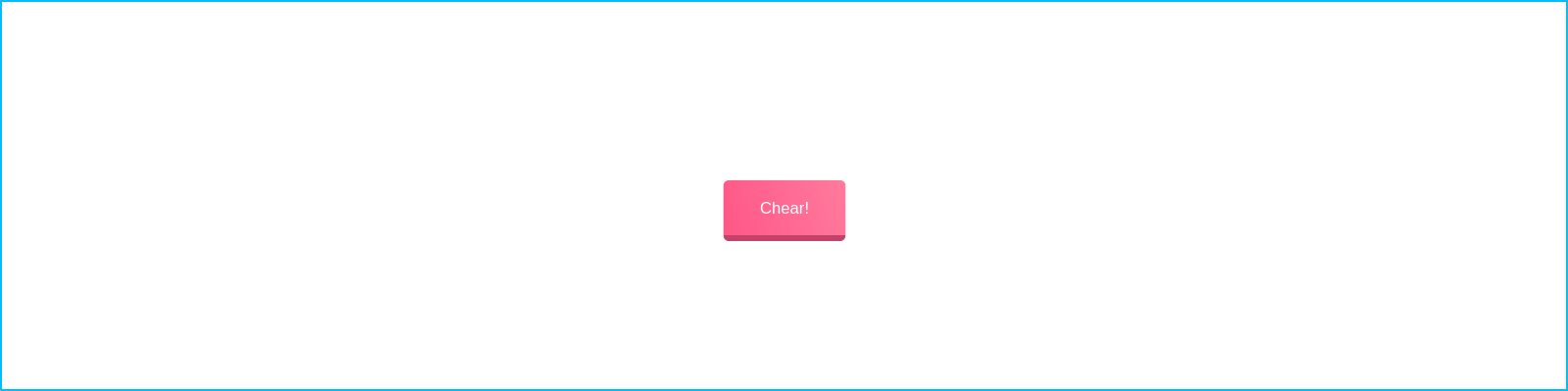
;;;; const CustomizedButton = Buttonextend` color: #FFF; border: none; border-radius: 5px; background: linear-gradient(70deg, #FF5686, #FF7B9E); border-bottom: 5px solid #C44267;` { return <div className="App"> <CustomizedButton onClick= > Chearful! </CustomizedButton> </div> ; } ;Result:
Created by
buoyantair
License
MIT