
Demo
Installation:
npm install --save react-animated-modalUsage
;; Component state = showModal: false ; { return <div> <Modal visible=thisstateshowModal closemodal= this type="flipInX" > Some text or JSX inside modal goes here... </Modal> <div onClick= this> Open Modal </div> </div> ; }Accepted props
| Prop name | Type | Accepted values |
|---|---|---|
| closemodal() (required) | function | -- |
| visible (required) | boolean | true / false |
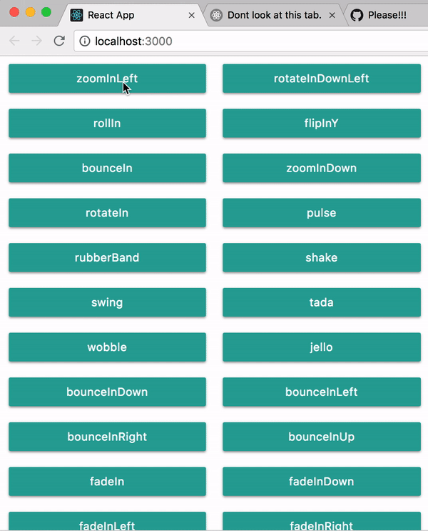
| type | enum | pulse, rubberBand, shake, swing, tada, wobble, jello, bounceIn, bounceInDown, bounceInLeft, bounceInRight, bounceInUp, fadeIn, fadeInDown, fadeInLeft, fadeInRight, fadeInUp, flip, flipInX, flipInY, lightSpeedIn, rotateIn, rotateInDownLeft, rotateInDownRight, rotateInUpLeft, rotateInUpRight, slideInUp, slideInDown, slideInLeft, slideInRight, zoomIn, zoomInDown, zoomInLeft, zoomInRight, zoomInUp, hinge, jackInTheBox, rollIn, bounce, flash |
I will be adding more props soon. All PRs are welcome!
Cheers!!!