react-admonitions
An admonitions React component, ported from remarkable-admonitions. Perfect for Docusaurus v2 and other React-based doc generators.


TL;DR Nice-looking hints, warnings, etc. specifically targeted toward Docusaurus docs websites.
Test the component out on Stackblitz, or view the demo
Install
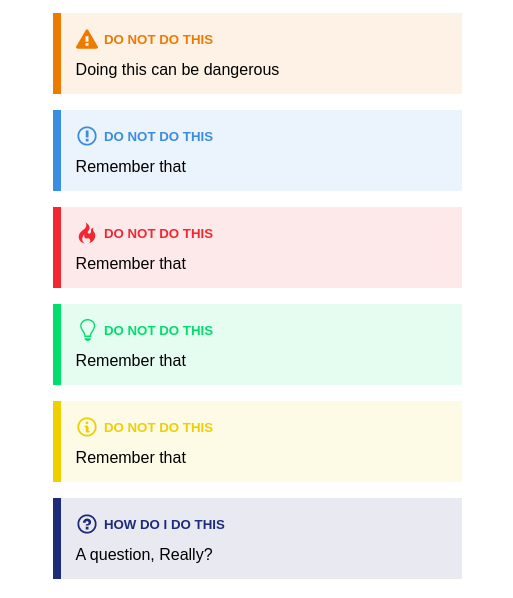
npm install --save react-admonitionsScreenshots
Usage
import React Component from 'react' import Admonition from 'react-admonitions' { return <Admonition ="warning" ="Do not do this"> Admonition Content </Admonition> }Props
| Name | Default | Description |
|---|---|---|
type |
none | What type of admonition you want to display. Valid options: "warning", "tip", "caution", "note", "important", "question" |
iconType |
"svg" |
The type of admonition icon. Valid options: "svg", "emoji" |
title |
none | The, well, title of the admonition |
Credits
HTML, styles, and concept all come from the amazing Markdown plugin by @favoloso, remarkable-admonitions.
License
MIT © nebrelbug