project-badge
Create fancy badges for your projects in plain JS.
Usage
In the browser
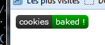
Download badge.js, and start having fun with badges !
Et voilà, a shiny custom badge in just two lines of code and 3 config parameters.
In node
This module is available as an npm package npm install project-package
You should check out node-canvas which provides a compatible canvas API in node.
Actually, it's what's being used in node-project-badge to provide a CLI badge generator.
One badge for every thing
Progress:
var myBadge = text: 'baking' progress: 32;
Common usage: code coverage
var myBadge = text: 'baking time' info: '12\'30';
Common usage: package verison, date of last build
var myBadge = text: 'taste' status: true successText: 'yummy' failureText: 'yuck !' unknownText: 'what ?';myBadge;myBadgestatus = false;myBadge;myBadgestatus = null;myBadge;
Common usage: build: passing/failure
API Reference
badge.config(conf)
Use this function to set global configuration settings. Available settings are:
'color-success': '#0a0''color-failure': '#a00''color-unknown': '#aaa''color-warning': '#880''color-info': '#3BC2EB''color-background': '#444''color-text': '#fff' 'font': '11px Verdana' # the same font for all texts 'border-radius': 5 # like css border-radius 'padding': 5 # x padding for the text 'text-height': 14 # text position, y-axis 'width': 50 # default width 'height': 20 # default height badge.Boolean
A badge that can take two states (namely 'failure' and 'success') depending on the value of 'status'
Parameters
text(String): the text shown on the left hand side of the badgestatus(true/false): defines the state the badge is insuccessText(String): text shown on the right side of the badge in case of successfailureText(String): text shown on the right side of the badge in case of failureunknownText(String): text shown on the right side of the badge in case the status is nullstatusText: (String): text shown on the right side of the badge regardless of the state statusText has precedence over (failure|success)Text
Typical use cases
- Show the result of a build in a CI environment (à la Travis-ci)
badge.Info
A badge that shows a single information as a key-value pair
Parameters
text(String): the text shown on the left hand side of the badge (key)info(String): the text shown on the right hand side of the badge (value)
Typical use cases
- Show the current version of a package
- Show the date of last build (useful when shown together with a build status badge)
badge.Progress
A badge that shows a real value bounded between a minimum and a maximum.
The badge is color coded to indicate wether the value is in the "bad", "warning"
or "good" interval (defined by the bounds parameter).
Parameters
text(String): the text shown on the left hand side of the badge (key)progress(Number): the real value to show ranging from 0 to 100progressText(String): the text shown on the right hand side of the badge (value)unit(String): a string appended to the progressText (default: '%')bounds(Array): two values that delimit the bad, warning and good zones (default: [40, 80])
Typical use cases
- Show code coverage (it was designed specifically for this use).
- Show any bounded continuous value.
badge.Badge
Base class for any badge class. You may create a badge of type badge directly but it won't generally be of great use.
It defines the badge public interface and handles the rendering pipeline.
Public API
The public API is defined by the parent class Badge and should not be overriden.
constructor(params: {key: value})
Constructs a badge and applies all parameters to this instancebadge.[param]
All parameters are directly accessible on the badge's instance. For instance:// All badges drawn with this instance will now use the text 'build'badgetext = 'build';renderTo(ctx: RenderingContext [, x: Number] [, y: Number]) -> void
Renders the badge on the provided rendering context at position (x, y). Is rendered at (0,0) by default.measure(ctx: RenderingContext) -> Dimentions
measures the width and height the badge will occupy. Base implementation measures the width taken bytextand two margins and returns the configured heightDimentions = {w: Number, h: Number}
Format used to represent badge dimentions
Rendering pipeline
The following methods are called in this order and may be overriden to implement custom graphics:
drawBorder(ctx: RenderingContext, dimentions: Dimentions) -> void
begins and constructs a path that defines the badge's borders (does not close nor draw it)drawBackground(ctx: DrawingContext, dimentions: Dimentions) -> void
draws the badge's backgrounddrawBackgroundEffects(ctx: DrawingContext, dimentions: Dimentions) -> void
applies effects once the background was drawndrawForeground(ctx: DrawingContext, dimentions: Dimentions) -> void
draws the badge's foregrounddrawForegroundEffects(ctx: DrawingContext, dimentions: Dimentions) -> void
applies effects once the foreground was drawn
To implement custom measurments, override doMeasure
doMeasure(ctx: RenderingContext) -> Dimentions
Actually performs the measure
Parameters
The following parameters are assumed to be necessary for any class implementing a badge
text(String): default text shown in the badge, left aligned
Changelog
0.2.0 -- Mar 19, 2017
- Add "unknown" status badge (thanks @tforgione)
- Add npm task to build the lib with grunt
0.1.0 -- Oct 19, 2014
- Initial project-badge release