


A lightweight plugin to display a modern checkbox.
- highly customizable
- very easy to implement
$ npm i ngx-i24-checkbox
import { NgxCheckboxModule } from 'ngx-i24-checkbox';
@NgModule({
  declarations: [ AppComponent ],
  imports: [BrowserModule, NgxCheckboxModule ],
  bootstrap: [AppComponent]
})
export class AppModule { }import { Component } from '@angular/core';
@Component({
selector: 'app-root',
templateUrl: './app.component.html',
styleUrls: ['./app.component.scss']
})
export class AppComponent {
} <ngx-checkbox></ngx-checkbox>
<!-- Or you can simply use directive -->
<!-- Note: type should be `checkbox` -->
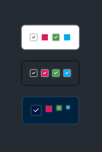
<input NgxCheckbox type="checkbox" />| Property (Type) | Default | Description |
|---|---|---|
| color | '#3c3c3c' | The color of check |
| backColor | '#fff' | The background of checkbox |
| borderColor | '#c6c6c6' | The border color |
| shadow | '0px 0px 4px 1px #6c6c6c' | The shadow of the checkbox |
| cWidth | '20px' | The width of the checkbox |
| cHeight | '20px' | The height of the checkbox |
| checkWidth | '6px' | The width of the checkbox signal |
| checkHeight | '10px' | The height of the checkbox signal |
| value | true | The default value |
-
checkedChanged- triggered on change the value
| Name | Link | Description |
|---|---|---|
| ngx-i24-circular-progress | Link | A lightweight plugin to render a simple, animated circular progress bar. |
| ngx-i24-progress-bar | Link | A lightweight plugin to render a simple, animated progress bar. |
| ngx-weekday-picker | Link | Lightweight plugin to a pick weekday. |
| ngx-i24-color-picker | Link | A lightweight plugin to pick a color. |
| ngx-i24-checkbox | Link | A lightweight plugin to display a modern checkbox. |

Copyright (c) 2022 Yaseen Alrefaee, contributors. Released under the MIT