
Compatibility:
Validation with google-libphonenumber
| ngx-dialer-input | Angular | ngx-bootstrap |
|---|---|---|
| 16.x.x | 16 | >= 11.0.2 |
| 17.x.x | 17 | >= 11.0.2 |
| 18.x.x | 18 | >= 18.0.0 |
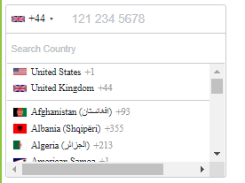
View example
$ npm install intl-tel-input --save
$ npm install google-libphonenumber --save
$ ng add ngx-bootstrap
Further, Angular CLI should tree-shake the rest of Ngx-Boostrap away if you don't utilize other dependencies from the bootstrap package. This should keep this dependency a lean feature-add
Add 'intl-tel-input' style file:
./node_modules/intl-tel-input/build/css/intlTelInput.css
to angular.json styles array:
"styles": [
  "./node_modules/intl-tel-input/build/css/intlTelInput.css",
  "src/styles.css"
],
$ npm install ngx-dialer-input
Add NgxDialerInputModule to your module file:
import { NgxDialerInputModule } from 'ngx-dialer-input';
imports: [NgxDialerInputModule];import { Component } from '@angular/core';
import { CountryISO, PhoneNumberFormat, SearchCountryField } from 'ngx-dialer-input';
@Component({
selector: 'app-root',
templateUrl: './app.component.html',
styleUrls: ['./app.component.css']
})
export class AppComponent {
title = 'test';
separateDialCode = true;
SearchCountryField = SearchCountryField;
CountryISO = CountryISO;
PhoneNumberFormat = PhoneNumberFormat;
preferredCountries: CountryISO[] = [CountryISO.UnitedStates, CountryISO.UnitedKingdom];
}<form [formGroup]="phoneForm">
<ngx-dialer-input
[cssClass]="'custom'"
[preferredCountries]="[CountryISO.UnitedStates, CountryISO.UnitedKingdom]"
[enableAutoCountrySelect]="false"
[enablePlaceholder]="true"
[searchCountryFlag]="true"
[searchCountryField]="[SearchCountryField.Iso2, SearchCountryField.Name]"
[selectFirstCountry]="false"
[selectedCountryISO]="CountryISO.India"
[maxLength]="15"
[phoneValidation]="true"
[inputId]="my-input-id"
name="phone"
formControlName="phone"
></ngx-dialer-input>
</form>| Options | Type | Default | Description |
|---|---|---|---|
| cssClass | string |
control-form |
Bootstrap input css class or your own custom one. |
| preferredCountries | <CountryISO>[] |
[] |
List of countries, which will appear at the top. |
| onlyCountries | <CountryISO>[] |
[] |
List of manually selected countries, which will appear in the dropdown. |
| enableAutoCountrySelect | boolean |
true |
Toggle automatic country (flag) selection based on user input. |
| enablePlaceholder | boolean |
true |
Input placeholder text, which adapts to the country selected. |
| customPlaceholder | string |
None |
Custom string to be inserted as a placeholder. |
| numberFormat | <PhoneNumberFormat> |
PhoneNumberFormat.International |
Custom string to be inserted as a placeholder. |
| searchCountryFlag | boolean |
false |
Enables input search box for countries in the flag dropdown. |
| searchCountryField | <SearchCountryField>[] |
[SearchCountryField.All] |
Customize which fields to search in, if searchCountryFlag is enabled. Use SearchCountryField helper enum. |
| searchCountryPlaceholder | string |
'Search Country' |
Placeholder value for searchCountryField
|
| maxLength | number |
None |
Add character limit. |
| selectFirstCountry | boolean |
true |
Selects first country from preferredCountries if is set. If not then uses main list. |
| phoneValidation | boolean |
true |
Disable phone validation. |
| inputId | string |
phone |
Unique ID for <input> element. |
| selectedCountryISO | <CountryISO> |
None |
Set specific country on load. |
| separateDialCode | boolean |
false |
Visually separate dialcode into the drop down element. |
| countryChange | <Country> |
None |
Emits country value when the user selects a country from the dropdown. |
Following formats are supported
- NATIONAL // Produces "011 111 11 11"
- INTERNATIONAL // Produces "+11 11 111 11 11"
- E164 // Produces "+11111111111"