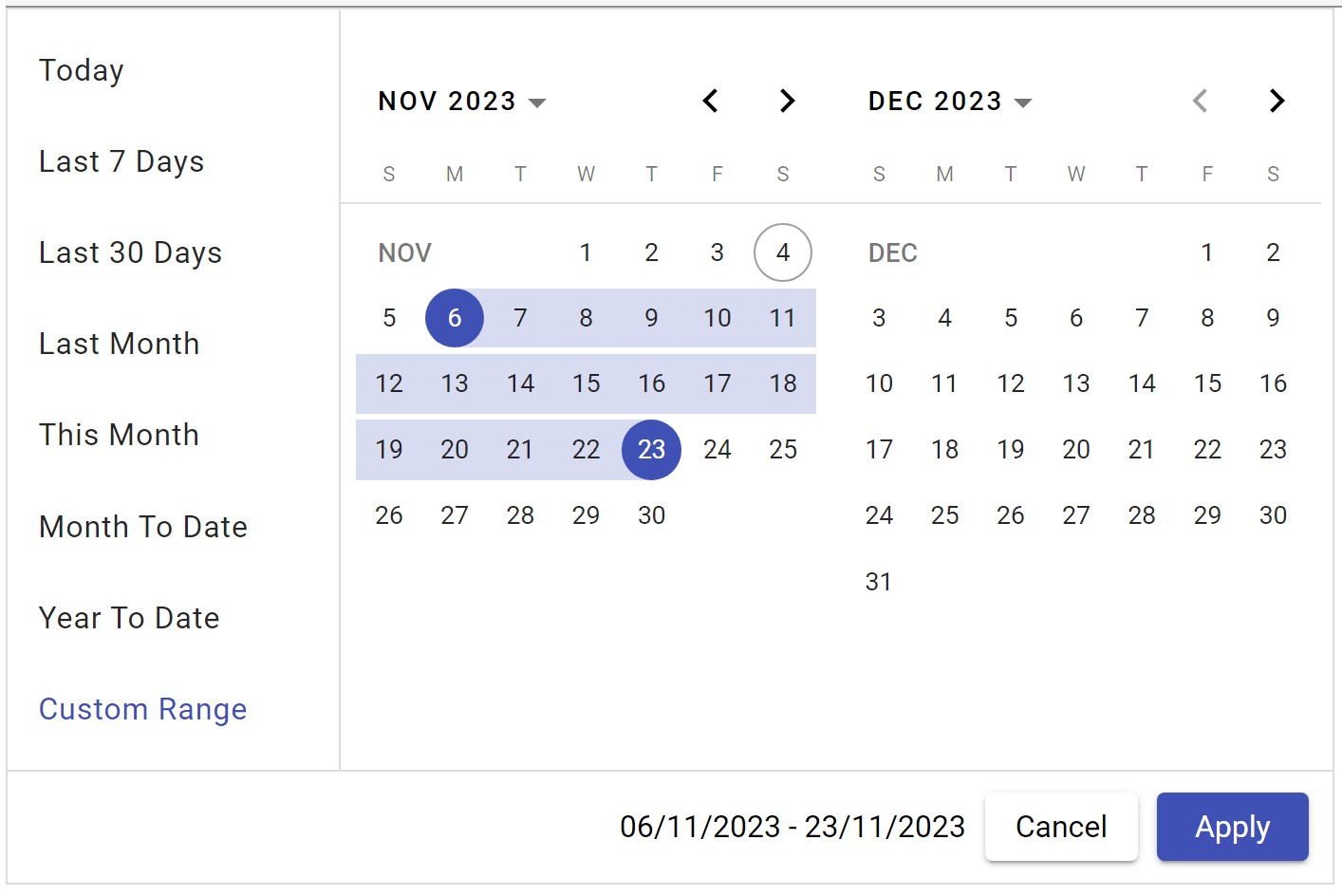
This library is build on top of angular material date-picker to provide date range selection with two views and predefined date options.
| Angular Version | Latest Library version |
|---|---|
| v16 | 1.2.10 |
| v17 | 2.2.4 |
The following section explains the steps required to create a simple 2 view Date Range Picker component and demonstrates its basic usage.
To use the 2 view Date Range Picker component in your application, install the following dependency packages:
1. angular (version 16.x)
2. angular-material (version 16.x)
2. bootstrap (version 5.0)
Angular provides an easy way to set up Angular CLI projects using the Angular CLI tool.
- Install the CLI application globally:
npm install -g @angular/cli- Create a new application:
ng new ng-date-range-picker-app- Navigate to the created project folder:
cd ng-date-range-picker-appTo use the 2 view Date Range Picker component in your application, install the following dependency packages:
- Angular Material Lib:
npm i @angular/material@16.2.6- Bootstrap CSS:
npm i bootstrap- Add bootstrap css inside angular.json:
"styles": [
        "src/styles.css",
        "@angular/material/prebuilt-themes/indigo-pink.css"
        "node_modules/bootstrap/dist/css/bootstrap.min.css",
],Range Picker package can be installed using the following command:
npm i ng-material-date-range-pickerImport the 2 view Date Range Picker module into your Angular application (src/app/app.module.ts):
import { NgModule } from '@angular/core';
import { CommonModule } from '@angular/common';
import { BrowserModule } from '@angular/platform-browser';
import { NgDatePickerModule } from 'ng-material-date-range-picker';
import { AppComponent } from './app.component';

@NgModule({
  declarations: [AppComponent],
  imports: [BrowserModule, NgDatePickerModule,  CommonModule],
  bootstrap: [AppComponent]
})
export class AppModule { }Modify the template in src/app/app.component.ts to render the 2 view Date Range Picker component:
import { Component } from '@angular/core';
@Component({
  selector: 'app-root',
  template: `<ng-date-range-picker></ng-date-range-picker>`
})
export class AppComponent {
  title = 'ng-date-range-picker-test';
}After completing the required configuration, run the following command:
ng serveThis will display the Date Range Picker in your default browser.
- Allow to select date range with two views.
- Predefined date support with list items.
- User can modify predefined date list.
- Provides complete controls on predefined date action items.
| Name | Type | Description |
|---|---|---|
selectedDates |
DateRange<Date> |
optional. default selection of start and end date |
dateFormat |
string |
optional. default is 'dd/MM/yyyy' |
dateDropDownOptions |
ISelectDateOption[] |
optional. Addition options to predefined date action list. |
minDate |
Date |
optional. To specify minimum date default is current date -10 years. |
maxDate |
Date |
optional. To specify max date default is current date +10 years. |
selectedOptionIndex |
number |
optional. To default selected option. (by default it is 3 which is last 30 days.) |
displaySelectedLabel |
boolean |
optional. To show the selected option label instead of date range |
cdkConnectedOverlayPositions |
ConnectedPosition[] |
optional. To control the overlay position |
staticOptionId |
string |
optional. To set id of static options container |
dynamicOptionId |
string |
optional. To set id of dynamic options container |
| Name | Type | Description |
|---|---|---|
onDateSelectionChanged |
SelectedDateEvent |
Emits when date selection is changed. And it contains range: DateRange and selectedOption: ISelectDateOption |
dateListOptions |
ISelectDateOption[] |
Emits pre-defined date action list items for configuration purpose. |
import { Component } from '@angular/core';
import { ISelectDateOption } from 'ng-date-range-picker/lib/model/select-date-option';

@Component({
  selector: 'app-root',
  template:` <ng-date-range-picker (dateListOptions)="dateListOptions($event)"></ng-date-range-picker>`
  templateUrl: './app.component.html',
  styleUrls: ['./app.component.scss'],
})
export class AppComponent {
  title = 'ng-date-range-picker-test';

  dateListOptions(optionList: ISelectDateOption[]) {
    optionList[0].isSelected = true;
    optionList[1].isVisible = false;
  }
}
In Above example first item of action list is selected and second option is hidden.
Upon clearing, it resets the minimum and maximum dates, and sets both the range and selectedOption to null.

