
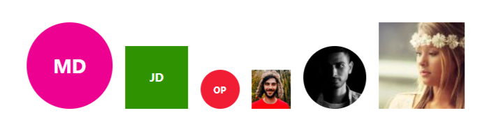
A simple and customizable Next.js/React.js avatar component that displays user initials, an image, or a fallback default avatar.
You can install the package using npm or yarn or pnpm:
npm install next-avatar
# or
pnpm add next-avatar
# or
yarn add next-avatarImport the Avatar component and use it in your Next.js/React.js project:
import React from 'react';
import Avatar from 'next-avatar';

const App = () => {
  return (
    <>
      <Avatar />
    </>
  );
};

export default App;<Avatar name="John Doe" size={60} />
<Avatar src="https://example.com/avatar.jpg" size={60} />
<Avatar src="https://example.com/avatar.jpg" borderRadius="99px" />
<Avatar name="Alice" color="#ff5733" fontSize="1.5em" />
<Avatar name="Alice" style={{color: "red", backgroundColor: "green"}} />| Prop | Type | Default | Description |
|---|---|---|---|
name |
string |
'' |
The name used to generate initials. |
src |
string |
'' |
The image source URL. |
size |
number |
50 |
The avatar size (width & height). |
color |
string |
'#fff' |
The text color for initials. |
fontSize |
string |
'1em' |
The font size for initials. |
borderRadius |
string |
'50%' |
The border radius of the avatar. |
style |
React.CSSProperties |
{} |
Additional inline styles. |
defaultSrc |
string |
'https://i.pravatar.cc/100' |
Fallback image URL when no name or source is provided. |
- Displays user initials when no image is provided.
- Supports custom colors and sizes.
- Falls back to a default image if neither name nor source is available.
- Handles broken image links gracefully.
MIT
🎉 Enjoy using Next Avatar Component! Feel free to contribute or report issues.