NativeScript Pager
tns plugin add nativescript-pager
tns plugin add nativescript-pager@9.x
tns plugin add nativescript-pager@8.0.2
tns plugin add nativescript-pager@7.2.3
tns plugin add nativescript-pager@2.3.0
Note v11+
Pager for NativeScript supports the core ObservableArray module part of the core NativeScript modules collection. Using an ObservableArray instance as a source for Pager will ensure that changes in the source collection will be automatically taken care of by the control.
IMPORTANT: Make sure you include xmlns:pager="nativescript-pager" on the Page element any element can be used in the pager
< pager : Pager items = " {{items}} " row = " 2 " id = " pager " spacing = " 2% " peaking = " 10% " transformers = " scale " pagesCount = " 10 " showIndicator = " true " backgroundColor = " lightsteelblue " >
< pager : Pager.itemTemplate >
< GridLayout rows = " auto, * " columns = " * " backgroundColor = " red " >
< Label text = " {{title}} " />
< Image row = " 1 " src = " {{image}} " />
</ GridLayout >
</ pager : Pager.itemTemplate >
</ pager : Pager >
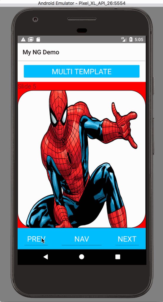
< c : Pager selectedIndexChange = " selectedIndexChange " itemTemplateSelector = " $index % 2 === 0 ? 'even' : 'odd' " selectedIndex = " 5 " items = " {{items}} " row = " 4 " id = " pager " pagesCount = " 10 " showIndicator = " true " backgroundColor = " lightsteelblue " >
< Pager.itemTemplates >
< template key = " even " >
< GridLayout rows = " auto,auto,* " columns = " * " >
< Label text = " Even " />
< Label row = " 1 " text = " {{title}} " />
< Image loaded = " loadedImage " row = " 2 " src = " {{image}} " />
</ GridLayout >
</ template >
< template key = " odd " >
< GridLayout rows = " auto,auto ,auto,* " columns = " * " backgroundColor = " white " >
< Label text = " Odd " />
< Label row = " 1 " text = " {{title}} " />
< StackLayout row = " 2 " >
< Label text = " {{image}} " />
</ StackLayout >
< Image loaded = " loadedImage " row = " 3 " src = " {{image}} " />
</ GridLayout >
</ template >
</ Pager.itemTemplates >
</ c : Pager >
< c : Pager selectedIndexChange = " selectedIndexChange " row = " 4 " id = " pager "
showIndicator = " true " backgroundColor = " lightsteelblue " >
< c : PagerItem backgroundColor = " red " >
< Label text = " First " > < / Label >
</ c : PagerItem >
< c : PagerItem backgroundColor = " white " >
< Label text = " Second " > < / Label >
</ c : PagerItem >
< c : PagerItem backgroundColor = " black " >
< Label text = " Third " color = " white " > < / Label >
</ c : PagerItem >
< c : PagerItem backgroundColor = " green " >
< Label text = " Fourth " > < / Label >
</ c : PagerItem >
</ c : Pager >
import Vue from ' nativescript-vue ' ;
import Pager from ' nativescript-pager/vue ' ;
Vue . use ( Pager ) ;
< template >
< Pager for = " item in items " >
< v-template >
< GridLayout class = " pager-item " rows = " auto, * " columns = " * " >
< Label : text = " item.title " />
< Image stretch = " fill " row = " 1 " : src = " item.image " / >
</ GridLayout >
</ v-template >
< v-template if = " $odd " >
< GridLayout class = " pager-item " rows = " auto, * " columns = " * " >
< Image stretch = " fill " : src = " item.image " / >
< Label : text = " item.title " row = " 1 " />
</ GridLayout >
</ v-template >
</ Pager >
</ template >
< Pager height = " 100% " : selectedIndex = " 1 " >
< PagerItem backgroundColor = " red " > < label text = " First " > < / label > </ PagerItem >
< PagerItem backgroundColor = " white " > < label text = " Second " > < / label > </ PagerItem >
< PagerItem backgroundColor = " black " >
< label text = " Third " color = " white " > < / label >
</ PagerItem >
< PagerItem backgroundColor = " green " > < label text = " Fourth " > < / label > </ PagerItem >
</ Pager >
import { PagerModule } from " nativescript-pager/angular " ;
@ NgModule ( {
imports : [
PagerModule
] ,
declarations : [
AppComponent
] ,
bootstrap : [ AppComponent ]
} )
Angular v2
< Pager
[ items ]= " items "
# pager
[ selectedIndex ]= " currentPagerIndex "
( selectedIndexChange )= " onIndexChanged($event) "
class = " pager "
>
< template let-i = " index " let-item = " item " >
< GridLayout
class = " pager-item "
rows = " auto, * "
columns = " * "
backgroundColor = " red "
>
< label [ text ]= " item.title " > < / label >
< image row = " 1 " [ src ]= " item.image " > < / image >
</ GridLayout >
</ template >
</ Pager >
Angular v4+
< Pager
[ items ]= " items "
# pager
[ selectedIndex ]= " currentPagerIndex "
( selectedIndexChange )= " onIndexChanged($event) "
class = " pager "
>
< ng-template let-i = " index " let-item = " item " >
< GridLayout
class = " pager-item "
rows = " auto, * "
columns = " * "
backgroundColor = " red "
>
< label [ text ]= " item.title " > < / label >
< image row = " 1 " [ src ]= " item.image " > < / image >
</ GridLayout >
</ ng-template >
</ Pager >
public templateSelector = ( item : any , index : number , items : any ) => {
return index % 2 === 0 ? ' even ' : ' odd ' ;
}
< Pager
row = " 1 "
[ items ]= " items | async "
[ itemTemplateSelector ]= " templateSelector "
# pager
[ selectedIndex ]= " currentPagerIndex "
( selectedIndexChange )= " onIndexChanged($event) "
class = " pager "
backgroundColor = " lightsteelblue "
>
< ng-template pagerTemplateKey = " even " let-i = " index " let-item = " item " >
< GridLayout class = " pager-item " rows = " auto,auto,* " columns = " * " >
< label text = " Even " > < / label > < label row = " 1 " [ text ]= " item.title " > < / label >
< image loaded = " loadedImage " row = " 2 " [ src ]= " item.image " > < / image >
</ GridLayout >
</ ng-template >
< ng-template pagerTemplateKey = " odd " let-i = " index " let-item = " item " >
< GridLayout
class = " pager-item "
rows = " auto,auto,auto,* "
columns = " * "
backgroundColor = " white "
>
< label text = " Odd " > < / label > < label row = " 1 " [ text ]= " item.title " > < / label >
< StackLayout row = " 2 " > < label [ text ]= " item.image " > < / label > </ StackLayout >
< image loaded = " loadedImage " row = " 3 " [ src ]= " item.image " > < / image >
</ GridLayout >
</ ng-template >
</ Pager >
< Pager
backgroundColor = " orange "
row = " 1 "
# pager
[ selectedIndex ]= " 1 "
height = " 100% "
>
< StackLayout * pagerItem backgroundColor = " red " >
< label text = " First " > < / label >
</ StackLayout >
< StackLayout * pagerItem backgroundColor = " white " >
< label text = " Second " > < / label >
</ StackLayout >
< StackLayout * pagerItem backgroundColor = " black " >
< label text = " Third " color = " white " > < / label >
</ StackLayout >
< StackLayout * pagerItem backgroundColor = " green " >
< label text = " Fourth " > < / label >
</ StackLayout >
</ Pager >
import { $Pager } from ' nativescript-pager/react ' ;
return (
< $Pager
height = { { unit : " % " , value : 100 } }
selectedIndex = { this . selectedIndex }
selectedIndexChange = { this . selectedIndexChange . bind ( this ) }
items = { this . items }
cellFactory = {
( item , ref ) => {
return (
< $StackLayout id = { item . title } ref = { ref } >
< $Label text = { item . title } / >
< $ImageCacheIt stretch = { ' aspectFill ' }
src = { item . image } / >
< / $StackLayout >
) ;
}
} / >
)
return ( < $Pager row = { 0 } col = { 0 } selectedIndex = { this . selectedIndex } height = { { unit : ' % ' , value : 100 } } >
< $PagerItem backgroundColor = { ' red ' } >
< $Label text = { ' First ' } / >
< / $PagerItem >
< $PagerItem backgroundColor = { ' white ' } >
< $Label text = { ' Second ' } / >
< / $PagerItem >
< $PagerItem backgroundColor = { ' black ' } >
< $Label text = { ' Third ' } color = { new Color ( ' white ' ) } / >
< / $PagerItem >
< $PagerItem backgroundColor = { ' green ' } >
< $Label text = { ' Fourth ' } / >
< / $PagerItem >
< $PagerItem backgroundColor = { ' pink ' } >
< $Label text = { ' Fifth ' } / >
< / $PagerItem >
< / $Pager > )
< Pager cache = " false " disableSwipe = " true " disableAnimation = " true " selectedIndex = " 5 " >
IOS
Android