my-css-flex
The CSS flex classnames every project needs.
Install
npm install my-css-flex<link rel="stylesheet" href="/node_modules/my-css-flex/flex.min.css" />or a CDN Link:
<link rel="stylesheet" href="https://cdn.jsdelivr.net/gh/taitulism/css-flex@latest/flex.min.css" />Classnames
Row Classnames:
Main axis (x)
.flexrow-
.flexrow-start(alias:.flexrow) -
.flexrow-center(alias:.flex-center) .flexrow-end.flexrow-spread
Secondary axis (y)
.f-top.f-bottom.f-stretch
Column Classnames:
Main axis (y)
.flexcol-
.flexcol-start(alias:.flexcol) .flexcol-center.flexcol-end.flexcol-spread
Secondary axis (x)
.f-left.f-right.f-stretch
Flex item
.flex-item
A few words
TL;DR
With
my-css-flex- flex containers are centered on the secondary axis by default because it makes more sense IMHO.
Read More...
Flex containers have a main axis and a secondary axis. The main axis is the one that matches the container direction (`x` for rows, `y` for columns). The secondary axis is, of course, the other one.To align items inside a flex container on its main axis we use the justify-content CSS property and for the secondary axis we use align-items.
Naturally, flex items will be placed at the top-left corner, for both rows and columns. This is because the default value for both axes is flex-start.
While it makes sense for the main axis, it makes less sense for the secondary axis.
When we close our eyes and imagine a navigation bar (or any other row of buttons) we would probably picture it centered on the y axis with equal space at the top and at the bottom.
With my-css-flex - package flex containers are centered on the secondary axis by default.
Flex Direction
There are two main classnames, one for rows and one for columns:
.flexrow.flexcol
Main Axis
To place the items along the main axis use flexrow | flexcol with, optionally, one of the following suffixes:
-start | -center | -end | -spread
-startis the default for the main axis and can be omitted:
.flexrowand.flexrow-startare the same.
.flexcoland.flexcol-startare the same.
.flexrow
┌──────────────────┐
│ ┌──┐┌──┐         │
│ └──┘└──┘         │
└──────────────────┘
VISUAL BUG: For some reason this looks weird on npm website. Continue on GitHub...
.flexrow-center
┌──────────────────┐
│     ┌──┐┌──┐     │
│     └──┘└──┘     │
└──────────────────┘
.flexrow-end
┌──────────────────┐
│         ┌──┐┌──┐ │
│         └──┘└──┘ │
└──────────────────┘
.flexrow-spread (A.K.A "space-between")
┌──────────────────┐
│ ┌──┐        ┌──┐ │
│ └──┘        └──┘ │
└──────────────────┘
To see the
flexcolequivalents, please tilt your head to the left :)
Secondary Axis
To align items along the secondary axis we add a secodary classname.
Secondary classnames start with an f- prefix and should be used together with a main axis classname.
For rows:
.f-top.f-bottom
For columns:
.f-left.f-right
For both, rows and columns:
.f-stretch
The "
f-" prefix is used to reduce the chance of classname collisions.
Examples:
.flexrow-center.f-top
┌─────────────────────┐
│      ┌──┐ ┌──┐      │
│      └──┘ └──┘      │
│                     │
│                     │
└─────────────────────┘
.flexrow-center.f-stretch
┌─────────────────────┐
│      ┌──┐ ┌──┐      │
│      │  │ │  │      │
│      │  │ │  │      │
│      └──┘ └──┘      │
└─────────────────────┘
.flexcol-spread.f-right
┌────────────┐
│       ┌──┐ │
│       └──┘ │
│            │
│            │
│       ┌──┐ │
│       └──┘ │
└────────────┘
Centering
To center a single item inside a container use (on the container):
.flex-center
┌─────────────┐
│             │
│     ┌─┐     │
│     └─┘     │
│             │
└─────────────┘
For multiple items use one of:
.flexrow-center.flexcol-center
.flexrow-center            .flexcol-center
┌──────────────┐             ┌───────────┐
│              │             │           │
│              │             │    ┌─┐    │
│    ┌─┐┌─┐    │             │    └─┘    │
│    └─┘└─┘    │             │    ┌─┐    │
│              │             │    └─┘    │
│              │             │           │
└──────────────┘             └───────────┘
In any case, don't use a secondary axis classname.
Flex item
.flex-itemSets a flex item with flex: 1 1 auto;
Common usages:
- When all the items in a flex container have the same size and expected to grow/shrink similarly.
┌────────────────┐ ┌────────────────────────┐ │┌──┐┌──┐┌──┐┌──┐│ ←→ │┌────┐┌────┐┌────┐┌────┐│ │└──┘└──┘└──┘└──┘│ │└────┘└────┘└────┘└────┘│ └────────────────┘ └────────────────────────┘ - When you need one item in a flex container to be stretchy/greedy and take all the space it could get while the rest of its siblings have static sizes.
┌──────────────────────────┐
│┌──┐┌──┐┌──┐┌────────┐┌──┐│
│└──┘└──┘└──┘└────────┘└──┘│
└──────────────────────────┘
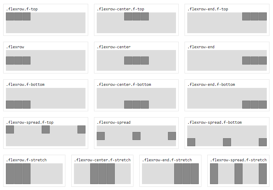
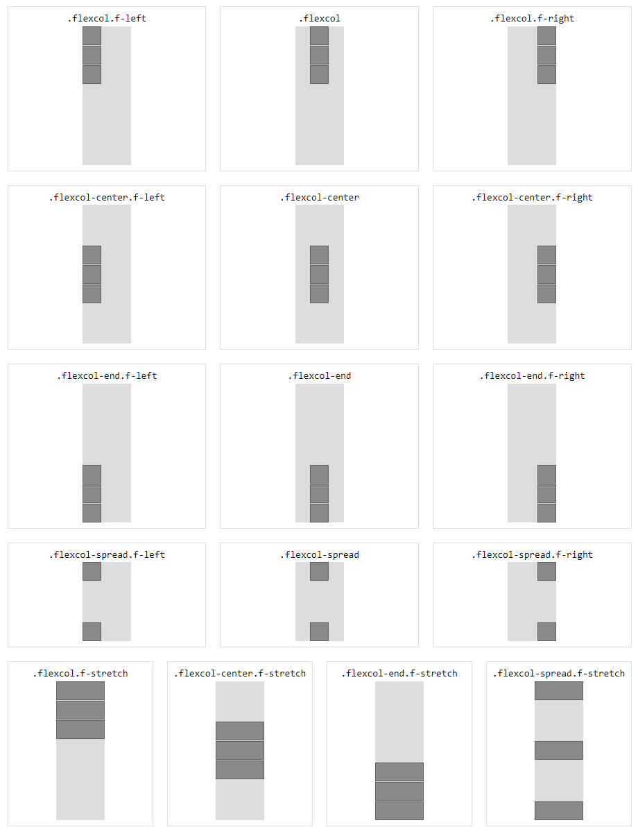
Reference Images
Rows
Columns
Development
Open the playground HTML file in the browser
./playground/index.html
To work with the minified file, run:
npm run devand swap CSS references in the playground HTML
Publish
Currently there are no tests.
Before publish run the HTML playground to verify everything visually.
Todo: Tests


