

MADE Vue - Accordion


A Vue 3 accordion component, a UI component for containers of expandable content.
Usage
To customise the accordion layout, you'll want to import the scss styling:
import "made-vue-accordion/styles.scss";
In your main file, you can import the component:
import { createApp } from "vue";
import App from "./App.vue";

import Accordion from "made-vue-accordion";

const app = createApp(App);
...
app.use(Accordion);
...
app.mount("#app");
You can then reference the accordion layout component in your app:
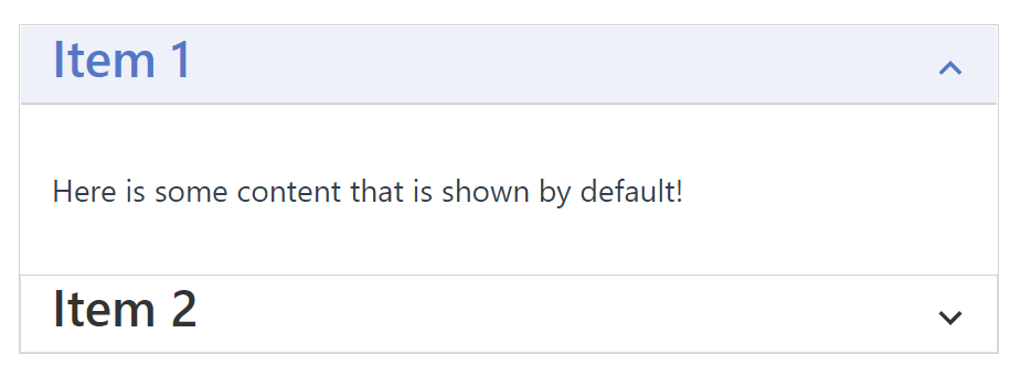
<template>
  <m-accordion>
    <m-accordion-item :showExpanded="true">
      <template #header>
        <h2>Item 1</h2>
      </template>

      <div class="item-container">
        Here is some content that is shown by default!
      </div>
    </m-accordion-item>

    <m-accordion-item>
      <template #header>
        <h2>Item 2</h2>
      </template>

      <div class="item-container">
        And here is some content that is hidden by default!
      </div>
    </m-accordion-item>
  </m-accordion>
</template>

<script lang="ts">
import { defineComponent } from "vue";

export default defineComponent({
  name: "App",
});
</script>

<style>
.item-container {
  padding: 32px 16px;
}
</style>