lancelot-animated-buttons
Animated buttoms for React.js

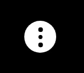
Install
npm install --save lancelot-animated-buttonsUsage
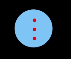
1. Animated Ellipsis button
import React from 'react'
import {LancelotEllipsisButton} from 'lancelot-animated-buttons'

const index = (props) => {
  return (
      <LancelotEllipsisButton/>
  )
}
Result
Customization
The table below shows the properties to customize the button:
| Property | Purpose | Type | Possible values | Default |
|---|---|---|---|---|
| animationTime | Duration of the rotation effect after clicking in seconds | number | any positive number | .5 |
| background | Background color of the button | string | colors | White |
| buttonSize | Size of the button | number | 1-10 | 3 |
| checked | Button checked or not | boolean | true/false | false |
| clicked | To call function when clicked | function | function | null |
| crossColor | Color of the cross | string | colors | red |
| cursor | Type of cursor when hovering | string | Cursor types (help, wait, pointer, grab, etc) | pointer |
| disableHoverEffect | To disable (if true) the effect when mouse is over | boolen | true/false | false |
| ellipsisColor | Color of the ellipsis | string | colors | Black |
| hoverEffectTime | Duration of the effect when hovering in seconds | number | any positive number | .5 |
| rotationIntensity | intensity of the rotation when clicked | number | 1-10 | 3 |
Example of customization
  <LancelotEllipsisButton
    animationTime={1}
    background="#78c2fa"
    buttonSize={8}
    clicked={()=>console.log("Lancelot!")}
    crossColor="#9dfa78"
    disableHoverEffect
    ellipsisColor="red"
    rotationIntensity={10}
  />
Result
2. Animated Hamburguer button
import React from 'react'
import {LancelotHamburguerButton} from 'lancelot-animated-buttons'

const index = (props) => {
  return (
      <LancelotHamburguerButton/>
  )
}
Result

Customization
The table below shows the properties to customize the button:
| Property | Purpose | Type | Possible values | Default |
|---|---|---|---|---|
| animationTime | Duration of the rotation effect after clicking in seconds | number | any positive number | .5 |
| background | Background color of the button | string | colors | White |
| buttonSize | Size of the button | number | 1-10 | 3 |
| checked | Button checked or not | boolean | true/false | false |
| clicked | To call function when clicked | function | function | null |
| crossColor | Color of the cross | string | colors | red |
| cursor | Type of cursor when hovering | string | Cursor types (help, wait, pointer, grab, etc) | pointer |
| disableHoverEffect | To disable (if true) the effect when mouse is over | boolen | true/false | false |
| hamburguerColor | Color of the hamburguer | string | colors | Black |
| hoverEffectTime | Duration of the effect when hovering in seconds | number | any positive number | .5 |
| rotationIntensity | intensity of the rotation when clicked | number | 1-10 | 3 |
Example of customization
  <LancelotHamburguerButton
    animationTime={2}
    background="#ccc"
    buttonSize={8}
    clicked={()=>console.log("Lancelot!")}
    crossColor="#238a0e"
    disableHoverEffect
    hamburguerColor="purple"
    rotationIntensity={10}
  />
Result

License
MIT © Elson Ramos