
Ion-Multi-Picker


Ion Multi Item Picker--An Ionic2 Custom Picker Component
Simulate IOS multi column picker by ionic2 picker.
For ionic 2.x, please use ion-multi-picker 1.x
Github: https://github.com/raychenfj/ion-multi-picker
NPM: https://www.npmjs.com/package/ion-multi-picker
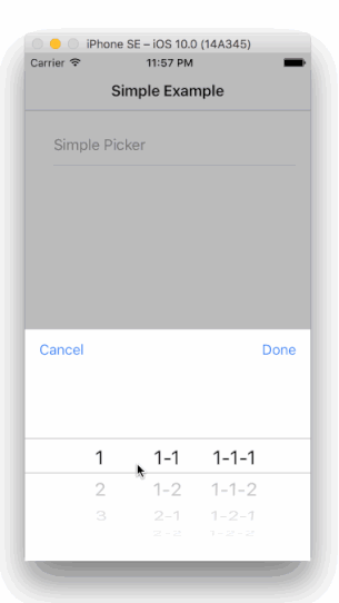
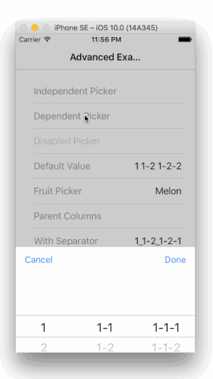
Preview
Picker with Independent/ Dependent Columns
Demo
Check out the live demo here: https://raychenfj.github.io/ion-multi-picker/
Installation
npm install ion-multi-picker --save
Usage
Basic
1.Import MultiPickerModule to your app/module.
import { MultiPickerModule } from 'ion-multi-picker'; @NgModule({ declarations: [ MyApp, AboutPage, ContactPage, HomePage, TabsPage, ], imports: [ IonicModule.forRoot(MyApp), MultiPickerModule //Import MultiPickerModule ], bootstrap: [IonicApp], entryComponents: [ MyApp, AboutPage, ContactPage, HomePage, TabsPage, ], providers: []})export class AppModule {}2.Initialize picker columns in your controller.
constructorprivate navCtrl: NavController You can use parentVal property to create dependency between each column.
this.dependentColumns = ;3.Add ion-multi-picker to your html template.
Simple Picker Note: Don't miss the item-content attribute
Like other ionic components, you can use [(ngModel)] to bind your data.
Default Value Set disabled to true to prevent interaction.
Disabled Picker Using Enum
It's a good case to use picker to choose value for an enum variable.
This componennt now provide a shorthand util function convertEnumToColumns to generate column from enum type,
and also you can bind a enum variable to ngModel.
Check the example fruit picker in the demo.
- Use
convertEnumToColumnsto generate columns;
; - Binding enum variable to
ngModel;
Fruit Picker Value Separator
When there are multiple columns, it need a separator to separate values from different columns.
The separator is space ' ' by default. Now you can customize the separator by using input property [separator].
Instead of define a property in your controller, you can directly pass a string or a char like below:
<ion-multi-picker id="separator" [(ngModel)]="sepVal" item-content [multiPickerColumns]="sepColumns" [separator]="'_'"></ion-multi-picker>
And the multi picker's return value should format like val1_val2_val3.
Parent Column
When use as a dependent picker, by default the dependency sequence is from left to right.
Now with parentCol, you can configure your own dependency sequence when needed, like from right to left.
The picker columns should be configured as below. The parentCol should be another column's name or alias.
    // Using parentCol
    this.parentColumns = [
      {
        name: 'child',
        parentCol: 'parent',
        options: [
          { text: '1-1-1', value: '1-1-1', parentVal: '1-1' },
          { text: '1-1-2', value: '1-1-2', parentVal: '1-1' },
          { text: '1-2-1', value: '1-2-1', parentVal: '1-2' },
          { text: '1-2-2', value: '1-2-2', parentVal: '1-2' },
          { text: '2-1-1', value: '2-1-1', parentVal: '2-1' },
          { text: '2-1-2', value: '2-1-2', parentVal: '2-1' },
          { text: '2-2-1', value: '2-2-1', parentVal: '2-2' },
          { text: '2-2-2', value: '2-2-2', parentVal: '2-2' }
        ]
      },{
        name: 'parent',
        parentCol: 'ancestor',
        options: [
          { text: '1-1', value: '1-1', parentVal: '1' },
          { text: '1-2', value: '1-2', parentVal: '1' },
          { text: '2-1', value: '2-1', parentVal: '2' },
          { text: '2-2', value: '2-2', parentVal: '2' },
        ]
      },{
        name: 'ancestor',
        options: [
          { text: '1', value: '1' },
          { text: '2', value: '2' }
        ]
      }
    ];
Attributes
| Attribute | Description | Type | Options | Default |
|---|---|---|---|---|
| multiPickerColumns | Required, configure multi picker columns | Array of MultiPickerColumn | - | - |
| item-content | Required, add this attribute so that this custom component can be display correctly under ion-item tag |
- | - | - |
| separator | Optional, charactor to separate value from each column | String | - | space |
| cancelText | Optional, customize the cancel button text | String | - | Cancel |
| doneText | Optional, customize the done button text | String | - | Done |
| placeholder (since 2.0.2) | Optional, set up a placeholder text when there is no option selected | String | - | - |
| showReset (since 2.1.1) | Optional, add an additional reset button next to the cancel button | Bool | - | false |
| resetText (since 2.1.1) | Optional, customize the reset button text | String | - | Reset |
Types
- MultiPickerColumn
| Property | Description | Type | Options | Default |
|---|---|---|---|---|
| options | Required, Options in a column | Array of MultiPickerOption | - | - |
| name | Optional, Column name | String | - | index start from 0 |
| parentCol | Optional, when used as a dependent picker, you can specify the parent column | String | - | previous column |
| alias | Optional, alias for a column, when use parentCol, it will find the column with same name or alias | String | - | - |
| columnWidth | Optional, specify the column width manually, it accepts a string including unit like % and px |
String | - | - |
- MultiPickerOption
| Property | Description | Type | Options | Default |
|---|---|---|---|---|
| text | Required, text displayed in the picker column | String | - | - |
| value | Required, the associated value of the text | String | - | - |
| parentVal | Optional, specify the dependency between current column and previous column | String | Value from your parent column | - |
| disabled | Optional, the option is visible or not | Boolean | - | false |
Contribution
Welcome issue report, PR and contributors. Help me improve it.
Fork and git clone this project,
most code for the multi picker is under src/app/components/multi-picker.
The unit test framework is karma + webpack + jasmine. And e2e test is protractor.
Add your unit test and use npm test to start karma.
Add your e2e test, run ionic serve on the example and then in another terminal use npm run e2e to run protractor on project root folder.
You can also add your use case in the app/pages.
Finally, send me a PULL REQUEST.
Acknowledgement
Thanks to HonLuk for sharing the city data in the demo.
License
MIT