hero-slider
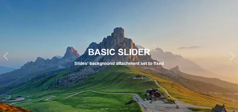
This package contains multiple components with a fair range of options to help developers quickly set up a hero slider.

Introduction
This package contains multiple components with a fair range of options to help developers quickly set up a hero slider. You can set the sliding animations, the background lazy loaded image animation, navs, buttons, callbacks, and even set your own buttons if you need to.
The idea behind the configurability was to set up clear boundaries between modules and components. The modules will control the behavior of the hero-slider, while the components themselves are self explanatory and mostly relevant to styling. The documentation will be divided in two main sections, Module, and Components.