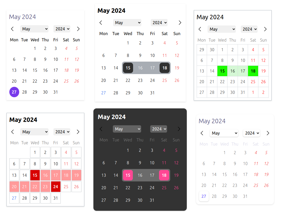
A headless, highly customizable, multi-calendar date picker component for React. It supports various calendars and locales.
https://sepehr09.github.io/headless-react-datepicker/
All calendars are supported by the ECMAScript's Intl API:
- Gregory
- Persian
- Indian
- Iso8601
- Japanese
- Buddhist
- Chinese
- Coptic
- Dangi
- Ethioaa
- Ethiopic
- Hebrew
- Islamic
- Islamic-umalqura
- Islamic-tbla
- Islamic-civil
- Islamic-rgsa
- Islamicc
- Roc
All locales are supported by the Intl API.
npm install headless-react-datepicker

# or

yarn add headless-react-datepicker

# or

pnpm add headless-react-datepickerimport "headless-react-datepicker/dist/styles.css";import React from "react";
import DatePickerProvider, {
Title,
Header,
WeekDays,
DaySlots,
} from "headless-react-datepicker";
const MyAwesomeDatePicker = () => {
return (
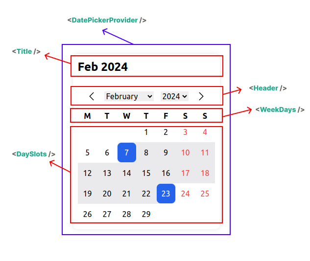
<DatePickerProvider>
<Title />
<Header />
<WeekDays />
<DaySlots />
</DatePickerProvider>
);
};Must be in place as the parent of the whole calendar component.
import { DatePickerProvider } from "headless-react-datepicker";| Name | Type | Description |
|---|---|---|
| value | Date | Date[] | The value of the date picker (Controlled component). |
| initialValue | Date | Date[] | The initial value of the date picker. |
| defaultStartDate | Date | The default start date. Useful when you want to be on a different month or year despite the initial value. |
| config | TCalendarConfig | The configuration for the date picker. |
| isRange | boolean | Indicates whether the date picker is a range picker. |
| calendar | TCalendar | The calendar to use. |
| onChange | (value: Date | Date[]) => void | on calendar selected date change |
| children | ReactNode | The other parts of the calendar or your custom components. |
| Name | Type | Description | Default |
|---|---|---|---|
| weekStartsOn | TDay | undefined | The first day of the week. | "monday" |
| locale | string | undefined | The locale to use. | "en-US" |
| showOtherDays | boolean | undefined | Show other days from the previous and next month or not. | false |
| otherDaysSelectable | boolean | undefined | Allow selecting other days from the previous and next month or not. | false |
| weekdayFormat | "long" | "short" | "narrow" | undefined | "narrow" | |
| dayFormat | "numeric" | "2-digit" | undefined | "numeric" | |
| yearRangeFrom | number | undefined | last 10 years if not provided | |
| yearRangeTo | number | undefined | current year if not provided | |
| maxDate | Date | undefined | Prevent selecting dates before this date. | |
| minDate | Date | undefined | Prevent selecting dates after this date. | |
| weekends | TDay[] | undefined | Specify which days of the week are holidays. | undefined |
| weekendSelectable | boolean | undefined | Allow selecting weekends or not. | true |
| allowBackwardRange | boolean | undefined | If user select a date before the previous selected date, it will be considered as a range or start from beginning. | false |
"gregory" | "persian" | "islamic" | "islamic-umalqura" | "islamic-tbla" | "islamic-civil" | "islamic-rgsa" | "iso8601" | "japanese" | "islamicc" | "roc" | "chinese" | "indian" | "buddhist" | "coptic" | "dangi" | "ethioaa" | "ethiopic" | "hebrew"
The Title component is used to display the month and year based on the selected locale and calendar.
import { Title } from "headless-react-datepicker";| Name | Type | Options | Default |
|---|---|---|---|
| monthFormat | string | undefined | "numeric", "2-digit" , "long" , "short" , "narrow" | "short" |
| yearFormat | string | undefined | "numeric" , "2-digit" | "numeric" |
| className | string | ClassName of the title component | |
| style | CSSProperties | css styles of the title component |
The Header component is used to navigate to the next and previous month and select month and year from the drop-down list.
You can customize arrow icons with React Node and the dropdowns with className and CSS stylesheets.
import { Header } from "headless-react-datepicker";| Name | Type | Description |
|---|---|---|
| leftIcon | ReactNode | |
| rightIcon | ReactNode | |
| monthSelectClassName | string | Class name of the month select dropdown |
| monthSelectStyles | CSSProperties | css styles of the month select dropdown |
| monthOptionClassName | string | className of the month Options in the dropdown |
| monthOptionStyles | CSSProperties | css styles of the month Options in the dropdown |
| monthSelectedOptionClassName | string | className the selected option in the month dropdown |
| monthSelectedOptionStyles | CSSProperties | css styles the selected option in the month dropdown |
| yearSelectClassName | string | className of the year select dropdown |
| yearSelectStyles | CSSProperties | css styles of the year select dropdown |
| yearOptionClassName | string | className of the year Options in the dropdown |
| yearOptionStyles | CSSProperties | css styles of the year Options in the dropdown |
| yearSelectedOptionClassName | string | className the selected option in the year dropdown |
| yearSelectedOptionStyles | CSSProperties | css styles the selected option in the year dropdown |
The WeekDays component is used to display the weekday header.
import { WeekDays } from "headless-react-datepicker";| Name | Type | Description |
|---|---|---|
| renderer | (args: TWeekDaysRendererArgs) => ReactNode | Custom renderer. If provided, the whole component will be ignored |
| className | string | Custom class name for the element |
| style | CSSProperties | css styles for the element |
| rootClassName | string | Custom class name for the parent root element |
| rootStyle | CSSProperties | css styles for the parent root element |
| Name | Type | Options | Description |
|---|---|---|---|
| formattedTitle | string | Title based on calendar config.weekdayFormat which follows locale and calendar. |
|
| weekIndex | number | ||
| weekDay | TDay | "monday" | "tuesday" | "wednesday" | "thursday" | "friday" | "saturday" | "sunday" |
The DaySlots component is used to display the month and year based on the selected locale and calendar.
import { DaySlots } from "headless-react-datepicker";| Name | Type | Description | Default |
|---|---|---|---|
| dayRenderer | (args: TDaySlotsDayRendererArgs) => ReactNode | Custom renderer | |
| onClickSlot | (date: Date) => void | when click on slot | |
| parentClassName | string | parent box | |
| parentStyles | CSSProperties | parent box | |
| slotParentClassName | string | ||
| slotParentStyles | CSSProperties | ||
| slotClassName | string | ||
| slotStyles | CSSProperties | ||
| todayStyles | CSSProperties | ||
| todayClassName | string | ||
| todayParentStyles | CSSProperties | ||
| todayParentClassName | string | ||
| disableStyles | CSSProperties | ||
| disableClassName | string | ||
| disableParentStyles | CSSProperties | ||
| disableParentClassName | string | ||
| weekendStyles | CSSProperties | ||
| weekendClassName | string | ||
| weekendParentStyles | CSSProperties | ||
| weekendParentClassName | string | ||
| selectedStyles | CSSProperties | ||
| selectedClassName | string | ||
| selectedParentStyles | CSSProperties | ||
| selectedParentClassName | string | ||
| selectableStyles | CSSProperties | ||
| selectableClassName | string | ||
| selectableParentStyles | CSSProperties | ||
| selectableParentClassName | string | ||
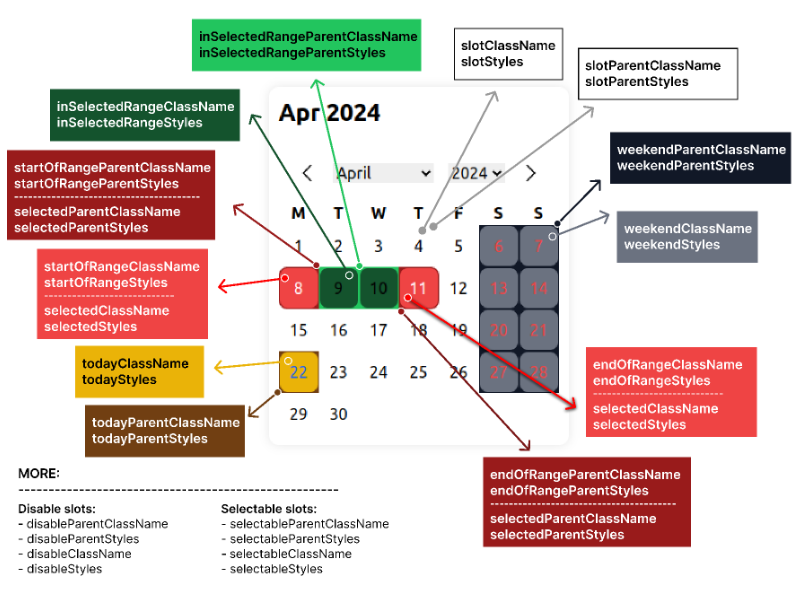
| inSelectedRangeStyles | CSSProperties | ||
| inSelectedRangeClassName | string | ||
| inSelectedRangeParentStyles | CSSProperties | ||
| inSelectedRangeParentClassName | string | ||
| startOfRangeStyles | CSSProperties | ||
| startOfRangeClassName | string | ||
| startOfRangeParentStyles | CSSProperties | ||
| startOfRangeParentClassName | string | ||
| endOfRangeStyles | CSSProperties | ||
| endOfRangeClassName | string | ||
| endOfRangeParentStyles | CSSProperties | ||
| endOfRangeParentClassName | string |
| Name | Type | Options | Default |
|---|---|---|---|
| date | Date | based on calendar config.dayFormat which follows locale and calendar. |
|
| formattedDay | string | Formatted date based on locale and calendar which is in the calendar config. |
|
| IsToday | boolean | Indicate that is the day is today or not. | |
| isSelectable | boolean | Is the day can be selected or not. | |
| isDisabled | boolean | Is the day is disabled or not. | |
| isInSelectedRange | boolean | Is in the selected range (if calendar type is range) or not. | |
| isStartOfRange | boolean | ||
| isEndOfRange | boolean | ||
| isInWeekend | boolean | ||
| isSelected | boolean | ||
| handleClickSlot | (date: Date) => void | ||
| handleKeyDown | (e: React.KeyboardEvent, date: Date) => void | onKeyDown event |
You can access almost all props and functions of the date picker from the date picker context, so you can customize and build your own custom component easily.
import { useDatePickerContext } from "headless-react-datepicker";

const MyCustomAwesomeHeader = () => {
  const { goToCurrentMonth, yearInTheCalendar } = useDatePickerContext();

  return <div onClick={goToCurrentMonth}>{yearInTheCalendar}</div>;
};| Name | Type | Description |
|---|---|---|
| goToNextMonth | () => void | Function to navigate to the next month |
| goToPrevMonth | () => void | Function to navigate to the previous month |
| goToDate | (date: Date) => void | Function to navigate to a specific date |
| goToCurrentMonth | () => void | Function to navigate to the current month |
| goToMonth | (month: number) => void | Local month (based on the desired calendar) |
| goToYear | (year: number) => void | Handle go to year (based on desire calendar) |
| daysOfMonth | Date[] | All the dates of the month rendered in the calendar |
| startDateIncludeOtherDays | Date | End date of the month rendered in the calendar (include previous month days (if in the week)) |
| endDateIncludeOtherDays | Date | Start date of the month rendered in the calendar (include next month days (if in the week)) |
| firstDayOfMonth | Date | First day of the month |
| lastDayOfMonth | Date | Last day of the month |
| selectedDay | Date | Date[] | undefined | The selected day in the calendar |
| handleClickSlot | (date: Date) => void | Callback function when a date is clicked |
| monthInTheCalendar | number | Current month in the calendar (based on desire calendar) |
| totalDaysInTheCalendar | number | Indicate the total days in the month |
| yearInTheCalendar | number | Current year in the desire calendar |
| monthsList | TMonthListItem[] | List of all month based on culture |
| yearsList | number[] | List of all years based on yearRangeFrom and yearRangeTo |
| initialValue | Date | Date[] | The initial value of the date picker. |
| defaultStartDate | Date | The default start date. Useful when you want to be on different month or year despite the initial value. |
| config | TCalendarConfig | The configuration for the date picker. |
| isRange | boolean | Indicates whether the date picker is a range picker. |
| calendar | TCalendar | The calendar to use. |
Using the Intl API which is ECMAScript Internationalization API with a very good browser support and depends on Temporal for converting other calendars into gregory.
- [x] remove dependency to date-fns
- [ ] time picker
- [ ] rangle picker hover effect
- [ ] integrate popover for whole calendar
- [ ] two side by side calendar
MIT @ Sepehr09
We're eagerly welcoming to contributors who want to help build and maintain this repo. PRs are always welcome!
you can see the change log here


