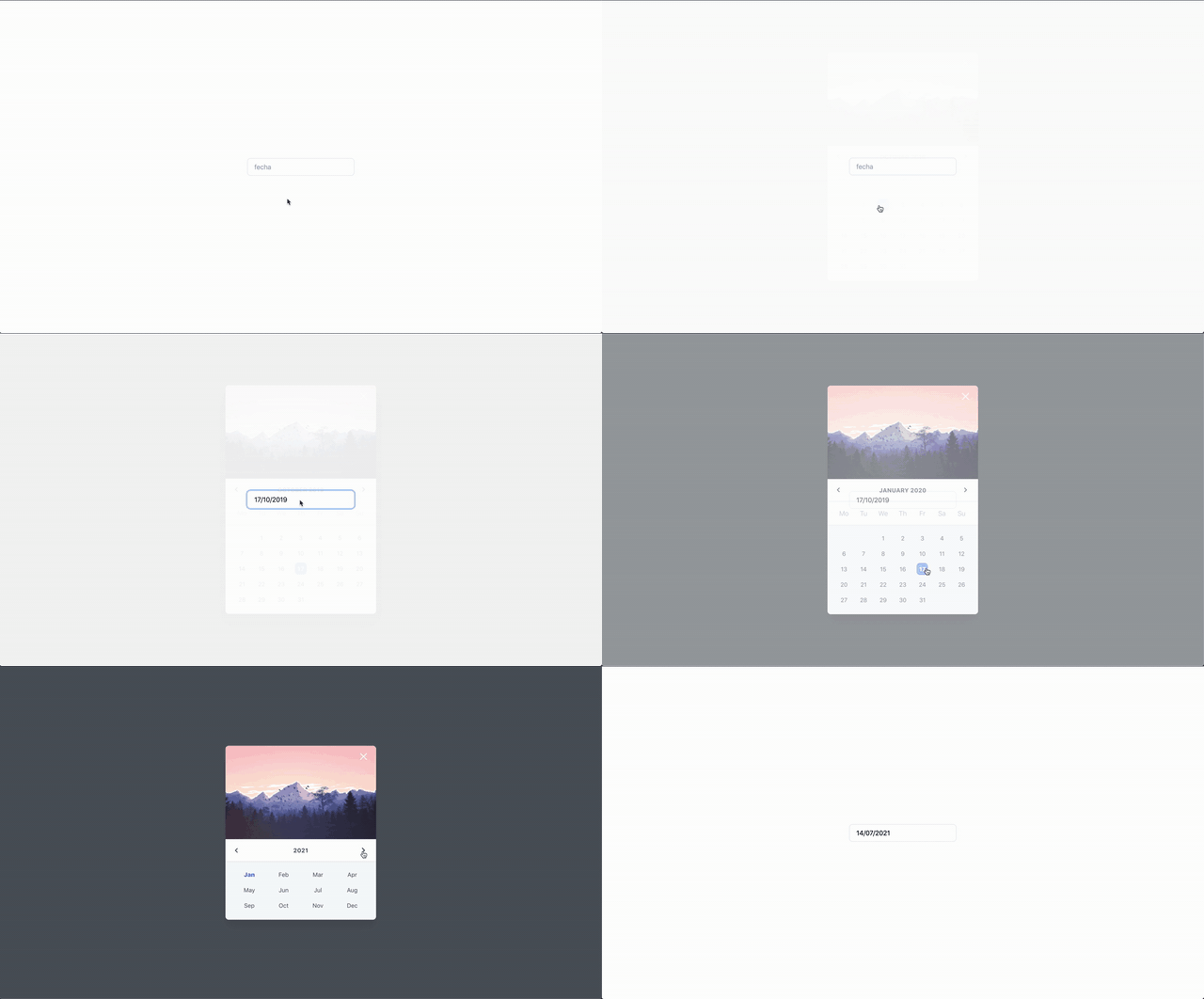
😎😎😎
Good looking components for Vue.js usign Tailwind css 👉 https://danny-aguilar.gitbook.io/future-vue-components/
🤙🏻🤙🏻🤙🏻
Documentation
Go here 👉 https://danny-aguilar.gitbook.io/future-vue-components/
Installation
install moment , animate.css , tailwind
npm install --save future-vue-componentsin case of error when you import css files from tailwind, try the complete route from where the @import is
(main.scss file) => /src/assets/scss/main.scss
 @import "./../../../node_modules/tailwindcss/dist/base.css";
 @import "./../../../node_modules/tailwindcss/dist/components.css";
 @import "./../../../node_modules/tailwindcss/dist/utilities.css";
⚠️ Warning: due to a bug already issued it to momentjs, other locales as spanish are not available for the moment, this error is shown as Can't resolve './locale'
Usage
import Vue from "vue"

import Datepicker from 'future-vue-components'
Vue.use(Datepicker)

import Card from 'future-vue-components'
Vue.use(Card)
vue template
<!-- Card -->
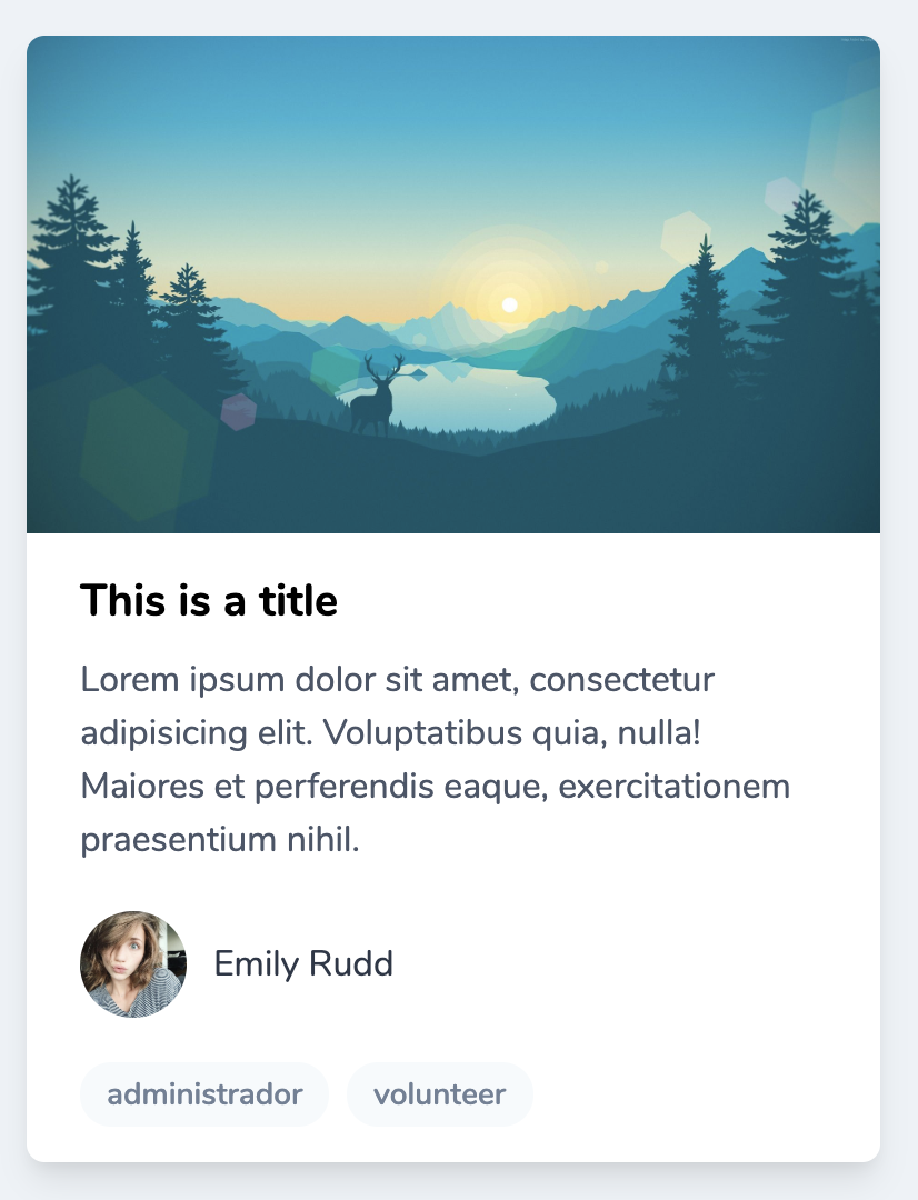
<future-card
  :user="{
    avatar_url: 'https://i.pinimg.com/originals/39/ec/15/39ec15a87824a1bdd57484e6a5459593.jpg',
    name: 'emily rudd'
  }"
>
  <span slot="title">This is a title</span>
  <span>
    Lorem ipsum dolor sit amet, consectetur adipisicing elit. Voluptatibus quia, nulla! Maiores et perferendis eaque, exercitationem praesentium nihil.
  </span>
</future-card>

<!-- Datepicker -->
<input
  @click="datepicker = true"
  type="text"
  placeholder="date"
  autocomplete="off"
  spellcheck="false"
  readonly="readonly"
  v-model="date"
>
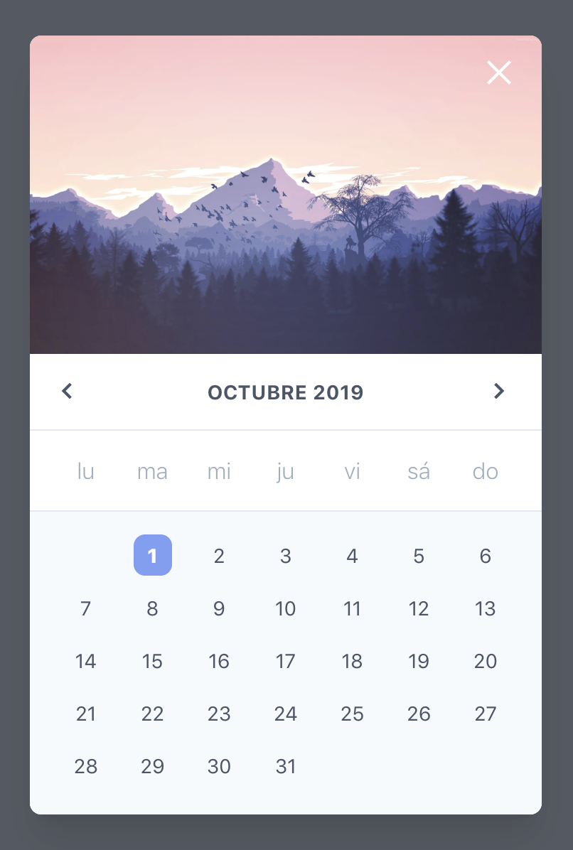
<future-datepicker
  :show="datepicker"
  @close="datepicker = false"
  @date="(datepicker) => {date = datepicker}"
/>
vue template
export default {
  props: {},
  data() {
    return {
      date: '',
      datepicker: false,
    }
  },
};
Props
Datepicker
| Name | Type | Default | Description | Example |
|---|---|---|---|---|
| color | String | indigo |
All colors accepted by Tailwind at https://tailwindcss.com/docs/customizing-colors/#default-color-palette. |
'red' or 'gray'
|
| background | Boolean | true |
Whether the datepicker shows a background image or not. |
true or false
|
| show | Boolean | false |
Whether the datepicker shows itself or not, is used to enable the modal and quit it. |
true or false
|
| background_url | String | https://www.xtrafondos.com/wallpapers/montanas-en-bosque-minimalista-flat-3306.jpg |
Default url for a background image if need it. | - |
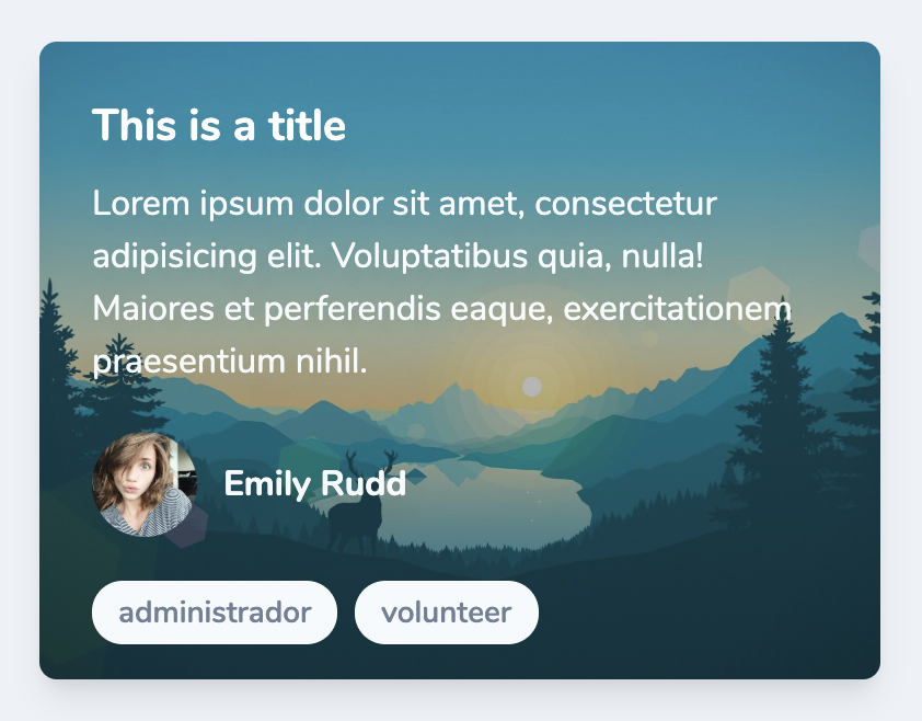
Card
| Name | Type | Default | Description | Example |
|---|---|---|---|---|
| color | String | gray |
All colors accepted by Tailwind at https://tailwindcss.com/docs/customizing-colors/#default-color-palette. |
'red' or 'gray'
|
| background | Boolean | true |
Whether the datepicker shows a background image or not. |
true or false
|
| type | String | normal |
It represents the card style that's shown. |
normal or full-image
|
| user | Object | null |
User's card data. | {avatar_url: 'https://i.pinimg.com/originals/39/ec/15/39ec15a87824a1bdd57484e6a5459593.jpg',name: 'emily rudd'} |
| badges | Array | [] |
All the badges that are going to be shown. | ['admin','volunteer'] |
| background_url | String | https://i.pinimg.com/originals/54/ce/a7/54cea70579cfefc972a4cbf67f92ea59.jpg |
Default url for a background image if need it. | - |
Development
npm install
npm run Test
# open localhost:8080
TODO
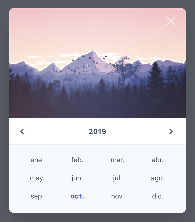
- Datepicker choose by year
- Fix .locale moment bug
License
MIT
