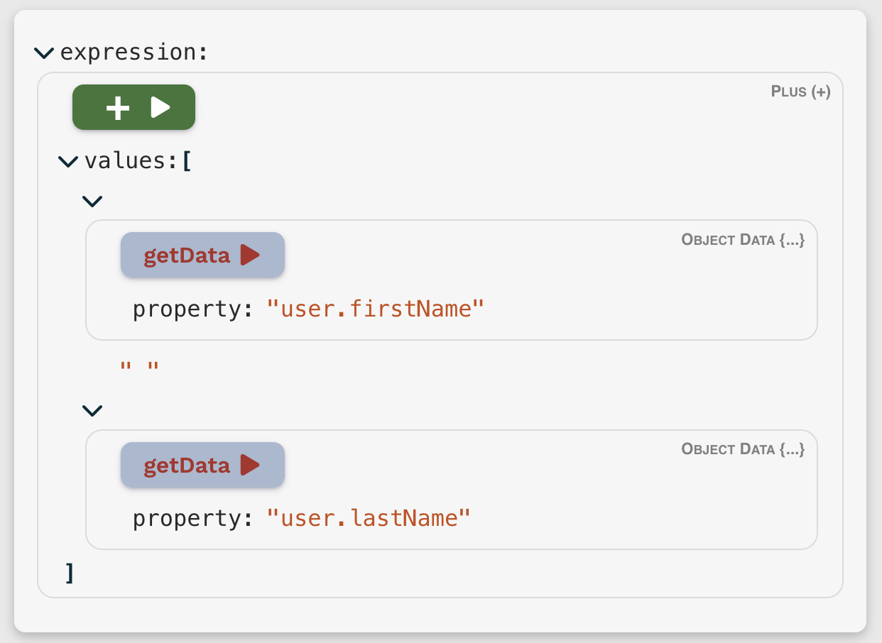
A React component for constructing and editing FigTreeEvaluator expressions.
It's built on json-edit-react (a JSON/object data viewer/editor), so usage is basically the same as for that component. The main addition is the use of Custom Nodes to handle the specifics of FigTree expressions, providing validation and custom UI to select and manipulate the various operators.
Your best bet is to have a play with the Demo to get a feel for it.
npm i fig-tree-builder-react
or
yarn add fig-tree-builder-react
import { FigTreeEditor } from 'fig-tree-builder-react'

// In your React component:
return
  <FigTreeEditor
    // These 3 props are required, the rest are optional
    figTree={figTree} // your FigTree instance
    expression={expressionObject} // your FigTree expression object
    setData={ (data) => updateMyExpression(data) } // function to update your expression object
{ ...otherProps } />The majority of props are those for json-edit-react, so won't be covered here. The ones specific to this component are:
| Prop | Type | Default | Description |
|---|---|---|---|
figTree |
FigTreeEvaluator |
A FigTree instance to run evaluations on | |
expression |
EvaluatorNode(object/array/value) |
The FigTree expression | |
setExpression |
(data: EvaluatorNode) => void |
React state update function |
| Prop | Type | Default | Description |
|---|---|---|---|
objectData |
object |
Data object accessed by FigTree's getData/objectProperties operator. |
|
onEvaluate |
(value: unknown, e: React.MouseEvent) => void |
Optional function to call on the evaluated result after clicking one of the "Evaluate" buttons. Can be used (for example) to display a Notification with the result. | |
onEvaluateStart |
() => void |
Called when an "Evaluate" button is clicked. Some evaluations can take some time (e.g. network requests), so this can be used to trigger a "Loading" indicator. | |
operatorDisplay |
Operator Display Data |
Used to set the background and text colours for the various Operator "Evaluate" buttons. See [below] for details. | |
defaultNewOperatorExpression |
EvaluatorNode |
Expression to populate the UI with when switching to a new "Operator" node | |
defaultNewFragment |
string |
Name of the Fragment to default to when switching to new "Fragment" node | |
defaultNewCustomOperator |
string |
Name of the Custom Operator to default to when switching to new "Custom Operator" node | |
addTopLevelFallback |
any |
If defined, the specified value will be inserted as a fallback when selecting a new operator/fragment at the top level only. This offers an option to ensure protection against evaluator errors lower in the tree. |
You can override the colour scheme for each operator in the UI by passing in an object to the operatorDisplay prop. Each operator can have the backgroundColor, textColor and displayName defined — see defaults file for specific structure.
You can also specify the colours for Fragments and Custom Operators in their metadata definitions.
Please open an issue: https://github.com/CarlosNZ/fig-tree-editor-react/issues
-
v0.7.10:
- When switching Fragments, remove old fragment properties
-
v0.7.9:
- Switching node type (operator/fragment/custom operator) auto-focuses the operator/fragment selector menu
- Add
addTopLevelFallbackprop
-
v0.7.8:
- props to set default expression, fragment and custom operator
-
v0.7.5:
- Fix possible infinite re-render when loading new expression
-
v0.7.1:
- Improve type definitions for styles input
- Pass "event" to
onEvaluatefunction
-
v0.7.0:
- Use updated editor package (json-edit-react) in order to restrict to enum values when appropriate
- Correct defaults for all operator properties
- v0.6.6: Respect editing restrictions in Custom Nodes
- v0.5.0 – v0.6.5: Initial release

