express-responsive-images-x
Original creator: @ztomm
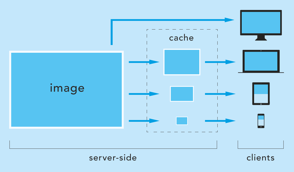
Server-side scaling and caching of images on-the-fly for Express on Node.js.
Images are resized to fit client's screen size or scaled by query parameters.
Mobile friendly, reduces bandwidth and saves loading time.
express-responsive-images-x on npmjs.org
Scaling
- by breakpoint (default)
- by browser width
- by query parameter (usefull for
srcset)
Features
- file type conversion (e.g. jpeg to webp)
- define watched directories
- define supported file types
- cache is updated when image is modified
- debug mode: see process step-by-step in console
New features
- support custom builded libvips (animated images)
- possibility of ignoring the presence of cookies with subsequent resizing
- dynamic image format
install
npm i express-responsive-images-x --saveusage
frontend
<head>
    // somewhere in <head> section (not necessary for directScaling)
    <script>document.cookie = 'screen=' + ('devicePixelRatio' in window ? devicePixelRatio : 1) + ',' + window.innerWidth + '; path=/; samesite=strict;'+(window.location.protocol === 'https:' ? ' secure=true' : '');</script>
</head>
backend
const responsiveImages = require('express-responsive-images-x');

// use it before declaring static routes
app.use(responsiveImages({
    // options
    staticDir: '/public',
    watchedDirectories: ['/images', '/media'], // inside staticDir
    // ...
}));

// static routes, something like this:
app.use('/', express.static(path.join(__dirname, 'public')));
options (default values)
By default images are scaled to a specified list of sizes (option scaleBy: 'breakpoint').
If you want, you can configure it to cache images for every possible viewport width (option scaleBy: 'viewport'). However, this is not recommended for public websites, as it can bloat the web space.
app.use(responsiveImages({
    staticDir:          '/public',
    watchedDirectories: ['/images'],
    fileTypes:          ['webp', 'jpg', 'jpeg', 'png', 'gif'],
    fileTypeConversion: '',
    cacheSuffix:        '-cache',
    cookieName:         'screen',
    scaleBy:            'breakpoint',
    breakpoints:        [320, 480, 640, 800, 1024, 1280, 1366, 1440, 1600, 1920, 2048, 2560, 3440, 4096],
    directScaling:      false,
    directScalingParam: 'w',
    directScaleSizes:   [],
    convertableFileTypes: [],
    convertableParam: 'as',
    customLibvips: false,
    saveWithMetadata: true,
    ignoreCookieErrorMethod: 0,
    debug: false
}));
staticDir (string)
The application's public directory with static files. Common: '/public' or '/pub' or '/dist' ...
staticDir: '/public'It should match the directory used by Express. E.g.:
app.use('/', express.static(path.join(__dirname, 'public')));watchedDirectories (array)
Array of directories nested in staticDir to watch for images. The module is listening to requests pointing to this folders.
At least one directory must be specified!
The use of wildcards * is possible.
// will match only /images directory, no subdirectories
watchedDirectories: ['/images']

// will match e.g. /img-user but not /img and not subdirectories e.g. /img/user
watchedDirectories: ['/img*']

// will match e.g. /images/user and /images/user/profile but not /images
watchedDirectories: ['/images/*']

// will match e.g. /images and /images/user and /images/user/profile
watchedDirectories: ['/images', '/images/*']
fileTypes (array)
Array of supported file types.
fileTypes: ['webp', 'jpg', 'jpeg', 'png', 'gif']fileTypeConversion (string)
All images are converted to a specific file type.
fileTypeConversion: 'webp'cacheSuffix (string)
Suffix of the folder name where the images should be cached. The folder is created automatically.
For example, the image /public/images/img.jpg is cached in /public/images-cache/640/img.jpg.
cacheSuffix: '-cache'cookieName (string)
The name of the cookie is changeable. The name must be the same as the one mentioned in the <head> tag (section "usage/frontend" above).
cookieName: 'screen'scaleBy (string)
Possible values: breakpoint or viewport.
breakpoint scales images to the next equal or higher breakpoint (see breakpoints option below).
scaleBy: 'breakpoint'viewport scales images exactly to the width of the client browser (not recommended for public websites).
scaleBy: 'viewport'breakpoints (array)
Array of allowed sizes to which images are scaled.
Example: A notebook with a width of 1280px creates and receives images scaled to a width of 1280px (exact breakpoint).
Another example: A mobile device with a width of 780px creates and receives images scaled to a width of 800px (next higher breakpoint).
breakpoints: [320, 480, 640, 800, 1024, 1280, 1366, 1440, 1600, 1920, 2048, 2560, 3440, 4096]directScaling (boolean)
directScaling and directScaleSizes are used to scale images directly if the query parameter w is set.
For example images/img.jpg?w=180 scales img.jpg to 180px width and stores it in images-cache/180/img.jpg.
The query parameter is w by default, e.g. img.jpg?w=180. The value is the width in pixels. The parameter name can be changed with the directScalingParam option.
(scaleBy is ignored if directScaling: true and the parameter w is sent).
directScaling: falseIt is recommended to combine this option with directScaleSizes to prevent your web space from getting bloated.
example for img srcset
As described by MDN Responsive images.
<img srcset="img.jpg?w=480 480w,
             img.jpg?w=800 800w"
     sizes="(max-width: 600px) 480px,
            800px"
     src="img.jpg?w=800"
     alt="">
directScalingParam (string)
The query parameter in the url for directScaling.
directScalingParam: 'w'Change this to myparam and the url should look like img.jpg?myparam=180.
directScaleSizes (array)
Array of allowed sizes (see directScaling option above).
If directScaling is enabled, it is recommended to specify the allowed image sizes as well.
Leave it empty to allow any image size.
directScaleSizes: []To allow certain sizes, e.g. 180px and 260px:
directScaleSizes: [180, 260]The urls must then be:
path-to/img.jpg?w=180path-to/img.jpg?w=260
customLibvips (boolean)
You can set customLibvips to true and all animated images will be resized while retaining the animation property. To learn how to build your own version of libvips, visit this page.
customLibvips: falsesaveWithMetadata (boolean)
Include all metadata (EXIF, XMP, IPTC) from the input image in the output image.
saveWithMetadata: trueignoreCookieErrorMethod (number)
0 - return original image if no cookies are found
1 - if direct scaling parameter (directScalingParam) is specified, the image will be resized up to this parameter (?w=64 -> 64px)
ignoreCookieErrorMethod: 0convetableFileTypes (array)
Array of supported file types for convertations. If the array is empty direct conversion will be disabled.
convertableFileTypes: ['webp', 'jpg', 'jpeg']convetableParam (string)
The query parameter in the url for convertableFileTypes.
convertableParam: 'as'example scenarios
№1
A (large) image as source: /public/images/desktop.jpg (1920x1080px).
Scenario desktop device = 1920px:
Client device width is equal or even larger than 1920px. Everything is fine, the image is delivered as usual.
Notebook device scenario = 1280px:
The width of the client's device is smaller than 1920px. The image is resized to 1280px (once) and cached in '/images-cache/1280/desktop.jpg'. Other devices with the same resolution will then browse the cached file.
Scenario mobile device = 320px, density of 1.5:
The image is scaled down to 480px (320 x 1.5) and cached in /public/images-cache/480/desktop.jpg.
Scenario direct scaling:
You need the image in 200px, regardless of the client's device width. You can get it with /public/images/desktop.jpg?w=200. See the directScaling and directScaleSizes options to enable this feature. This is useful to fill srcset with multiple image sizes.
№2
You want to optimize your website using Google's new webp format, but some browsers still don't support this format. You can use direct conversion! Just specify which files can be converted in convertableFileTypes parameter and do something like this:
<picture>
   <source srcset="https://mysite.com/assets/img/image.png?as=webp" type="image/webp"/>
   <img src="https://mysite.com/assets/img/image.png" alt="my awesome art"/>
</picture>
picture tag can help you. If the format specified in the source (type) is not supported it will be skipped to src in original img
Strategies and optimizations
The way the cookie is set affects the behavior of the module.
To decide:
- take browser width
- take browser width or height (important when changing device orientation)
- take device width
- take device width or height (important when changing device orientation)
The difference between browser width and screen width is that the browser is not in fullscreen mode. A reduced browser window can have smaller images if the cookie is set to window.innerWidth or window.innerHeight.
If screen.width or screen.height is set, the images will be based on the device resolution regardless of the browser size.
The advantage of Math.max(...) is when the device changes orientation. The image will stay sharp because the larger dimension is already loaded.
With window.innerWidth and window.innerHeight
The scaling of the browser window affects the image size.
document.cookie = 'screen=' + ('devicePixelRatio' in window ? devicePixelRatio : 1) + ',' + window.innerWidth + '; path=/; samesite=strict;'+(window.location.protocol === 'https:' ? ' secure=true' : '');document.cookie = 'screen=' + ('devicePixelRatio' in window ? devicePixelRatio : 1) + ',' + Math.max(window.innerWidth, window.innerHeight) + '; path=/; samesite=strict;'+(window.location.protocol === 'https:' ? ' secure=true' : '');With screen.width and screen.height
The scaling of the browser window has no influence on the image size. The resolution of the device is decisive.
document.cookie = 'screen=' + ('devicePixelRatio' in window ? devicePixelRatio : 1) + ',' + screen.width + '; path=/; samesite=strict;'+(window.location.protocol === 'https:' ? ' secure=true' : '');document.cookie = 'screen=' + ('devicePixelRatio' in window ? devicePixelRatio : 1) + ',' + Math.max(screen.width, screen.height) + '; path=/; samesite=strict;'+(window.location.protocol === 'https:' ? ' secure=true' : '');SPA's and similar usecases
This is just an experimental idea and needs to be customized.
To have updated cookies while requests are fired and the page is not completely reloaded, a resize event listener could help:
(function () {
	var w = window.innerWidth;
	window.addEventListener('resize', function () {
		if (w !== window.innerWidth) {
			w = window.innerWidth;
			setCookie();
			// or instead of setCookie() reload the page
			// location.reload();
		}
	}, false);

	var setCookie = function () {
		document.cookie = 'screen=' + ('devicePixelRatio' in window ? devicePixelRatio : 1) + ',' + window.innerWidth + '; path=/; SameSite=strict; Secure';
	};

	setCookie();
})();