
This project is a fork of https://github.com/jm-david/emoji-mart-vue with many performance fixes, tests and some structural code changes.
The original component was very slow to show/destroy, around 2 seconds to show and even a bit longer to destroy, so it was unusable in a popup.
This was the reason to fork and change it, the demo is here, use the "Show / hide the picker" button to see create/destroy performance
Major changes are:
- Reworked emoji index class: use same index (so same data) for all components.
- Added vue-virtual-scroller for emoji categories (note: there is
StaticPickerversion that doesn't use virtual scroller) - Render emojis in categories without
Emojicomponent, there are a lot of emojis to render and there is a noticeable slow down even with virtual scrolling when we render a component per emoji. - Frozen objects with emoji data to disable Vue change tracking
- Do not create
EmojiIndexglobally, before it was loaded (along with the emoji data) even when it was not actually used - Extract CSS into external file, use less inline styles to reduce the amount of generated HTML
- Fixes in CSS for native unicode emojis ported from the original react project
- Excluded ./data/all.json from the js bundle (it was always loaded within the bundle even if it is not needed)
- Updated to babel 7
- Added tests
Breaking change in v6: removed Emoji and Picker wrappers, renamed NimbleEmoji to Emoji and NimblePicker to Picker.
See the Convenience Wrappers section below for details.
The original project has been forked from emoji-mart which was written for React

Installation
Install from npm: npm install --save emoji-mart-vue-fast.
It is also possible to install directly from github (could be useful for forks): npm install --save serebrov/emoji-mart-vue#5.4.9.
Here is the list of releases.
Components
Picker
let emojiIndex = dataImport CSS with default styles:
Note: to have a custom look for the picker, either use own css file without including the standard one or add custom styles on top of standard.
Note: CSS also includes background images for image-based emoji sets (apple, google, twitter, emojione, messenger, facebook). The images are loaded from the unpkg.com. To use self-hosted emojis sheet, override CSS like this:
/* load emojione sheet from own server */| Prop | Required | Default | Description |
|---|---|---|---|
| autoFocus | false |
Auto focus the search input when mounted | |
| color | #ae65c5 |
The top bar anchors select and hover color | |
| emoji | department_store |
The emoji shown when no emojis are hovered, set to an empty string to show nothing | |
| emojiSize | 24 |
The emoji width and height; affects font size for native emoji (it is 80% of emojiSize); also the picker width is cacluated dynamically based on emojiSize | |
| perLine | 9 |
Number of emojis per line. While there’s no minimum or maximum, this will affect the picker’s width. | |
| i18n | {…} |
An object containing localized strings | |
| native | false |
Renders the native unicode emoji | |
| set | apple |
The emoji set: 'apple', 'google', 'twitter', 'emojione', 'messenger', 'facebook' |
|
| showPreview | true |
Display preview section | |
| showSearch | true |
Display search section | |
| showCategories | true |
Display categories | |
| showSkinTones | true |
Display skin tones picker | |
| emojiTooltip | false |
Show emojis short name when hovering (title) | |
| skin | Forces skin color: 1, 2, 3, 4, 5, 6 |
||
| defaultSkin | 1 |
Default skin color: 1, 2, 3, 4, 5, 6 |
|
| pickerStyles | Inline styles applied to the root element. Useful for positioning | ||
| title | Emoji Mart™ |
The title shown when no emojis are hovered | |
| infiniteScroll | true |
Scroll continuously through the categories |
| Event | Description |
|---|---|
| select | Params: (emoji) => {} |
| skin-change | Params: (skin) => {} |
The select event can be handled to insert the emoji into the text area or use it in any other way.
This component does not enforce the usage pattern and it's up to the application how to handle the emoji after it was selected.
For example:
<picker :data="emojiIndex" @select="this.selectEmoji" />

...

selectEmoji(emoji) {
  // Assuming the `textContainer` method that returns the
  // text container component with `enterText` method.
  const textContainer = this.textContainer()
  // Enter the native emoji
  textContainer.enterText(emoji.native)
}
The above will use emoji.native to insert native emoji into the input.
This is the simplest way to use the component, that works relatively well in latest versions of native browsers. Here, we rely on native unicode emoji support, which, theoretically, should be handled just like any other unicode characters.
Although, the support for native unicode emoji is still not perfect: unicode emoji characters are part of the font and the font needs to be colorful. But there is no yet a single standard for color fonts implemented by browsers, so the browser leaves emoji rendering to the operating system.
This way, how the emoji will look depends on the operating system and native unicode emoji will look different on different platforms. Also older operating system versions don't not support all the emojis that are currently in the unicode standard, so it may be necessary to limit emojis to some smaller subset.
More consistent solution is also more complex: we can use emoji.colons to insert emoji in the "colons" syntax (such as :smile:) and use regular expressions to find and render the colons emoji as images.
In this case, most likely, the application will keep text emoji representation in the database and replace before rendering wherever needed (browser, mobile app, email).
The emoji.getPosition() might be useful in this case to get the emoji position on the emoji sprite sheet.
The replacement can be done approximately like this:
const COLONS_REGEX = new RegExp(
  '([^:]+)?(:[a-zA-Z0-9-_+]+:(:skin-tone-[2-6]:)?)',
  'g'
)

/**
 * Replace emojis insdie the `text` with `<span>`s.
 */
export function wrapEmoji(text: string): string {
  return text.replace(COLONS_REGEX, function(match, p1, p2) {
    const before = p1 || ''
    // We add "data-text='{emoji.native}'", don't replace it
    if (endsWith(before, 'alt="') || endsWith(before, 'data-text="')) {
      return match
    }
    let emoji = emojiIndex.findEmoji(p2)
    if (!emoji) {
      return match
    }
    return before + emojiToHtml(emoji)
  })
  return text;
}

/**
 * Convert Emoji to HTML to represent it as an image.
 */
export function emojiToHtml(emoji: Emoji): string {
  let style = `background-position: ${emoji.getPosition()}`
  // The src="data:image..." is needed to prevent border around img tags.
  return `<img data-text="${emoji.native}" alt="${
    emoji.colons
  }" src="data:image/gif;base64,R0lGODlhAQABAIAAAAAAAP///yH5BAEAAAAALAAAAAABAAEAAAIBRAA7" class='emoji-text' style="${style}">`
}
Similarly, we can use emoji.native to insert native emoji and then find and replace them with images. In this case, the application can keep the native emoji in the database and replace with images where needed - in this case, it can do the replacement for browser, but keep unicode emoji for native app.
The replacement can be done like this (using the emoji-regex package):
// npm install emoji-regex
import emojiRegex from 'emoji-regex'

import data from 'emoji-mart-vue-fast/data/all.json'
import { EmojiIndex } from 'emoji-mart-vue-fast'

const unicodeEmojiRegex = emojiRegex()

export function wrapEmoji(text: string): string {
  return text.replace(unicodeEmojiRegex, function(match, offset) {
    const before = text.substring(0, offset)
    if (endsWith(before, 'alt="') || endsWith(before, 'data-text="')) {
      // Emoji inside the replaced <img>
      return match
    }
    // Find emoji object by native emoji.
    let emoji = emojiIndex.nativeEmoji(match)
    if (!emoji) {
      // Can't find unicode emoji in our index
      return match
    }
    // See `emojiToHtml` function above.
    return emojiToHtml(emoji)
  })
}
Here we can use emojiIndex.hativeEmoji(native_emoji) to get the emoji object by native emoji and then convert it to the HTML image.
I18n
search: 'Search'notfound: 'No Emoji Found'categories: search: 'Search Results' recent: 'Frequently Used' people: 'Smileys & People' nature: 'Animals & Nature' foods: 'Food & Drink' activity: 'Activity' places: 'Travel & Places' objects: 'Objects' symbols: 'Symbols' flags: 'Flags' custom: 'Custom'Sheet sizes
Sheets are served from unpkg, a global CDN that serves files published to npm. Note: URLs for background images are specified in the css/emoji-mart.css.
| Set | Size (sheetSize: 16) |
Size (sheetSize: 20) |
Size (sheetSize: 32) |
Size (sheetSize: 64) |
|---|---|---|---|---|
| apple | 334 KB | 459 KB | 1.08 MB | 2.94 MB |
| emojione | 315 KB | 435 KB | 1020 KB | 2.33 MB |
| 322 KB | 439 KB | 1020 KB | 2.50 MB | |
| 301 KB | 409 KB | 907 KB | 2.17 MB | |
| messenger | 325 KB | 449 MB | 1.05 MB | 2.69 MB |
| 288 KB | 389 KB | 839 KB | 1.82 MB |
Datasets and Custom Emojis
While the default setup assumes all.json usage with all sets available, you may want to include only a single set data to reduce the size of your bundle.
| Set | Size (on disk) |
|---|---|
| all | 570 KB |
| apple | 484 KB |
| emojione | 485 KB |
| 421 KB | |
| 483 KB | |
| messenger | 197 KB |
| 484 KB |
To use these data files (or any other custom data), use the Picker component like this:
let index = dataUsing EmojiIndex, it is also possible to control which emojis data is included or excluded via constructor parameters:
| Param | Default | Description |
|---|---|---|
| include | [] |
Only load included categories. Accepts I18n categories keys. Order will be respected, except for the recent category which will always be the first. |
| exclude | [] |
Don't load excluded categories. Accepts I18n categories keys. |
| custom | [] |
Custom emojis |
| recent | Pass your own frequently used emojis as array of string IDs | |
| recentLength | Set the number of emojis for the recent category. | |
| emojisToShowFilter | ((emoji) => true) |
Categories for exclude and include parameters are specified as category id, that are present in data arrays.
Avaiable categories are: people, nature, foods, activity, places, objects, symbols, flags.
For example:
let { // check the emoji properties, see the examples of emoji object below return true // return true to include or false to exclude}let include = 'people' 'nature'// or exclude:// let exclude = ['flags'] const custom = name: 'Octocat' short_names: 'octocat' text: '' emoticons: keywords: 'github' imageUrl: 'https://assets-cdn.github.com/images/icons/emoji/octocat.png?v7' let index = data emojisToShowFilter include exclude customExamples of emoji object:
id: 'smiley' name: 'Smiling Face with Open Mouth' colons: ':smiley:' text: ':)' emoticons: '=)' '=-)' skin: null native: '😃' id: 'santa' name: 'Father Christmas' colons: ':santa::skin-tone-3:' text: '' emoticons: skin: 3 native: '🎅🏼' id: 'octocat' name: 'Octocat' colons: ':octocat' text: '' emoticons: custom: true imageUrl: 'https://assets-cdn.github.com/images/icons/emoji/octocat.png?v7'StaticPicker
Same as Picker, but doesn't use vue-virtual-scroller.
It is a bit slower, but easier to customize (especially, if you need a custom scroll bar style).
Note: vue-virtual-scroller also may lead to rendering problems when Picker is used inside the dialog (in particluar, QDialog from Quasar Framework).
The StaticPicker might also be useful here, see #57 for other workarounds (disable animation, trigger vue-virtual-scroller update after rendering).
Emoji
| Prop | Required | Default | Description |
|---|---|---|---|
| emoji | ✓ | Either a string or an emoji object |
|
| size | ✓ | The emoji width and height. | |
| native | false |
Renders the native unicode emoji | |
| fallback | Params: (emoji) => {} |
||
| set | apple |
The emoji set: 'apple', 'google', 'twitter', 'emojione' |
|
| sheetSize | 64 |
The emoji sheet size: 16, 20, 32, 64 |
|
| backgroundImageFn | ((set, sheetSize) => `https://unpkg.com/emoji-datasource@3.0.0/sheet_${set}_${sheetSize}.png`) |
A Fn that returns that image sheet to use for emojis. Useful for avoiding a request if you have the sheet locally. | |
| skin | 1 |
Skin color: 1, 2, 3, 4, 5, 6 |
|
| tooltip | false |
Show emoji short name when hovering (title) |
| Event | Description |
|---|---|
| select | Params: (emoji) => {} |
| mouseenter | Params: (emoji) => {} |
| mouseleave | Params: (emoji) => {} |
Unsupported emojis fallback
Certain sets don’t support all emojis (i.e. Messenger & Facebook don’t support :shrug:). By default the Emoji component will not render anything so that the emojis’ don’t take space in the picker when not available. When using the standalone Emoji component, you can however render anything you want by providing the fallback props.
To have the component render :shrug: you would need to:
{ return `::`}Headless search
The Picker doesn’t have to be mounted for you to take advantage of the advanced search results.
const emojiIndex = dataemojiIndex// => [🎄, 🎅🏼, 🔔, 🎁, ⛄️, ❄️]With custom data
let emojiIndex = dataemojiIndexStorage
By default EmojiMart will store user chosen skin and frequently used emojis in localStorage. That can however be overwritten should you want to store these in your own storage.
storePossible keys are:
| Key | Value | Description |
|---|---|---|
| skin | 1, 2, 3, 4, 5, 6 |
|
| frequently | { 'astonished': 11, '+1': 22 } |
An object where the key is the emoji name and the value is the usage count |
| last | 'astonished' | (Optional) Used by frequently to be sure the latest clicked emoji will always appear in the “Recent” category |
Features
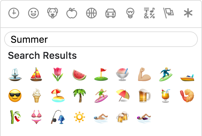
Powerful search
Short name, name and keywords
Not only does Emoji Mart return more results than most emoji picker, they’re more accurate and sorted by relevance.
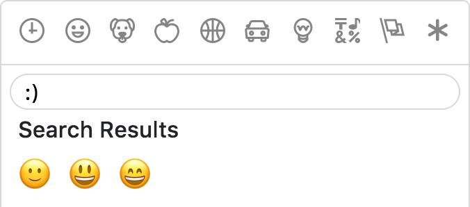
Emoticons
The only emoji picker that returns emojis when searching for emoticons.
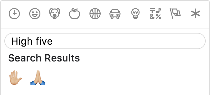
Results intersection
For better results, Emoji Mart split search into words and only returns results matching both terms.
Fully customizable
Anchors color, title and default emoji


Emojis sizes and length
Default skin color
As the developer, you have control over which skin color is used by default.

It can however be overwritten as per user preference.

Multiple sets supported
Apple / Google / Twitter / EmojiOne / Messenger / Facebook

Convenience Wrappers
Below are convenience wrappers for Emoji and Picker components that make usage simpler.
These were present before in the project source, but, since they are using all.json for data, that resulted in bigger bundle sizes (as all.json was also included into the any app that is using emoji picker, even if it doesn't need all.json).
So the components were removed and included here as an example.
Picker component wrapper with default settings:
<script> let index = data functional: true props: ...PickerProps data: type: Object { return index } { let data props children = ctx return }</script>Emoji component wrapper with default settings:
<script> functional: true props: ...EmojiProps data: type: Object { let index = data return index } { let data props children = ctx return }</script>Not opinionated
Emoji Mart doesn’t automatically insert anything into a text input, nor does it show or hide itself. It simply returns an emoji object. It’s up to the developer to mount/unmount (it’s fast!) and position the picker. You can use the returned object as props for the EmojiMart.Emoji component. You could also use emoji.colons to insert text into a textarea or emoji.native to use the emoji.
Development
Build the component and the demo app.
# Build the component and watch for file changes. $ npm run build# Build the demo app and watch for file changes. $ npm run dev:docsOpen docs/index.html in browser to see the demo.
Or serve the dir (with npx and http-server:
npx http-server ./docsAnd open http://127.0.0.1:8080/.
Tests
Run tests with npm run jest.
To debug tests, run npm run jest-debug and then open chrome://inspect in Chrome and open the node inspector client from there.
Building
# Checkout master branch, update version git checkout master# Edit package.json, update version vim package.json # Checkout build branch git checkout build # Merge latest master into it git merge master # Build NODE_ENV=production npm run buildnpm run dev:docs # Add build files git add buiid/git add docs/git commit -m "Rebuild" # Push changes git push origin HEAD # Tag the new release (same as package.json version), add the description for tag # Hint: refer PRs with #17 (PR id) to later have links to PRs in github releases git tag 3.1.1 -a # Push the tags git push origin --tags # Publish to npm with `npm publish` ## 🎩 Hat tips! Original react emoji picker: [missive/emoji-mart].Vue port: [jm-david/emoji-mart-vue] Powered by [iamcal/emoji-data] and inspired by [iamcal/js-emoji].<br>🙌🏼 [Cal Henderson].