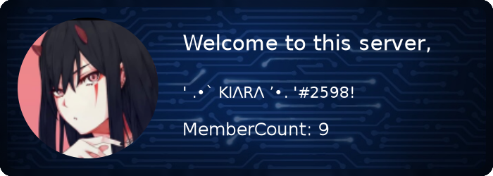
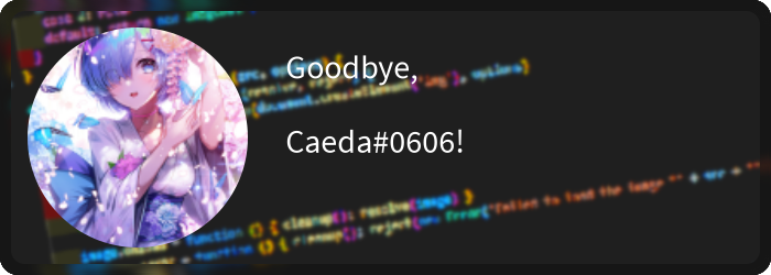
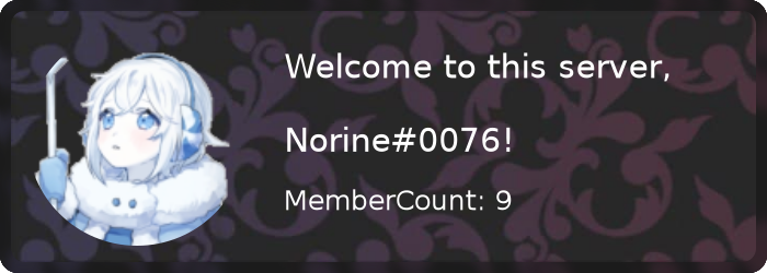
Simple easy-to-use Goodbye and welcome cards for your discord Bot. The version changelog could be found at changelog.md. If you have any problems or questiosn considering this package, feel free to open a issue or join our discord server.
- ⛩️ 3 default themes (circuit, code, dark)
- 🍭 gradient color support
- 🖼️ custom background support
- 📎 customizable cards (blur, rounded edges)
- 🗛 multiple font support
- 💿 rounded edges / border
- ⭕ avatar outline
(Note that all example codes below are for discord.js Version 13. Example usage code in Version 12, is provided in another file)
  /** Select a theme with some default options */
  theme?: keyof typeof themes;
  /** Options for the text on the card */
  text?: {
    /** Text in the Top */
    title?: string | Text;
    /**Text in the middle(big) */
    text?: string | Text;
    /** Text on the bottom */
    subtitle?: string | Text;
    /** Font Color */
    color?: ColorResolvable;
    /** Custom Font */
    font?: string;
  };
  /** Options for the avatar */
  avatar?: {
    /** The Avatar Image, can be a URL/Canvas/Image or Buffer */
    image?: ImageResolvable;
    /** Width of the outline around the avatar */
    outlineWidth?: number;
    /** Color of the outline */
    outlineColor?: ColorResolvable;
    /** Border radius of the avatar between 0.0 and 1.0
     *  (0 = rect. 1 = circle)
     * @default 1.0 */
    borderRadius?: number;
    /** Radius to control the size of the avatar
     *  the value is multiplied with the height/2
     *  of the canvas, so 1.0 fills the entire height
     *  @default 0.8 */
    imageRadius?: number;
  };
  card?: {
    /** Override the Background, can be a URL/Canvas/Image or Buffer  */
    background?: ImageResolvable;
    /** If the background should be blurred (true -> 3) */
    blur?: boolean | number;
    /** When enabled a blurred border is drawn, enabled by default */
    border?: boolean | number;
    /** If enabled the edges will be rounded, enabled by default */
    rounded?: boolean | number;
    //custom?: ModuleFunction;
  };
  generation?: {
    /** Add name to this card, this will save the card
     * renderd without text and image, to speed up the generation
     * by only updating dynamic content */
    static?: string;
    /** Image Format, by default it's PNG */
    format?: mimeType;
};| Package | Version |
|---|---|
| discord.js | 14.13.0 |
| discord-welcome-card | 4.9.1 |
Note: (If you want to use Gradients, you maybe need to import Gradient like this: const { drawCard, LinearGradient } = require('discord-welcome-card'))
Welcome Card
const client = new Client({
	intents: [
		GatewayIntentBits.Guilds,
		GatewayIntentBits.GuildMessages,
		GatewayIntentBits.MessageContent,
		GatewayIntentBits.GuildMembers,
	],
});

client.on('messageCreate', async (message) => {
  if (message.author.bot) return;

  const image = await welcomeImage(message.member, { theme: 'circuit' });

  message.channel.send({ files: [image] });
});


client.login('Your-Bot-Token');
Goodbye Card
const { Client, GatewayIntentBits  } = require('discord.js');
const { drawCard, LinearGradient } = require('discord-welcome-card');
const client = new Client({
	intents: [
		GatewayIntentBits.Guilds,
		GatewayIntentBits.GuildMessages,
		GatewayIntentBits.MessageContent,
		GatewayIntentBits.GuildMembers,
	],
});

client.on('messageCreate', async (message) => {
  if (message.author.bot) return;

  const image = await welcomeImage(message.member, { theme: 'code' });

  message.channel.send({ files: [image] });
});

client.login('Your-Bot-Token');
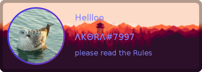
Custom Card
const { Client, GatewayIntentBits  } = require('discord.js');
const { drawCard, LinearGradient } = require('discord-welcome-card');
const client = new Client({
	intents: [
		GatewayIntentBits.Guilds,
		GatewayIntentBits.GuildMessages,
		GatewayIntentBits.MessageContent,
		GatewayIntentBits.GuildMembers,
	],
});

client.on('messageCreate', async (message) => {
  if (message.author.bot) return;
  //Generating the actual custom Card
  const image = await drawCard({
    theme: 'circuit',
    text: {
      title: 'Hellloo',
      text: message.author.tag,
      subtitle: 'please read the Rules',
      color: `#88f`,
    },
    avatar: {
      image: message.author.displayAvatarURL({ extension: 'png' }),
      outlineWidth: 5,
      outlineColor: new LinearGradient([0, '#33f'], [1, '#f33']),
    },
    card: {
      background: 'https://i.imgur.com/ea9PB3H.png',
      blur: 1,
      border: true,
      rounded: true,
    }
  });

  message.channel.send({ files: [image] });
});

client.login('Your-Bot-Token');There are some examples of cards/themes in the examples folder, these are mostly provided by the community and showcase the possibilities of this package. If you think your card looks awesome and unique and would be a great addition to our examples, then we'll happily look at your card, and maybe include it.
Image Options may be different depending on the discord.js Version your using.
image: message.author.displayAvatarURL({ format: 'png' }),
needs to be
image: message.author.displayAvatarURL({ extension: 'png' }),
See here
| name | children | size |
|---|---|---|
| canvas | 0 | 57.02M |
| @discord-card/core | 0 | 2.93M |
| 2 modules | 0 children | 59.95M |


