Accordion title


A tiny helper function for creating Web Components
Highlights
- Zero dependencies, only 2kb 🕊️
- Template literals as templating engine 💡
- Write standards-compliant Web Components 🌍
- Use with Vue, React, Angular and friends 🤝
- Small and easy API 🚴
Table of contents
Installation
CDN
Create an index.html file and include Customel with the CDN:
If you are using native ES Modules, you can include it in the index.html like this:
NPM
npm install customel
;Introduction
Custom elements are awesome. They make it possible for everybody to use your components, no matter which new javascript framework they are using. As a part of the native web platform they are a great way to build maintainable and long lasting UI-libraries.
Still, writing Web Components from scratch can require quite a lot of boiler plate. Customel is a small wrapper around the HTMLElement class that reduces a lot of the boiler plate, enforces some best practises, and makes it easier to make new custom elements.
Customel is not meant to be a way to build software or large applications. It is built as a way to create small, reusable Web Components.
Getting started
The easiest way to try out Customel is using the JSFiddle Hello World example. You can follow the Quick Start from here.
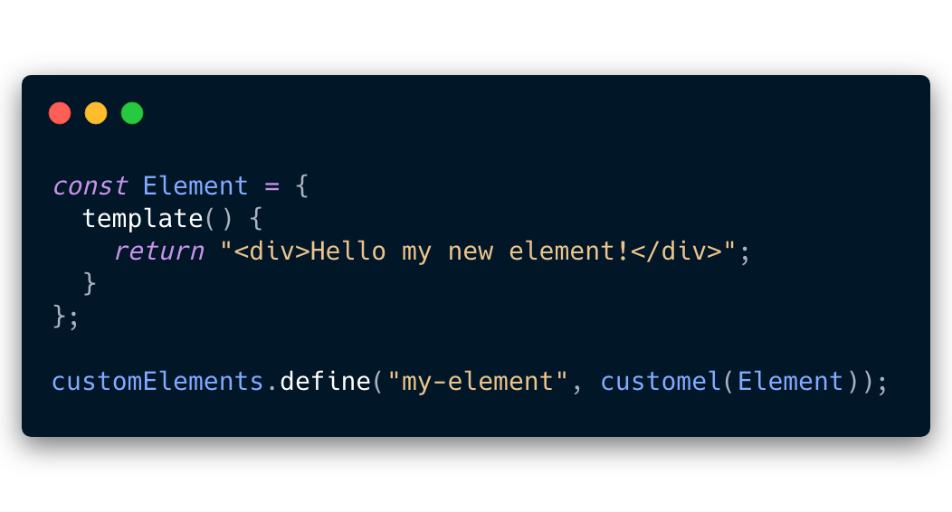
First create a file called my-element.js. Import Customel, create your component, and define it.
// my-element.js; const Element = { return "<div>Hello my new element!</div>"; }; customElements;Create a index.html file, and import my-element.js.
Your custom element is now ready to be used!
<!-- index.html ---><html> <head> <script type="module" src="my-element.js"></script> </head> <body> <my-element></my-element> </body></html>Documentation
Template
You probably want to render some html inside your custom element. The easiest way to do this is to just return a string with some HTML:
const Element = { return "<div>HTML as a string</div>"; };The template function also provides a template literal called html that we can use when we want to add event handlers to the component, or we want to loop through a list.
const items = "Item 1" "Item 2"; const Element = { return html` alert("Clicked")}>Button `; };Styles
To apply styles to your custom element, you can return CSS as a string:
const Element = { return ` button { background-color: red; color: white; } `; } { return html` My button `; };You can also use props or state to render styles conditionally.
const Element = props: active: false { return ` button { background-color: ; color: white; } `; } { return html` My button `; };This will however cause a rerender of the whole internal stylesheet of the component. So it is adviced to toggle classes based on props or state instead:
const Element = props: active: false { return ` button { background-color: blue; color: white; } button.active { background-color: red; } `; } { const buttonClass = thispropsactive ? "active" : null; return html` My button `; };State
Your state is contained in a state object.
You can modify the state with the this.setSate function.
this.setState will cause a rerender and you will get a fresh DOM with updated data.
const Element = state: active: false { return html` this.setState({ active: true })}> Active state is `; };Props
Use props to define data that your custom element can recieve from the outside. Always provide a default value to your props.
Simple props
If the default value is a string, number or a boolean then your prop will be available as an attribute on your custom element:
const Accordion = props: open: false { return html` Accordion title `; }; customElement;This makes attributes available on your component.
They will also be reflected as properties, so you could just do this as well:
Advanced props
If the default value is a function, object, array or any other type of data, it will be available as a property on the element instead of an attribute.
const List = props: todos: "Buy milk" "Learn stuff" { return html` `; }; customElement; Actions
const Element = props: title: "Title" actions: { ; } { return html` this.actions.showMessage()}> My button `; };Use in frameworks
React
Vue
Custom Elements play nicely with Vue, but for rich data you will need to add a .prop on the attribute to bind the value to the property and not the attribute of the custom element.
For now you will also need to replace the whole array every time you update it's value, as Customel does not watch for nested changes. This may come in the future via use of a Proxy.
Angular
Coming...
React
Coming...
Customel is MIT licensed.