
Customizable radio selection of items defined by user

npm install --save custom-item-radio-select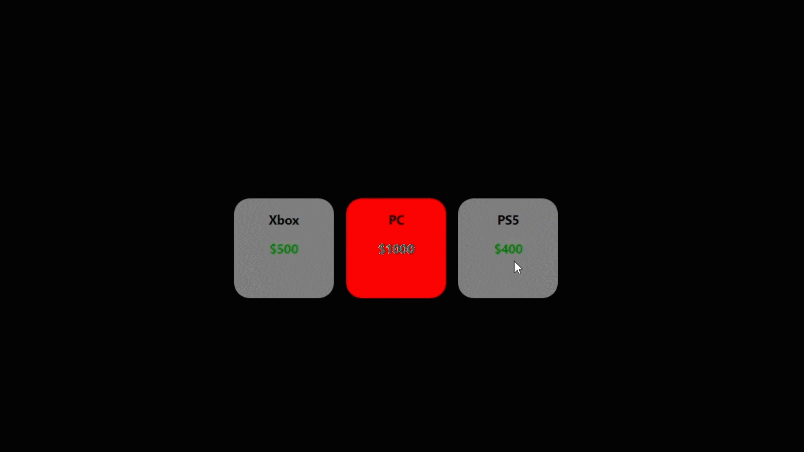
This package brings a radio button behaviour for any type of data and component representation which is specified by the developer.
This component requires information that will be represented and how this information will be displayed as a radio button. Therefore, the ItemRadioSelect component must be provided with an array of data (the items of any type) and the component that will be rendered as a radio button for each of those items.
| Props | type | description | required | default |
|---|---|---|---|---|
| itemsData | array | array of data for the items to be rendered | required | |
| radioItemRender | func(itemData, isSelected) | function to render your custom radio item based on the data | required | |
| type | string | specify an horizontal or vertical display of the items (values can be "horizontal" or "vertical") | no-required | horizontal |
| onSelectedItem | func(selectedItem) | function to do something on radio item selected | required |
| Props | type | description | default |
|---|---|---|---|
| width | string | specify the width of ItemRadioSelect component container | |
| height | string | specify the height of ItemRadioSelect component container | |
| gap | string | specify the gap between items of ItemRadioSelect component |
Let's consider the example where we fetch information about products that have an ID, a name, and a value. In this case, we have an array with the following items:
export interface Product {
  id: number
  name: string
  value: number
}

data = [
  { id: 1, name: 'Xbox', value: 500 },
  { id: 2, name: 'PC', value: 1000 },
  { id: 3, name: 'PS5', value: 400 }
]
Then, in this example, we want to implement a radio selection of these Products representing them as simple cards that manages the information on his own simple way.
For this we create a basic component called Card that receives in his props the data of the product that it will render and a boolean that specifies if this Card/Product is the one selected on the Radio selection (Information provided by the ItemRadioSelect component).
import React from 'react'
import { CardData } from './App'

// Names defined by you
export interface CardProps {
  productData: Product // The data of the item to display (in this case a Product)
  isProductSelected: boolean // Information about whether this item (in this case, the Product) is the currently selected on the ItemRadioSelect component or not
}

export default function Card(props: CardProps) {
  const { productData, isProductSelected } = props

  const [background, setBackground] = useState('grey')

  useEffect(() => {
    // Example of behavior for when the item is selected or not
    if (isProductSelected) {
      setBackground('red')
    } else setBackground('grey')
  }, [isProductSelected])

  return (
    <div
      style={{
        width: '8rem',
        textAlign: 'center',
        backgroundColor: background,
        height: '8rem',
        borderRadius: '20px',
        fontWeight: '700'
      }}
    >
      <p>{productData.name}</p>
      <p style={{ color: 'green' }}>${productData.value}</p>
    </div>
  )
}The retrieved array of products and the Card component are sent as properties to the ItemRadioSelect component.
It can also be observed how styles can be specified within it, as well as the functionality that is executed when one of the items is selected.
import ItemRadioSelect from 'custom-item-radio-select'
import React, { useState } from 'react'
import Card from './Card'

export interface Product {
  id: number
  name: string
  value: number
}

function App() {
  // Fetched data
  const [data, setData] = useState<Product[]>([
    { id: 1, name: 'Xbox', value: 500 },
    { id: 2, name: 'PC', value: 1000 },
    { id: 3, name: 'PS5', value: 400 }
  ])

  // Styles for ItemRadioSelect component:
  // width: Specify the width of the container of the radio select
  // height: Specify the height of the container of the radio select
  // gap: Specify the gap between items of the radio select
  const itemRadioSelectStyles = {
    width: '100%',
    height: '20rem',
    gap: '1rem'
  }

  return (
    <div
      style={{
        backgroundColor: 'black',
        height: '100vh',
        width: '100%',
        paddingTop: '10rem'
      }}
    >
      <ItemRadioSelect
        style={itemRadioSelectStyles}
        type='horizontal' // type can be "horizontal" (flexDirection row) or "vertical" (flexDirection column)
        itemsData={data} // Specification of the data to render the items
        onSelectedItem={(selectedItem: Product) => {
          console.log(selectedItem)
        }} // Definition of what to execute upon the selection of an item
        radioItemRender={(radioItemData: Product, isSelected: boolean) => (
          <Card productData={radioItemData} isProductSelected={isSelected} />
        )}
        // Specification of the component that will render each data item and function as a radio button
        //  In this case, the Card component created below
        // Must give the props of the data to represent, and the props to know whether this Card/Product is the
        // one selected or not
      />
    </div>
  )
}Given the operation of the component in this example, it demonstrates its versatility for handling various datasets, such as products in this case, and pairing them with any suitable representation component, like the Card component shown here. The main ItemRadioSelect component supplies the data of the item to be rendered (referred to here as productData) and information indicating whether that item is currently selected in the radio selection (referred to here as isProductSelected).
This setup enables customization of how different pieces of information are presented, as well as defining specific actions to occur upon selecting or deselecting a particular item.
MIT © LeanM