
Cube React Component
3D Cube component made with React, ideal for a cool gallery
Here is a GIF of the cube in the demo so that you can see what it looks like at a glance (the actual demo is live, customizable and allow you to export the code necessary to instantiate the cube with the used custom values: open the demo page):
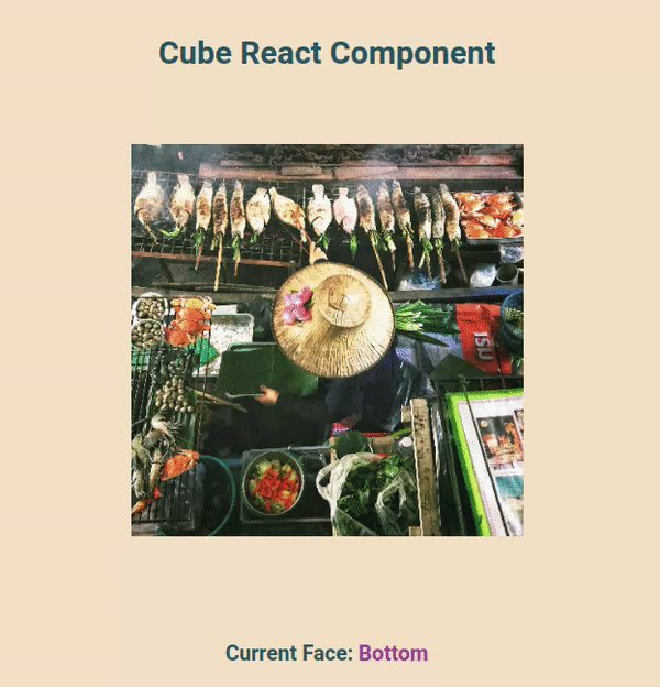
Cube react component is a cool 3D react cube component.
If you want to showcase some images in an original way, give it a try.
Either continue to read to learn more about this cube component to see if it fits your needs or jump right to Installation & Usage.
Description
Customization
You can add up to 6 faces to the cube.
The cube is very customizable.
You can customize:
- the content of the faces (naturally)
- the current face you want the cube to be showing at an instant T (the logic about when to change the current face is totally up to you, the npm module provides help in the form of exported variables with values and TypeScript types you may want to use when incorporating this component in your project)
- the duration of the transition between the faces
- the CSS transition function used for the transition
- the perspective used for the transition animation
- the size of the cube, either conveniently with an object argument if you want to use the default Tailwind breakpoints, or you can set up your own custom breakpoints by providing a certain CSS variable.
You can add custom CSS classes and React props to:
- the container
- the scene (wrapper of the inner cube used as an anchor for the animation)
- the inner cube itself
- and the 6 faces. You can choose to add custom CSS classes & React Props to all the faces at the same time or if you want more granularity, you can target only the one(s) you want.
Accessibility
The cube has the aria-live="polite" property so that the cube announces face changes to screen readers. All the faces other than the current face have aria-hidden="true". You can add other props easily as mentioned above.
Ease of use
This package exports multiple variables with values & TypeScript types you may want to use when using this cube: an array with the names of the default breakpoints, an array with the names of the faces, a type that only accepts the names of the faces, etc. Look at the API documentation for more details about what is available (everything is listed in the navigation section).
Reliability
This component has been thoroughly tested with Playwright. There are at the time of writing 45 tests that make sure it works properly. You can take a look at the tests suite in the GitHub repository.
Look at the API documentation for more details about the API.
Installation & Usage
1. Inside your project, install cube-react-component from npm
npm install cube-react-component // Expect you to have React "18.2.0" or later, didn't test with older versions but should work too.2. Import the required CSS, either in your code file with your bundler or directly in your CSS (Paths are different between the two, make sure to add the dist in the path for the in-CSS-file import)
If your bundler support it, you can import the CSS in the code file where you want to instantiate the cube:
import "cube-react-component/style.css";Or you can just import the CSS in an active CSS file:
@import "path/to/node_modules/cube-react-component/dist/style.css"; /* Check if your project has a better way to import the CSS than hardcoding the path */Then you just have to import the Cube and instantiate it with your values:
import { Cube } from "cube-react-component";
...
<Cube
  sizes={{
    base: "50vw",
    sm: "40vw",
    md: "35vw",
    lg: "30vw",
    xl: "25vw",
    "2xl": "20vw",
  }}
  perspective="none"
  transitionDuration="1s"
  transitionTimingFunction="cubic-bezier(0.4, 0, 0.2, 1)"
  currentFace={currentFace}
  faces={faces}
/>
Look at the code of the demo to see a real example. The actual demo itself also acts as a builder! You can customize parameters and it produces the code for the cube that you can copy at the push of a button. Don't hesitate to try it.
If you want to set up your own breakpoints, you need to set the CSS variable --cube-css-size on the container or above:
  /* Give the class with the CSS variable to the container of the cube or to a wrapping component.
  Use whatever breakpoints you want and however many variations you want */
.css-cube-sizing {
  --cube-css-size: 100vw;
}

@media (min-width: 1000px) {
  .css-cube-sizing {
    --cube-css-size: 50vw;
  }
}

@media (min-width: 2000px) {
  .css-cube-sizing {
    --cube-css-size: 20vw;
  }
}
Then you can set the prop useCSSVariableForCubeSize to true on the cube so that TypeScript won't complain because you didn't provide a sizes object to the Cube:
<Cube
  perspective="none"
  transitionDuration="1s"
  transitionTimingFunction="cubic-bezier(0.4, 0, 0.2, 1)"
  currentFace={currentFace}
  faces={faces}
  // set the CSS variable on the container (or any wrapping component above if you want)
  containerAdditionalClasses="css-cube-sizing"
  // then set either:
  useCSSVariableForCubeSize={true}
  // or you can also just mention it since it will default to true:
  useCSSVariableForCubeSize
/>
The CSS size has priority even if you don't set the variable useCSSVariableForCubeSize, do no set it if you want to use the sizes object to size the cube.
Look at the API documentation for more details about the API.
Credits
This cube CSS logic is inspired from the one presented in this Intro to CSS 3D transforms: https://3dtransforms.desandro.com/
License
MIT