Carbon Native
A set of UI components for building React Native apps


Demo App
Get Started
yarn add carbon-nativeComponents
- [x] Badge
- [x] Buttons
- [x] Card
- [x] Container
- [x] Content
- [x] Icons
- [x] List
- [x] Range
- [x] Toggle
- [x] Toolbar
- [x] Typography
- [x] H1
- [x] H2
- [x] H3
- [x] H4
- [x] H5
- [x] H6
- [x] P
- [x] A
- [x] BR
- [x] Em
- [x] Small
- [x] Strong
- [x] S
- [x] U
- [x] Mark
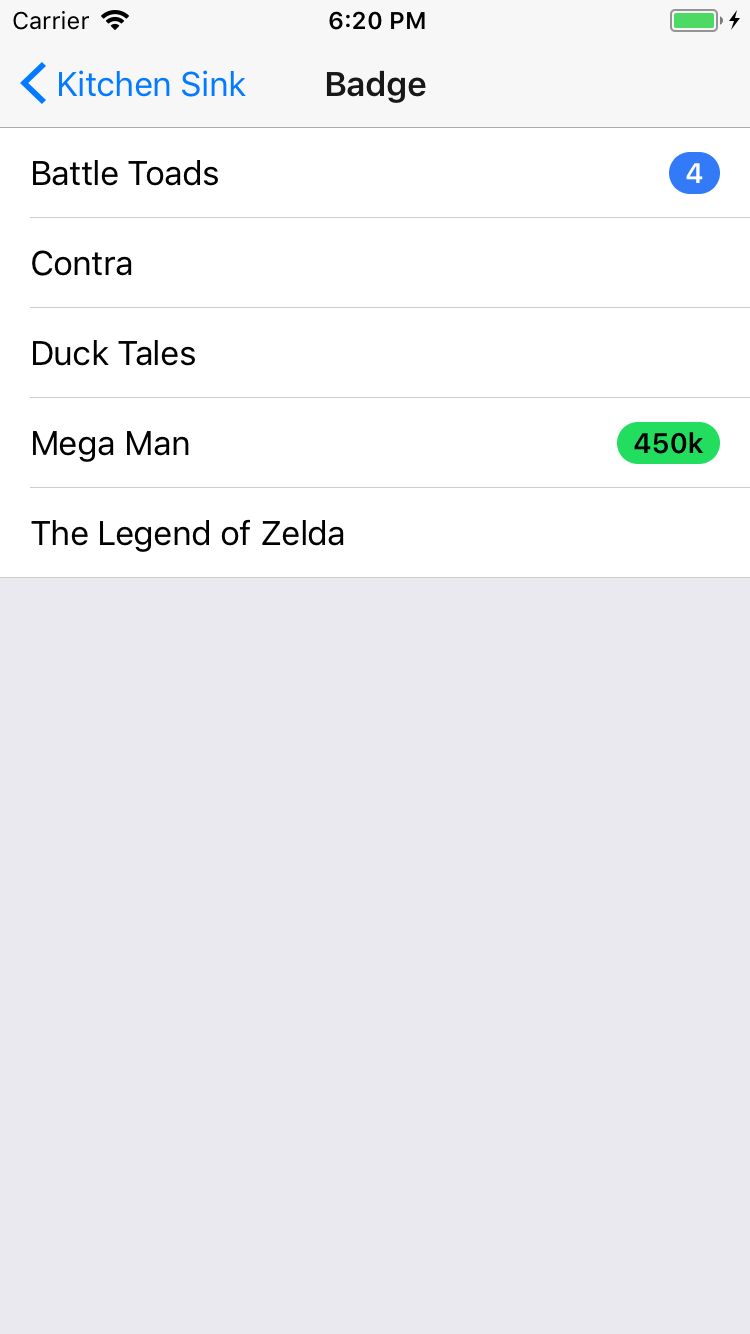
Badge
import {
  Badge,
} from 'carbon-native';

<Badge
  color="primary"
  text="4"
/>Buttons
import {
  Button,
} from 'carbon-native';

<Button
  color="stable"
  text="Regular Button"
/>

<Button
  color="primary"
  text="Outline Button"
  outline
/>

<Button
  color="secondary"
  text="Clear Button"
  clear
/>Card
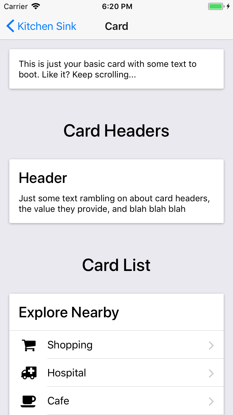
import {
  Card,
  H4,
} from 'carbon-native';

<Card>
  <H4>Header</H4>
  <Text>
    Just some text rambling on.
  </Text>
</Card>Icons
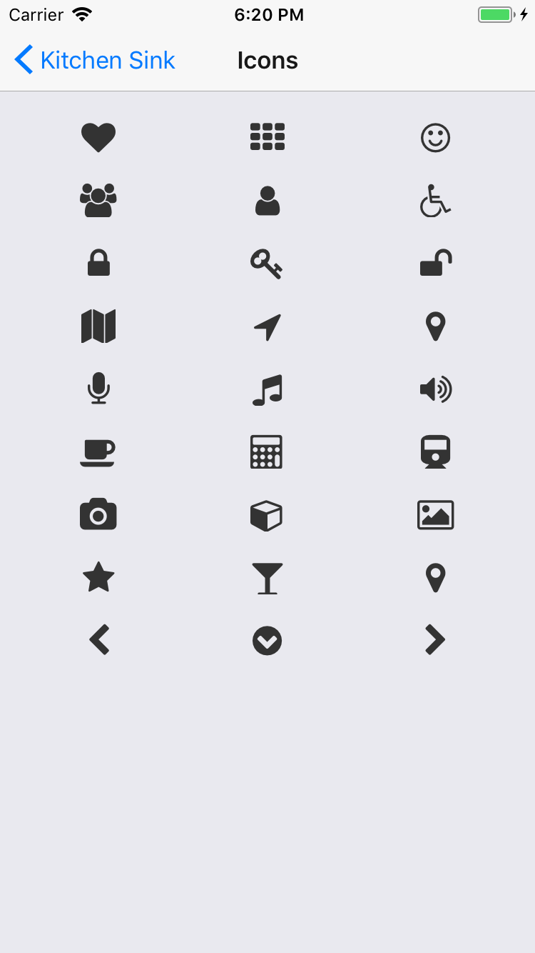
npm install react-native-vector-icons --save
rnpm link
import Icon 'react-native-vector-icons/FontAwesome';
<Icon
name="volume-down"
size={24}
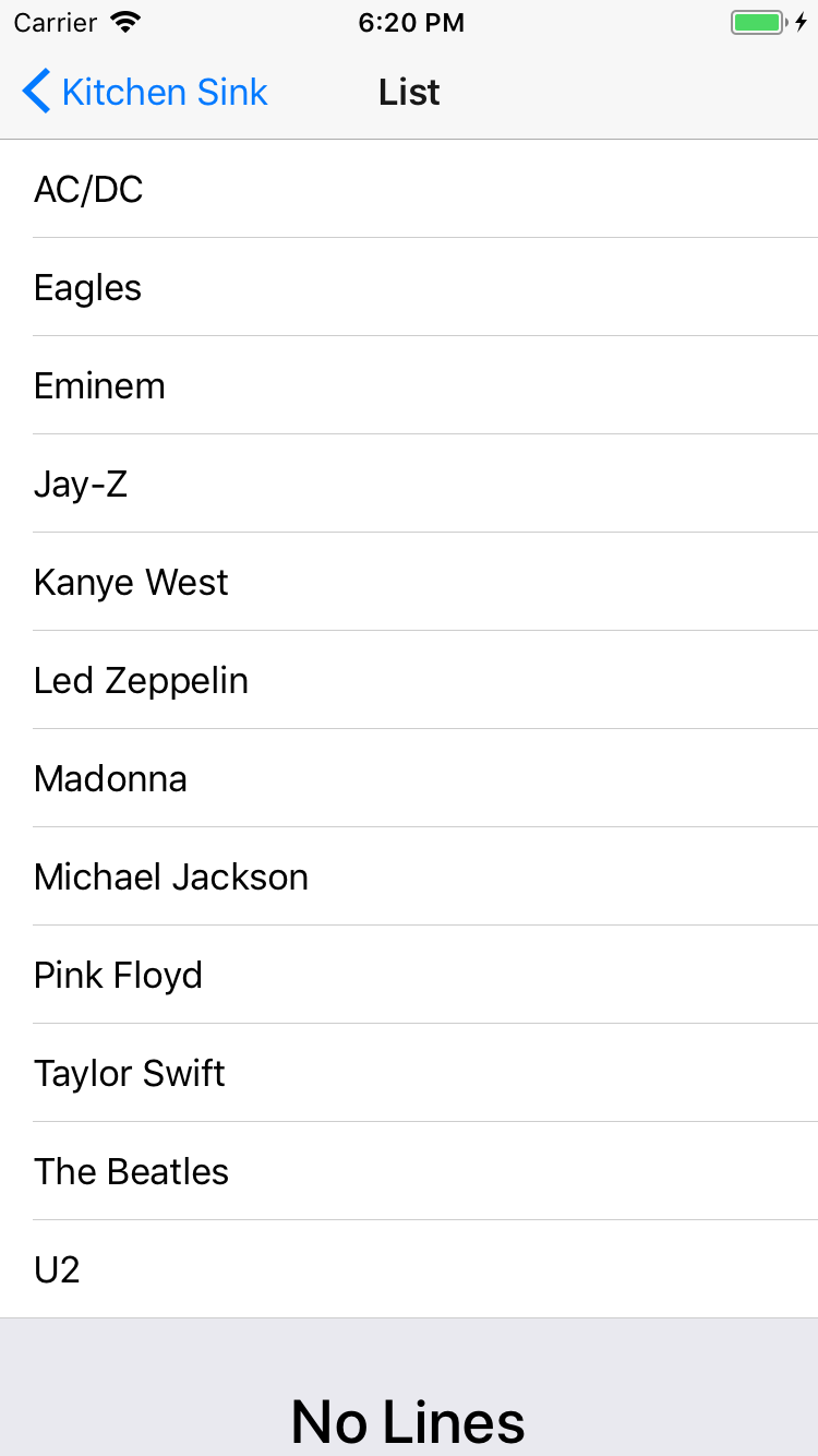
/>List
import {
  List,
  Item,
  ItemIcon,
  ItemContent,
  ItemText,
  Note,
} from 'carbon-native';

<List>
  <Item>
    <ItemIcon>
      <Icon name="bolt" size={24} />
    </ItemIcon>
    <ItemContent>
      <ItemText>Harry</ItemText>
      <Note>The boy who lived</Note>
    </ItemContent>
  </Item>
</List>Range
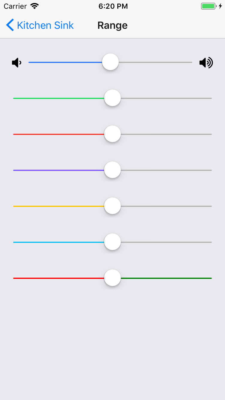
import {
  Range,
} from 'carbon-native';

<Range
  value={this.state.value}
  onValueChange={(value) => this.setState({ value })}
/>Toggle
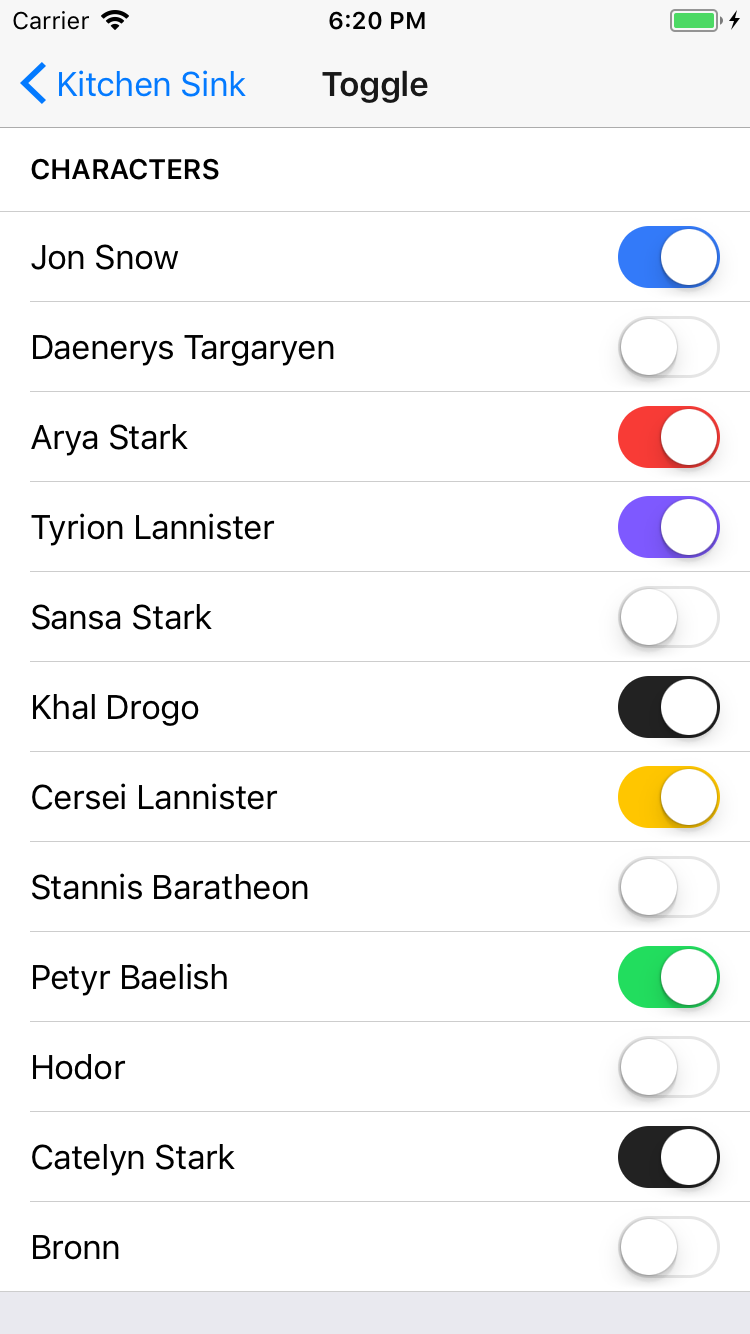
import {
  Toggle,
} from 'carbon-native';

<Toggle
  color="primary"
  onValueChange={(value) => this.setState({ toggleState: value })}
  value={this.state.toggleState}
/>Toolbar
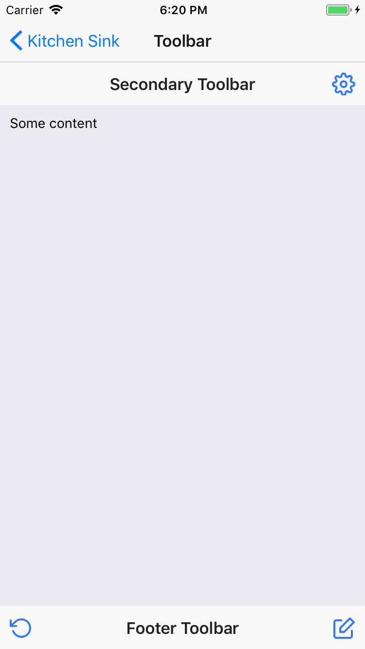
import {
  Toolbar,
  ToolbarTitle,
} from 'carbon-native';

<Toolbar color="primary">
  <ToolbarTitle color="light">Primary</ToolbarTitle>
</Toolbar>Typography
import {
H1,
H2,
H3,
H4,
H5,
H6,
P,
BR,
Em,
Small,
Strong,
S,
U,
} from 'carbon-native';
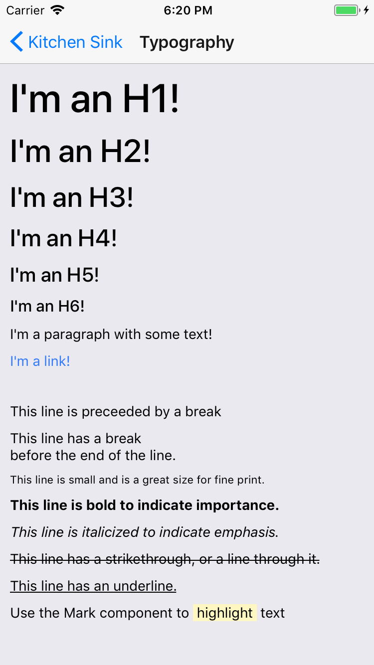
<H1>I'm an H1!</H1>
<H2>I'm an H2!</H2>
<H3>I'm an H3!</H3>
<H4>I'm an H4!</H4>
<H5>I'm an H5!</H5>
<H6>I'm an H6!</H6>
<P>I'm a paragraph with some text!</P>
<BR />
<P>This line is preceeded by a break</P>
<P>
This line has a break<BR />
before the end of the line.
</P>
<P>
<Small>This line is small and is a great size for fine print.</Small>
</P>
<P>
<Strong>This line is bold to indicate importance.</Strong>
</P>
<P>
<Em>This line is italicized to indicate emphasis.</Em>
</P>
<P>
<S>This line has a strikethrough, or a line through it.</S>
</P>
<P>
<U>This line has an underline.</U>
</P>
<P>
Use the Mark component to <Mark>highlight</Mark> text
</P>Contribute
Contribution guidelines for this project