Bs5Utils - A JavaScript utility package for Bootstrap 5 components
A simple package to make the usage of various components within Bootstrap 5 easier to use.
If this package has helped you, and you're feeling particularly generous:
- ETH/MATIC: 0x6515654c8e931052ab17a63311411D475D503e59
- ADA: addr1qxaqvghsr8lu3wrmql4fcvg6txj5083s2a9rr5dmrrtjt0yn8t0x4yav3ma2flg3tzcu9767s7senydcumnf6c4krnnspn949q
Note: The package is also available on npmjs: https://www.npmjs.com/package/bs5-utils
Contents
Configuration
There are several defaults which you can customize:
Bs5Utils.defaults.toasts.position = 'top-right';
Bs5Utils.defaults.toasts.container = 'toast-container';
Bs5Utils.defaults.toasts.stacking = false;
As bs5Utils.Snack is a subset of bs5Utils.Toast, the configuration for toasts will also apply to bs5Utils.Sanck.
Theming
You can register your own custom styles by passing classes to specific components by using the static
method Bs5Utils.registerStyle. The components you can customise are:
-
btnClose- The dismiss button -
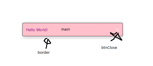
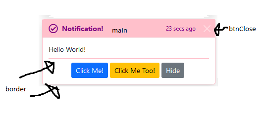
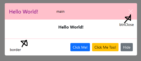
main- The area of the toast, snack, or modal which will display thetypecolor -
border- The border of the component
These components have been clearly illustrated below. For the time being, the border style for bs5Utils.Snack cannot
be overridden.
Note: All of these keys must be passed in the styles parameter object.
Method Overview
/**
 * Register a style for the components
 * @param key - To reference your style
 * @param styles - The style object
 */
Bs5Utils.registerStyle(key, styles)
Usage
You first define your CSS classes:
.bg-pink {
    background-color: pink;
}

.text-purple {
    color: purple;
}

.border-pink {
    border-color: pink !important;
}
Then you register the style:
Bs5Utils.registerStyle('pink', {
    btnClose: ['btn-close-white'],
    main: ['bg-pink', 'text-purple'],
    border: ['border-pink']
});
Pass empty arrays if you wish to leave the default styles e.g.
Bs5Utils.registerStyle('pink', {
    btnClose: [],
    main: ['bg-pink', 'text-purple'],
    border: ['border-pink']
});
Now, pink can be used as a type when displaying snacks, toasts, or modals e.g.
Snack
Toast
Modal
API
This package is based around the Bs5Utils class, so first things first, construct the object:
const bs5Utils = new Bs5Utils();Thereafter you'll be able to use the methods outlined below.
Snacks
Method Overview
/**
 * Display a lightweight toast for simple alerts
 * @param - type the theme of the snack
 * @param - title the title of the of the snack
 * @param - delay in ms, if specified the snack will autohide after the specified amount
 * @param - dismissible set whether the dismiss button should show
 */
bs5Utils.Snack.show(
    type,
    title,
    delay = 0,
    dismissible = true
);
Usage
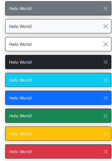
bs5Utils.Snack.show('secondary', 'Hello World!', delay = 0, dismissible = true);
bs5Utils.Snack.show('light', 'Hello World!', delay = 0, dismissible = true);
bs5Utils.Snack.show('white', 'Hello World!', delay = 0, dismissible = true);
bs5Utils.Snack.show('dark', 'Hello World!', delay = 0, dismissible = true);
bs5Utils.Snack.show('info', 'Hello World!', delay = 0, dismissible = true);
bs5Utils.Snack.show('primary', 'Hello World!', delay = 0, dismissible = true);
bs5Utils.Snack.show('success', 'Hello World!', delay = 0, dismissible = true);
bs5Utils.Snack.show('warning', 'Hello World!', delay = 0, dismissible = true);
bs5Utils.Snack.show('danger', 'Hello World!', delay = 0, dismissible = true);
Example
Toasts
Method Overview
/**
 * Display a toast for alerts
 * @param type - the theme of the snack
 * @param icon - Set an icon in the top-left corner, you can pass HTML directly
 * @param title - the title of the of the toast
 * @param subtitle - the subtitle of the toast
 * @param content - the content of the toast
 * @param buttons - the action buttons of the toast
 * @param delay - in ms, if specified the snack will autohide after the specified amount
 * @param dismissible - set whether the dismiss button should show
 */
bs5Utils.Toast.show({
    type,
    icon = '',
    title,
    subtitle = '',
    content = '',
    buttons = [],
    delay = 0,
    dismissible = true,
});
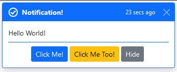
Usage
bs5Utils.Toast.show({
    type: 'primary',
    icon: `<i class="far fa-check-circle fa-lg me-2"></i>`,
    title: 'Notification!',
    subtitle: '23 secs ago',
    content: 'Hello World!',
    buttons: [
        {
            text: 'Click Me!',
            class: 'btn btn-sm btn-primary',
            handler: () => {
                alert(`Button #1 has been clicked!`);
            }
        },
        {
            text: 'Click Me Too!',
            class: 'btn btn-sm btn-warning',
            handler: () => {
                alert(`You clicked me too!`);
            }
        },
        {
            type: 'dismiss',
            text: 'Hide',
            class: 'btn btn-sm btn-secondary'
        }
    ],
    delay: 0,
    dismissible: true
});
Example
Modals
Method Overview
/**
 * Display a modal
 * @param type - the theme of the snack
 * @param title - the title of the modal, if omitted, the modal-header element is removed
 * @param content - the content of the modal, if omitted, the modal-body element is removed
 * @param buttons - any action buttons, if omitted, the the modal-footer element  is removed
 * @param centered - set whether the modal is centered
 * @param dismissible - set whether the dismiss button should show
 * @param backdrop - set the type of backdrop: true, false, static
 * @param keyboard - set whether the escape key closes the modal
 * @param focus - set whether the modal is autofocussed when initialized
 * @param fullscreen - set whether the modal is fullscreen
 * @param modalSize - set the size of the modal: sm, lg, xl by default, it's an empty string
 */
bs5Utils.Modal.show({
    type,
    title = '',
    content = '',
    buttons = [],
    centered = false,
    dismissible = true,
    backdrop = dismissible ? true : 'static',
    keyboard = dismissible,
    focus = true,
    fullscreen = false,
    size = ''
})
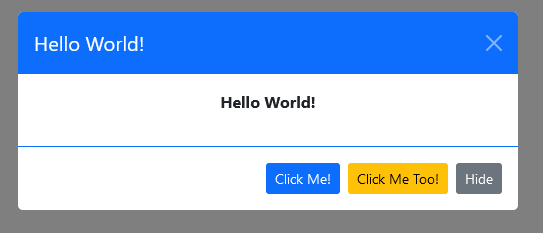
Usage
bs5Utils.Modal.show({
    type: 'primary',
    title: `Hello World!`,
    content: `<p class="text-center fw-bold">Hello World!</p>`,
    buttons: [
        {
            text: 'Click Me!',
            class: 'btn btn-sm btn-primary',
            handler: () => {
                alert(`Button #1 has been clicked!`);
            }
        },
        {
            text: 'Click Me Too!',
            class: 'btn btn-sm btn-warning',
            handler: () => {
                alert(`You clicked me too!`);
            }
        },
        {
            type: 'dismiss',
            text: 'Hide',
            class: 'btn btn-sm btn-secondary'
        }
    ],
    centered: true,
    dismissible: true,
    backdrop: 'static',
    keyboard: false,
    focus: false
});
Example
Support & Contribute
- Use: Babel Repl and JavaScript Minifier to build the app to transpile and minify your changes
- Submit issues and PRs
- Let's know how you're using this package in your project
- If this package has helped you, and you're feeling particularly generous:
- ETH/MATIC: 0x6515654c8e931052ab17a63311411D475D503e59
- ADA: addr1qxaqvghsr8lu3wrmql4fcvg6txj5083s2a9rr5dmrrtjt0yn8t0x4yav3ma2flg3tzcu9767s7senydcumnf6c4krnnspn949q
