
Bootstrap Tree View


A simple and elegant solution to displaying hierarchical tree structures (i.e. a Tree View) while leveraging the best that Twitter Bootstrap has to offer.
Dependencies
Where provided these are the actual versions bootstrap-treeview has been tested against.
Getting Started
Install
You can install using bower (recommended):
$ bower install bootstrap-treeviewor using npm:
$ npm install bootstrap-treeviewor download manually.
Usage
Add the following resources for the bootstrap-treeview to function correctly.
<!-- Required Stylesheets --> <!-- Required Javascript -->The component will bind to any existing DOM element.
Basic usage may look something like this.
{ // Some logic to retrieve, or generate tree structure return data;} ;Data Structure
In order to define the hierarchical structure needed for the tree it's necessary to provide a nested array of JavaScript objects.
Example
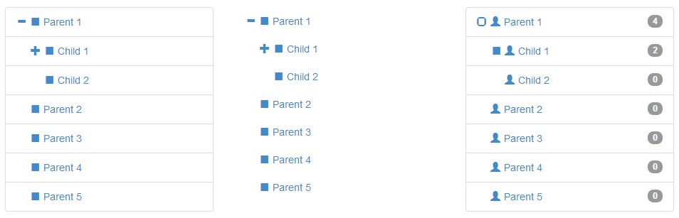
var tree = text: "Parent 1" nodes: text: "Child 1" nodes: text: "Grandchild 1" text: "Grandchild 2" text: "Child 2" text: "Parent 2" text: "Parent 3" text: "Parent 4" text: "Parent 5" ;At the lowest level a tree node is a represented as a simple JavaScript object. This one required property text will build you a tree.
text: "Node 1"If you want to do more, here's the full node specification
text: "Node 1" icon: "glyphicon glyphicon-stop" selectedIcon: "glyphicon glyphicon-stop" color: "#000000" backColor: "#FFFFFF" href: "#node-1" selectable: true state: checked: true disabled: true expanded: true selected: true tags: 'available' nodes: {} ... Node Properties
The following properties are defined to allow node level overrides, such as node specific icons, colours and tags.
text
String Mandatory
The text value displayed for a given tree node, typically to the right of the nodes icon.
icon
String Optional
The icon displayed on a given node, typically to the left of the text.
For simplicity we directly leverage Bootstraps Glyphicons support and as such you should provide both the base class and individual icon class separated by a space.
By providing the base class you retain full control over the icons used. If you want to use your own then just add your class to this icon field.
selectedIcon
String Optional
The icon displayed on a given node when selected, typically to the left of the text.
color
String Optional
The foreground color used on a given node, overrides global color option.
backColor
String Optional
The background color used on a given node, overrides global color option.
href
String Optional
Used in conjunction with global enableLinks option to specify anchor tag URL on a given node.
selectable
Boolean Default: true
Whether or not a node is selectable in the tree. False indicates the node should act as an expansion heading and will not fire selection events.
state
Object Optional
Describes a node's initial state.
state.checked
Boolean Default: false
Whether or not a node is checked, represented by a checkbox style glyphicon.
state.disabled
Boolean Default: false
Whether or not a node is disabled (not selectable, expandable or checkable).
state.expanded
Boolean Default: false
Whether or not a node is expanded i.e. open. Takes precedence over global option levels.
state.selected
Boolean Default: false
Whether or not a node is selected.
tags
Array of Strings Optional
Used in conjunction with global showTags option to add additional information to the right of each node; using Bootstrap Badges
Extendible
You can extend the node object by adding any number of additional key value pairs that you require for your application. Remember this is the object which will be passed around during selection events.
Options
Options allow you to customise the treeview's default appearance and behaviour. They are passed to the plugin on initialization, as an object.
// Example: initializing the treeview// expanded to 5 levels// with a background color of green;You can pass a new options object to the treeview at any time but this will have the effect of re-initializing the treeview.
List of Options
The following is a list of all available options.
data
Array of Objects. No default, expects data
This is the core data to be displayed by the tree view.
backColor
String, any legal color value. Default: inherits from Bootstrap.css.
Sets the default background color used by all nodes, except when overridden on a per node basis in data.
borderColor
String, any legal color value. Default: inherits from Bootstrap.css.
Sets the border color for the component; set showBorder to false if you don't want a visible border.
checkedIcon
String, class names(s). Default: "glyphicon glyphicon-check" as defined by Bootstrap Glyphicons
Sets the icon to be as a checked checkbox, used in conjunction with showCheckbox.
collapseIcon
String, class name(s). Default: "glyphicon glyphicon-minus" as defined by Bootstrap Glyphicons
Sets the icon to be used on a collapsible tree node.
color
String, any legal color value. Default: inherits from Bootstrap.css.
Sets the default foreground color used by all nodes, except when overridden on a per node basis in data.
emptyIcon
String, class name(s). Default: "glyphicon" as defined by Bootstrap Glyphicons
Sets the icon to be used on a tree node with no child nodes.
enableLinks
Boolean. Default: false
Whether or not to present node text as a hyperlink. The href value of which must be provided in the data structure on a per node basis.
expandIcon
String, class name(s). Default: "glyphicon glyphicon-plus" as defined by Bootstrap Glyphicons
Sets the icon to be used on an expandable tree node.
highlightSearchResults
Boolean. Default: true
Whether or not to highlight search results.
highlightSelected
Boolean. Default: true
Whether or not to highlight the selected node.
levels
Integer. Default: 2
Sets the number of hierarchical levels deep the tree will be expanded to by default.
multiSelect
Boolean. Default: false
Whether or not multiple nodes can be selected at the same time.
nodeIcon
String, class name(s). Default: "glyphicon glyphicon-stop" as defined by Bootstrap Glyphicons
Sets the default icon to be used on all nodes, except when overridden on a per node basis in data.
onhoverColor
String, any legal color value. Default: '#F5F5F5'.
Sets the default background color activated when the users cursor hovers over a node.
selectedIcon
String, class name(s). Default: "glyphicon glyphicon-stop" as defined by Bootstrap Glyphicons
Sets the default icon to be used on all selected nodes, except when overridden on a per node basis in data.
searchResultBackColor
String, any legal color value. Default: undefined, inherits.
Sets the background color of the selected node.
searchResultColor
String, any legal color value. Default: '#D9534F'.
Sets the foreground color of the selected node.
selectedBackColor
String, any legal color value. Default: '#428bca'.
Sets the background color of the selected node.
selectedColor
String, any legal color value. Default: '#FFFFFF'.
Sets the foreground color of the selected node.
showBorder
Boolean. Default: true
Whether or not to display a border around nodes.
showCheckbox
Boolean. Default: false
Whether or not to display checkboxes on nodes.
showIcon
Boolean. Default: true
Whether or not to display a nodes icon.
showTags
Boolean. Default: false
Whether or not to display tags to the right of each node. The values of which must be provided in the data structure on a per node basis.
uncheckedIcon
String, class names(s). Default: "glyphicon glyphicon-unchecked" as defined by Bootstrap Glyphicons
Sets the icon to be as an unchecked checkbox, used in conjunction with showCheckbox.
Methods
Methods provide a way of interacting with the plugin programmatically. For example, expanding a node is possible via the expandNode method.
You can invoke methods in one of two ways, using either:
1. The plugin's wrapper
The plugin's wrapper works as a proxy for accessing the underlying methods.
Limitation, multiple arguments must be passed as an array of arguments.
2. The treeview directly
You can get an instance of the treeview using one of the two following methods.
// This special method returns an instance of the treeview. ; // The instance is also saved in the DOM elements data,// and accessible using the plugin's id 'treeview'.data'treeview' ;A better approach, if you plan a lot of interaction.
List of Methods
The following is a list of all available methods.
checkAll(options)
Checks all tree nodes
;Triggers nodeChecked event; pass silent to suppress events.
checkNode(node | nodeId, options)
Checks a given tree node, accepts node or nodeId.
;Triggers nodeChecked event; pass silent to suppress events.
clearSearch()
Clear the tree view of any previous search results e.g. remove their highlighted state.
;Triggers searchCleared event
collapseAll(options)
Collapse all tree nodes, collapsing the entire tree.
;Triggers nodeCollapsed event; pass silent to suppress events.
collapseNode(node | nodeId, options)
Collapse a given tree node and it's child nodes. If you don't want to collapse the child nodes, pass option { ignoreChildren: true }.
;Triggers nodeCollapsed event; pass silent to suppress events.
disableAll(options)
Disable all tree nodes
;Triggers nodeDisabled event; pass silent to suppress events.
disableNode(node | nodeId, options)
Disable a given tree node, accepts node or nodeId.
;Triggers nodeDisabled event; pass silent to suppress events.
enableAll(options)
Enable all tree nodes
;Triggers nodeEnabled event; pass silent to suppress events.
enableNode(node | nodeId, options)
Enable a given tree node, accepts node or nodeId.
;Triggers nodeEnabled event; pass silent to suppress events.
expandAll(options)
Expand all tree nodes. Optionally can be expanded to any given number of levels.
;Triggers nodeExpanded event; pass silent to suppress events.
expandNode(node | nodeId, options)
Expand a given tree node, accepts node or nodeId. Optionally can be expanded to any given number of levels.
;Triggers nodeExpanded event; pass silent to suppress events.
getCollapsed()
Returns an array of collapsed nodes e.g. state.expanded = false.
;getDisabled()
Returns an array of disabled nodes e.g. state.disabled = true.
;getEnabled()
Returns an array of enabled nodes e.g. state.disabled = false.
;getExpanded()
Returns an array of expanded nodes e.g. state.expanded = true.
;getNode(nodeId)
Returns a single node object that matches the given node id.
;getParent(node | nodeId)
Returns the parent node of a given node, if valid otherwise returns undefined.
;getSelected()
Returns an array of selected nodes e.g. state.selected = true.
;getSiblings(node | nodeId)
Returns an array of sibling nodes for a given node, if valid otherwise returns undefined.
;getUnselected()
Returns an array of unselected nodes e.g. state.selected = false.
;remove()
Removes the tree view component. Removing attached events, internal attached objects, and added HTML elements.
;revealNode(node | nodeId, options)
Reveals a given tree node, expanding the tree from node to root.
;Triggers nodeExpanded event; pass silent to suppress events.
search(pattern, options)
Searches the tree view for nodes that match a given string, highlighting them in the tree.
Returns an array of matching nodes.
;Triggers searchComplete event
selectNode(node | nodeId, options)
Selects a given tree node, accepts node or nodeId.
;Triggers nodeSelected event; pass silent to suppress events.
toggleNodeChecked(node | nodeId, options)
Toggles a nodes checked state; checking if unchecked, unchecking if checked.
;Triggers either nodeChecked or nodeUnchecked event; pass silent to suppress events.
toggleNodeDisabled(node | nodeId, options)
Toggles a nodes disabled state; disabling if enabled, enabling if disabled.
;Triggers either nodeDisabled or nodeEnabled event; pass silent to suppress events.
toggleNodeExpanded(node | nodeId, options)
Toggles a nodes expanded state; collapsing if expanded, expanding if collapsed.
;Triggers either nodeExpanded or nodeCollapsed event; pass silent to suppress events.
toggleNodeSelected(node | nodeId, options)
Toggles a node selected state; selecting if unselected, unselecting if selected.
;Triggers either nodeSelected or nodeUnselected event; pass silent to suppress events.
uncheckAll(options)
Uncheck all tree nodes.
;Triggers nodeUnchecked event; pass silent to suppress events.
uncheckNode(node | nodeId, options)
Uncheck a given tree node, accepts node or nodeId.
;Triggers nodeUnchecked event; pass silent to suppress events.
unselectNode(node | nodeId, options)
Unselects a given tree node, accepts node or nodeId.
;Triggers nodeUnselected event; pass silent to suppress events.
Events
Events are provided so that your application can respond to changes in the treeview's state. For example, if you want to update a display when a node is selected use the nodeSelected event.
You can bind to any event defined below by either using an options callback handler, or the standard jQuery .on method.
Example using options callback handler:
and using jQuery .on method
;List of Events
nodeChecked (event, node) - A node is checked.
nodeCollapsed (event, node) - A node is collapsed.
nodeDisabled (event, node) - A node is disabled.
nodeEnabled (event, node) - A node is enabled.
nodeExpanded (event, node) - A node is expanded.
nodeSelected (event, node) - A node is selected.
nodeUnchecked (event, node) - A node is unchecked.
nodeUnselected (event, node) - A node is unselected.
searchComplete (event, results) - After a search completes
searchCleared (event, results) - After search results are cleared
Copyright and Licensing
Copyright 2013 Jonathan Miles
Licensed under the Apache License, Version 2.0 (the "License"); you may not use this file except in compliance with the License. You may obtain a copy of the License at http://www.apache.org/licenses/LICENSE-2.0
Unless required by applicable law or agreed to in writing, software distributed under the License is distributed on an "AS IS" BASIS, WITHOUT WARRANTIES OR CONDITIONS OF ANY KIND, either express or implied. See the License for the specific language governing permissions and limitations under the License.