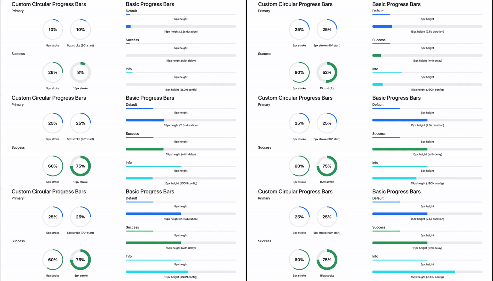
Enhanced progress components with circular progress and animations for Bootstrap 5.
This package provides:
- Standard Bootstrap Progress Bar Extension with animation
- Custom circular progress bars
- Viewport-based animation triggers
- Configurable animation duration and delays
- Multiple color variants (primary, success, info, warning, danger)
- Stroke width customization for circular progress
- Built-in accessibility features
- Lightweight implementation (only ~325 lines of JS)
- Support for dynamically added progress bars
npm install bootstrap-progress-extensionInclude the CSS and JavaScript files in your project:
<!-- For production -->
<link href="path/to/bootstrap-progress-extension.min.css" rel="stylesheet">
<script src="path/to/bootstrap-progress-extension.min.js"></script>

<!-- For development/debugging -->
<link href="path/to/bootstrap-progress-extension.css" rel="stylesheet">
<script src="path/to/bootstrap-progress-extension.js"></script><div class="progress" role="progressbar" aria-label="Basic example"
aria-valuenow="75" aria-valuemin="0" aria-valuemax="100"
data-bs-config='{"duration": 2000}'>
<div class="progress-bar"></div>
</div>- Note: The
<div class="progress-label">...</div>element is required within the.progress-barfor circular progress bars. Important: For circular progress bars, you only need to include the standard.progressand.progress-barelements, along with a<div class="progress-label">...%</div>inside the.progress-bar. The decorative<div class="circle-background"></div>and<div class="circle-progress"></div>elements will be automatically injected by the script. Do not include them in your source HTML.
<div class="progress circular" role="progressbar" aria-label="Circular progress"
     aria-valuenow="75" aria-valuemin="0" aria-valuemax="100"
     data-bs-config='{"strokeWidth": 15, "animateInViewport": true}'>
  <div class="progress-bar bg-success">
    <div class="progress-label">75%</div>
    <!-- .circle-background and .circle-progress will be added here by the script -->
  </div>
</div>For RTL languages like Arabic, Hebrew, or Persian, simply wrap your progress bar in a container with dir="rtl":
<div dir="rtl">
  <!-- Circular Progress in RTL -->
  <div class="progress circular" role="progressbar" aria-label="تقدم دائري"
       aria-valuenow="65" aria-valuemin="0" aria-valuemax="100"
       data-bs-config='{"strokeWidth": 15, "duration": 2000}'>
    <div class="progress-bar bg-primary">
      <div class="circle-background"></div>
      <div class="circle-progress"></div>
      <div class="progress-label">٦٥٪</div>
    </div>
  </div>

  <!-- Standard Progress Bar in RTL -->
  <div class="progress" role="progressbar" aria-label="شريط التقدم"
       aria-valuenow="70" aria-valuemin="0" aria-valuemax="100"
       data-bs-config='{"duration": 1800}'>
    <div class="progress-bar bg-success"></div>
  </div>
</div>Progress bars added dynamically to the DOM after page load will be automatically initialized:
// Create a progress bar dynamically
const progressBar = document.createElement('div');
progressBar.className = 'progress';
progressBar.setAttribute('role', 'progressbar');
progressBar.setAttribute('aria-label', 'Dynamic progress');
progressBar.setAttribute('aria-valuenow', '60');
progressBar.setAttribute('aria-valuemin', '0');
progressBar.setAttribute('aria-valuemax', '100');

const bar = document.createElement('div');
bar.className = 'progress-bar bg-success';
bar.style.width = '0%';

progressBar.appendChild(bar);
document.body.appendChild(progressBar);
// No manual initialization needed - MutationObserver will detect and initialize itAll progress components can be configured using the data-bs-config attribute with JSON:
| Option | Type | Default | Description |
|---|---|---|---|
strokeWidth |
Number | 15 |
Sets the stroke width in pixels for circular progress bars |
size |
Number | 120 |
Sets the size in pixels for circular progress bars |
duration |
Number | 1500 |
Animation duration in milliseconds |
delay |
Number | 0 |
Delay before animation starts in milliseconds |
animation |
Boolean | false |
Whether to animate the progress. Set to true to enable animation. |
animateInViewport |
Boolean | true |
Only animate when the element enters the viewport |
The appearance of the circular progress bars can be customized using the following CSS custom properties:
| Variable | Description | Default Value | Controlled By |
|---|---|---|---|
--circle-size |
The overall width and height of the circular progress component. | 120px |
size config option |
--circle-thickness |
The thickness of the progress ring. | 15px |
strokeWidth config option |
--arc-color |
The color of the progress arc. Determined by bg-* classes. |
var(--bs-progress-bar-bg) |
bg-* CSS class |
--progress-angle |
The calculated angle (0-360deg) representing the current progress visually. | 0deg |
JavaScript (setValue) |
Note: While --arc-color and --progress-angle are used internally, you typically control the appearance via the data-bs-config options (size, strokeWidth) and standard Bootstrap background utility classes (bg-primary, bg-success, etc.) rather than setting these CSS variables directly.
This extension leverages standard Bootstrap CSS variables for theming and consistency:
| Bootstrap Variable | How It's Used |
|---|---|
--bs-progress-bg |
Background color for the track of standard progress bars and the inactive portion of the circular progress ring. |
--bs-progress-bar-bg |
Default color for the active arc of circular progress bars (used when no specific bg-* class is applied). |
--bs-success |
Color for the active arc when .bg-success is used on the circular progress bar. |
--bs-danger |
Color for the active arc when .bg-danger is used on the circular progress bar. |
--bs-warning |
Color for the active arc when .bg-warning is used on the circular progress bar. |
--bs-info |
Color for the active arc when .bg-info is used on the circular progress bar. |
--bs-body-bg |
Background color used for the inner cutout area of the circular progress bar (to match the page background). |
--bs-body-color |
Default text color for the percentage label inside circular progress bars. |
--bs-dark |
Text color used for the percentage label specifically when the circular progress bar has the .bg-light class. |
Working with progress bars programmatically:
// Create a new progress bar instance
const progressElement = document.querySelector('.progress');
const progressBar = new ProgressBar(progressElement);

// Set value without animation
progressBar.setValue(75);

// Animate to value (target percentage, optional duration)
progressBar.animate(90, 2000);

// Initialize to 0%
progressBar.initialize();Bootstrap Progress Bar Extension are built with accessibility in mind:
-
ARIA Support: All progress bars use proper ARIA attributes (
role="progressbar",aria-valuenow,aria-valuemin,aria-valuemax, andaria-label) -
Reduced Motion: Automatically respects the user's
prefers-reduced-motionbrowser setting, disabling animations for users who prefer reduced motion - Text Labels: Circular progress bars include visible text labels showing the current progress percentage
- Color Contrast: All components maintain proper contrast ratios between background, foreground, and text elements
-
RTL Support: Full support for right-to-left languages using the
dir="rtl"attribute - Responsive Design: Components adapt to different screen sizes for usability on mobile devices
- Chrome/Edge 60+
- Firefox 60+
- Safari 12+
- iOS 12+
- Not compatible with Internet Explorer
MIT


